Layering meaning intoname, music, and message
A name can shape how the world sees you—and how you see yourself. When The Wailin’ Jennys first formed, the name was a spontaneous pun—an offhand suggestion from a Winnipeg guitar shop owner that quickly became an unceremonial baptism that stuck. But by the time they asked me to design their second full-length album, I saw an opportunity: to begin building meaning into it. What started as a clever nod to Waylon Jennings could become something deeper—a vessel for meaning, symbolism, and story.
Firecracker
My collaboration with the Jennys began in 2005 and has grown into one of the most enduring creative relationships of my career. By then, the group had evolved—Annabelle Chvostek had joined Ruth Moody and Nicky Mehta, bringing a new kind of charge to the trio’s sound. From the outset, I worked closely with Ruth and Nicky, whose vision and trust shaped everything that followed. Our conversations set the tone for a process that was intuitive, layered, and deeply responsive to the music. What we built together over time wasn’t just packaging—it was a kind of visual grammar, as resonant as the harmonies that inspired it.


As the design developed,the meaning evolved for me.The firecracker becamesomething closer to awake-up call—a revelationor reckoning.
Their second full-length album arrived with weightier themes and a deeper emotional core. Even before I heard a note, I sensed it would stretch beyond tradition. The demo confirmed it—songs rooted in folk, but not bound by it. Old forms carried new messages. There was conviction in every line.
In an early conversation, the band asked for my thoughts on the shortlist of titles. I made the case for Firecracker. It felt rich with metaphor—evocative of sudden energy, but also capable of deeper meaning. As the design evolved, so did the metaphor. The firecracker became a wake-up call—a revelation or reckoning.
I began layering dime-store firecracker visuals with Masonic symbolism, Americana, and biblical overtones. The result felt strangely resonant—just like the music. The eye-in-triangle motif, often misread in pop culture, returned to its original meaning: divine watchfulness. A reminder of consequence—of what’s seen and what must be accounted for.
Themes of “heart” and “home” ran through the record. To echo that, I used the heart-in-hand symbol—a traditional gesture of welcome—with one finger missing. A quiet warning. Not unlike the caution labels on vintage firecrackers. Or the moral lessons tucked inside the lyrics.
Numbers—especially the power of three—became another quiet thread. Three weeping children, hands raised in blessing, offered a melancholic reading of the band’s name. This too was a kind of Wailin’ Jennys. A visual parallel to the emotional tone of the record. What emerged was an iconography both old and new: part firecracker box, part hymnal, part prophecy.
Even the numbering on the package—originally a nod to firecracker sizing—began to read like biblical chapter and verse. What started as design became something more symbolic. A visual story with emotional weight to match the songs it held.
I’ve always avoided plastic jewel cases, favouring heavyweight card stocks that invite touch. Firecracker used a digipak printed on backing board—the kind found on the back of notepads—adding texture and an organic feel.
With this stock and just three colours, I achieved surprising tonal range. Starting with the brown base, I added a spot white, then red, then black. Each layer was distinct, but as they overprinted, they combined to create unexpected tones and new visual context—echoing the ephemeral, layered feel of vintage firecracker packaging
Promotional Suite
Created alongside the album packaging, these pieces carried the Firecracker design into promotional and collectible form. Two postcards—circulated through cafés, festivals, and mail orders—offered fans a mailable keepsake, while a sticker echoed the album’s tactile, hand-illustrated style in a format that could travel anywhere. Together, they extended the album’s visual language far beyond its sleeve.
Recognition:
- Juno Award – Nominated for Roots & Traditional Album of the Year
- Folk Alliance International Award – Contemporary Release of the Year
- Billboard – More than 68 weeks on the Top Bluegrass Charts
- Folk Alley – Voted #1 album of 2006 (Penn State Public Broadcast Radio)
- North American Folk Chart – #2 folk album of 2006 and #1 Canadian album
- Billboard – #4 Top 50 Bluegrass Albums of 2007
- Western Canadian Music Award – Best Album Design (Ron Sawchuk)
- Applied Arts Photography & Illustration Annual – Best Poster Illustration (Ron Sawchuk)
- Signature Awards – “Best Cover Design” (Ron Sawchuk)
Client The Wailin’ Jennys
ProjectFirecracker Year2006
A subtle signal of change
After a year of touring, Annabelle Chvostek left the band and was replaced by Heather Masse. My first project for the new lineup wasn’t an album, but a simple poster—with no brief beyond making it visually appealing and leaving space for tour dates. Still, I saw an opening. This was Jennys Mark 3, and I wanted to mark the shift. I chose a 19th-century steam fire engine as the central image—a nod to Firecracker and the idea of putting out the fire. These engines often had names like “Old Sue” or “Baby Girl.” To me, this one was a Wailin’ Jenny—ready to meet fire with feeling. One new detail quietly debuted here: a “Trade Mark No. 3” beneath the band name. It would return on the next album.

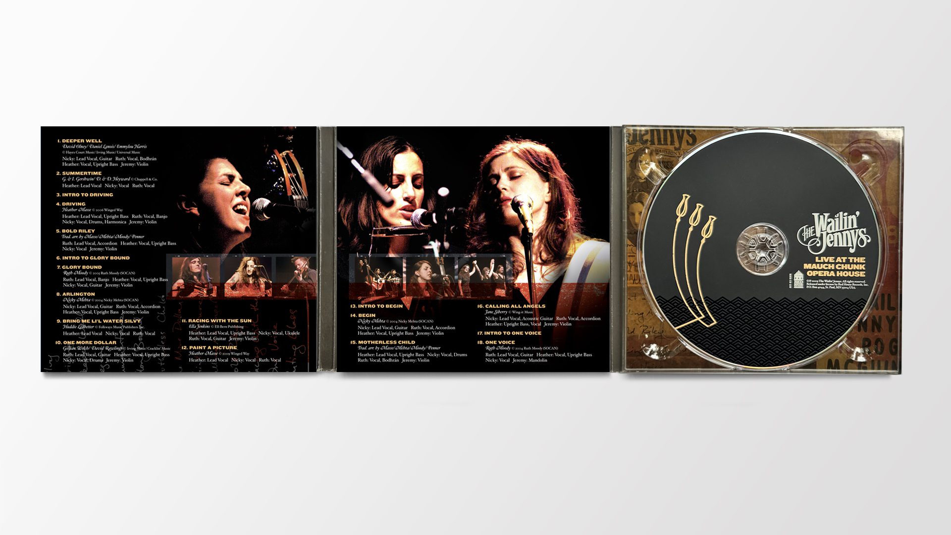
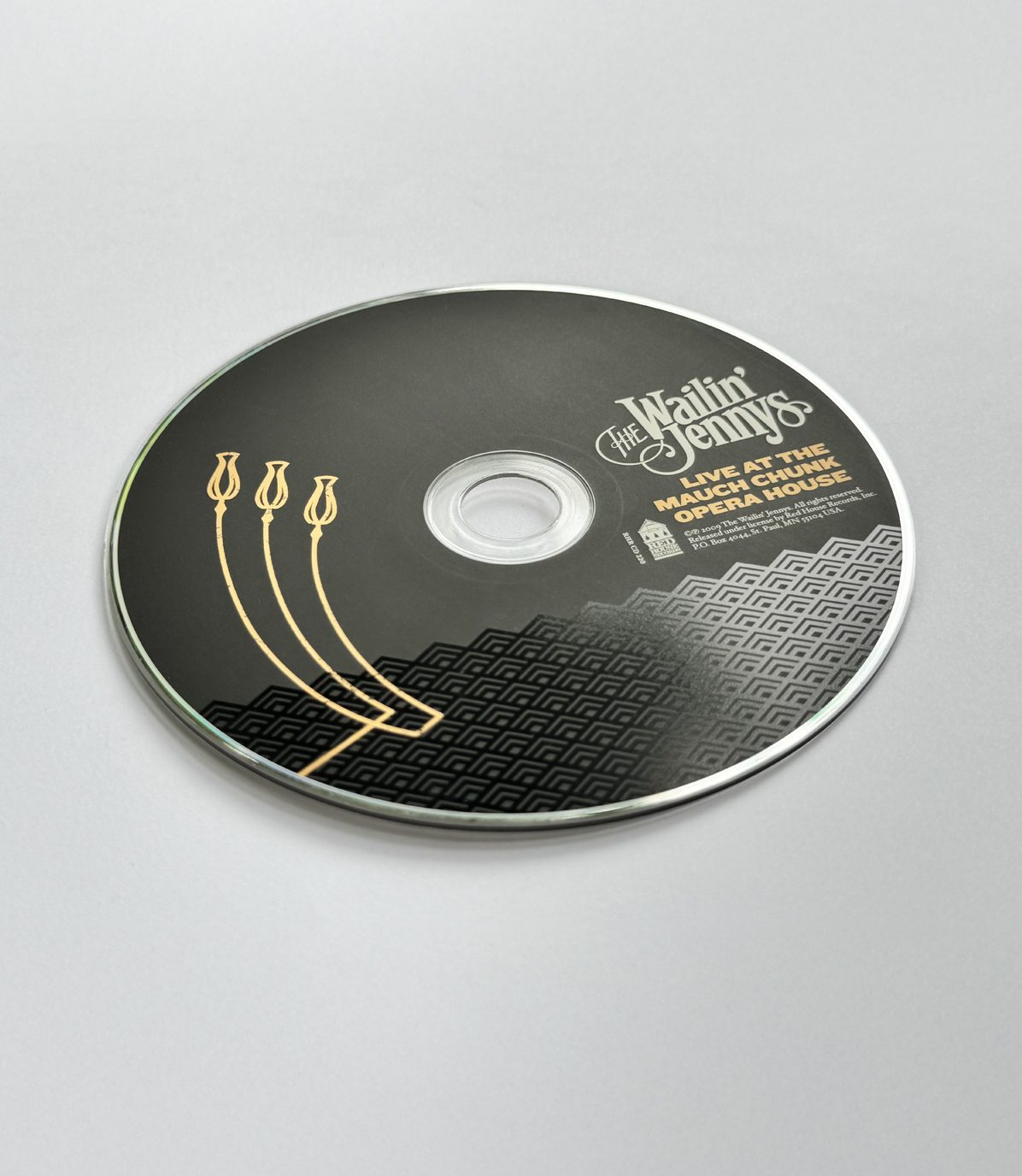
Live at the Mauch Chunk Opera House
A period of intense touring followed in the next couple of years, as the band honed their live performance. One night—August 30, 2008—they recorded a show at the Mauch Chunk Opera House, one of America’s oldest vaudeville theatres. The venue, nestled in the Victorian village of Jim Thorpe, PA, had been in continuous operation for more than 140 years.
On stage, the Jennys kept things light and mobile, as you have to when you’re touring up to 320 days a year. I was always drawn to Nicky’s homemade drum kit—just a kick pedal attached to a red vintage suitcase. Maybe she loved the sound, maybe it doubled as a case for the pedal—or maybe both. Either way, it became a charming, nostalgic feature of their live set. And I leaned into it as the concept for the cover.


Sometimes the mostlasting identities arrivewithout warning.
The wordmark on the Mauch Chunk cover wasn’t designed as a long-term logo—but it earned its place. Nestled inside the satin-lined suitcase, it felt perfectly at home. Over time, it became the band’s visual signature, appearing on future albums, posters, and merchandise.
I asked Nicky to send the suitcase and pedal to the photographer, Art Turner. When he opened it, I was struck by the quilted red satin lining and the fringe inside the lid—like a miniature stage curtain. It was an unexpected contrast: the driving force of a kick pedal paired with something so delicate. And yet, that contrast felt right. One part road-tested rhythm, one part worn-in elegance. A soft interior shaped by the demands of the road. Another expression of a Wailin’ Jenny.
After a few setups, we landed on the one you see on the final cover. The inside of the suitcase created a natural space for a custom wordmark, which eventually became the band’s logo.
The “Trade Mark No. 3” also appeared here—replacing the branding on the kick pedal in quiet but deliberate fashion. It marked the third incarnation of the band, embedded not in the foreground, but in the rhythm that drove the music forward. The final cover offered an honest portrait of a group on the road, carried in a vintage aesthetic that felt true to who they were.
Adapting the design
As the Jennys’ audience grew, so did the need to adapt artwork across formats and territories. That meant flexing the design across jewel cases, digipaks, digital releases, and shifting label templates. I often stepped in as a design steward—consulting with labels to preserve intent, consistency, and meaning along the way.


Promotional Suite
The Mauch Chunk artwork also found life in smaller, shareable forms. A record-store poster announced the release with the same ornate, vintage-inspired feel as the packaging, while a sticker offered a portable fragment of the design. Each piece kept the album’s visual world intact, no matter the scale.
Recognition:
- Indie Acoustic Project Award – “Best Acoustic Ensemble” – Live at the Mauch Chunk
- Billboard – More than 45 weeks on the Top Bluegrass Charts
- Western Canadian Music Award – Best Album Design (Ron Sawchuk)
Client The Wailin’ Jennys
Project Live at the Mauch Chunk Opera House Year2009
Bright Morning Stars
For their 2011 release, Bright Morning Stars, The Wailin’ Jennys teamed up with award-winning producer, engineer, and mixer Mark Howard. Known for his work with Bob Dylan, Neil Young, Emmylou Harris, Lucinda Williams, and others, Howard brought a cinematic edge to the project—combining innovative textures with the band’s signature harmonies and a grounded mix of Americana, pop, and traditional folk.
One early concept explored a different title still in the running at the time: Open Wide Your Wounded Heart. The design featured an antique dressmaker’s mannequin doubling as a birdcage, with three birds in flight, escaping through the chest. It offered another take on the band’s name and echoed the album’s themes of release and vulnerability. The cover included an oval die-cut window at the heart, revealing the title printed on the inside panel. The concept was never used, but helped shape the direction of what followed.
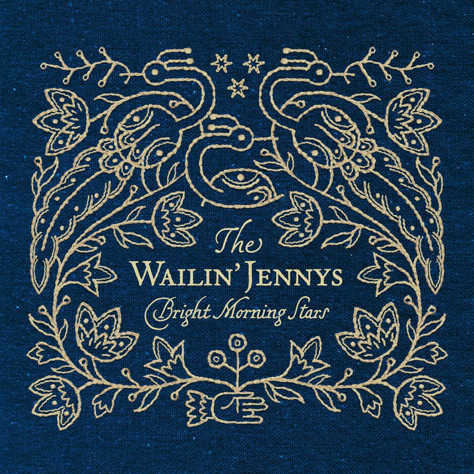

Ultimately, they chose Bright Morning Stars—a traditional Appalachian spiritual recorded by various folk artists over the years. I was drawn to the lyric: “Oh where are our dear mothers? They are gone to heaven a shoutin’. Day is breakin’ in my soul.” It suggested something profound and transitional—forebears crossing into the afterlife as dawn breaks.
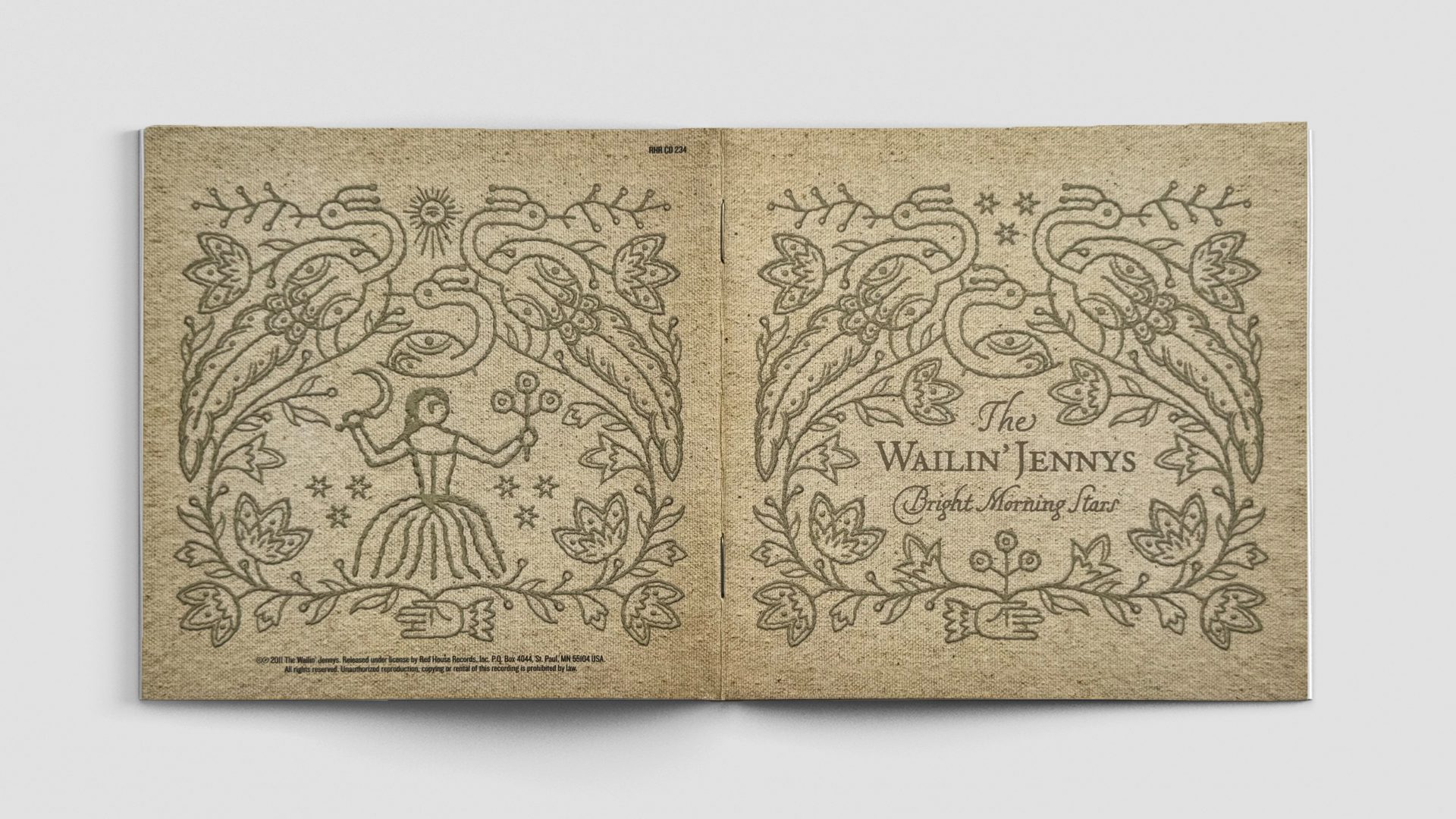
To explore that liminal space between endings and beginnings, I built the artwork around day and night. Both versions were designed as if embroidered folk panels—one light, one dark, each printed to resemble stitched linen.
The first panel represented spring: three pheasants nesting, surrounded by flowering vines in bloom. Three bright morning stars hung in the sky. At the base, all growth emerged from a hand—the same hand from the Firecracker cover, missing its finger. It symbolized creation—stitching life into form.
The second panel represented autumn. It mirrored the composition but carried deeper weight. The stars became a sun bearing an eye—a recurring motif of divine watchfulness. A young maiden stood at the centre, holding a scythe in one hand and a harvested plant in the other. A lighthearted folk scene—woven with a warning that even in beauty, consequence waits.
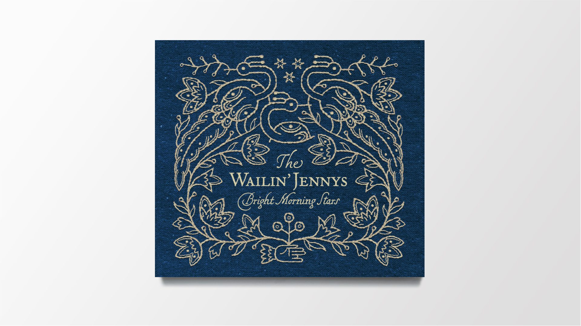

The Trade Mark No.3makes a quiet return—
Hidden inside the sleeve pocket that held the booklet, it appeared only if you squeezed the edges to widen the opening—a small reward for those paying attention.
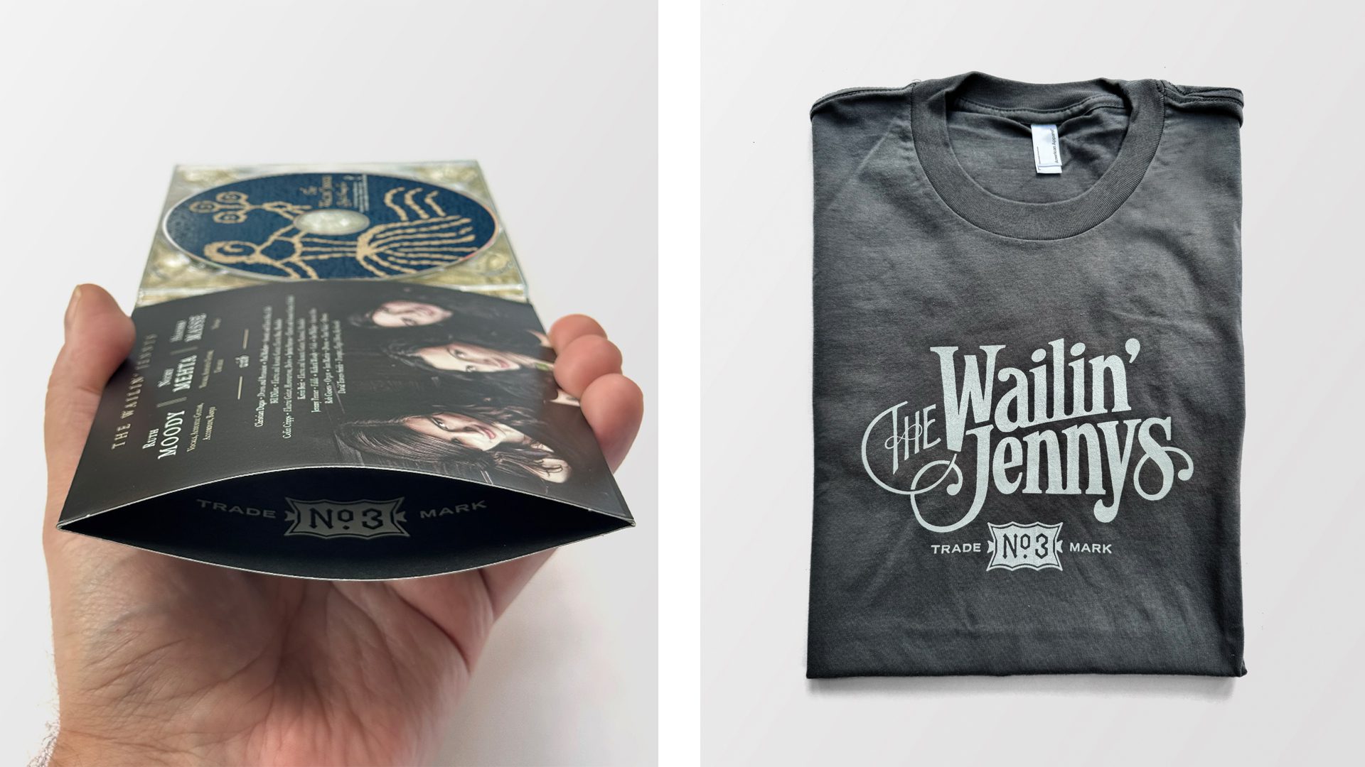
Details like this add nuance to the broader visual language, offering side stories—quiet signatures within the main narrative—and sometimes becoming points of proud display. On a t-shirt, what was hidden becomes a knowing badge: I’m a fan. I know the code.
As the Jennys’ audience grew, so did the design system’s reach. By this point, I was often asked to reformat materials for different labels in different countries. Record companies began co-opting my services directly—producing marketing assets, print ads, and oversized posters for stores worldwide. The same visual language that began in stitch and ink now scaled for display.
These weren’t just illustrations. They were quiet parables—stitched in symbols, shaped by meaning, and open to interpretation. In a body of work concerned with lineage and transformation, Bright Morning Stars stood as a kind of spiritual inflection point—a record about time, endings, and what’s carried forward.
Recognition:
- Juno Award – Winner Roots & Traditional Album of the Year
- Indie Acoustic Project – Best Acoustic Ensemble
- Canadian Folk Music Awards – Producer of the Year – David Travers-Smith & Mark Howard
- Western Canadian Music Award – Best Roots Duo/Group Recording of the Year
- Western Canadian Music Award – Nominated for Best Album Design (Ron Sawchuk)
Client The Wailin’ Jennys
ProjectBright Morning Stars Year2011

“We have had the privilege of working with Ron for almost20 years, and his designs have adorned several of our albums,tour posters, and t-shirts during that time. We have yet tomeet a graphic designer more dedicated to the intricaciesand meaning behind their creations.”
- Nicky Mehta, musical artist, founding member of The Wailin’ Jennys
Fifteen
A milestone, and a moment to lean in
In 2017, The Wailin’ Jennys recorded their fourth studio album—Fifteen—a curated collection of some of their favourite cover songs to mark fifteen years as a band. By then, the language of symbols and numbers we’d established on Firecracker, Mauch Chunk, and Bright Morning Stars had begun to take root. Whether by recognition or coincidence—or maybe something more celestial—it felt like the right time to lean in. This album was a milestone. A moment to honour the past while anticipating the next phase of the band’s future.


Palmistry, reinterpretation,and song as sign
Multiple concepts were presented, but the one that resonated most was rooted in palmistry and fortune-telling. It paired naturally with the idea of time—reading the lines in a hand to glimpse what was and what may come. The graphic language drew from folk mysticism, extending the tone and style already carried through the previous albums.
The hand with the missing finger—first introduced on Firecracker, then layered into the foliage of Bright Morning Stars—now stepped fully into the foreground. Reimagined as a palmistry chart, it became the central image on the cover.
To ground the concept beyond aesthetics, I did my research. The astrological symbols on the hand follow traditional placements, but this wasn’t a reproduction. It was a reinterpretation—recasting the Jennys as soothsayers in their own right.
Instead of using the traditional names for the hand lines in palmistry, I renamed each one after a song from the album. Through research—or something like magic—every title aligned thematically with the meanings of the palm’s structure.
Take Boulder to Birmingham, for example. The title replaced the Line of the Head. Written by Emmylou Harris after Gram Parsons’ death, the lyrics speak to grief and devotion. In palmistry, a long Line of the Head reflects deep commitment; a fork at the end, like in our design, suggests inner struggle. The symbolism matched the sentiment perfectly.
Even a song the band had cut before seeing the concept—Book of Love—echoed through the artwork. Originally written by Stephin Merritt of The Magnetic Fields for 69 Love Songs, it connects to the number 69 (the astrological symbol for Cancer), which appears on the mount of the ring finger—the very finger that’s been missing since Firecracker. Coincidence? Or something foretold? (The final line of the song? “And you, you ought to give me wedding rings.”)


Fifteen, written in the stars
The album’s title, Fifteen, appears as Roman numerals—XV—boldly placed at the top of the cover. Overlaid, the X and V form a seven-pointed star or heptagram: a symbol of perfection, divinity, and magical power in some traditions. Surrounding the hand, fifteen stars—one for each year of the band’s journey around the sun.
The stars were printed in silver foil—subtle, reflective, and tactile. They caught light as you turned the cover, reinforcing movement and alignment. That detail extended to the disc itself, where the stars were knocked out to reveal the silver of the CD’s surface. The typography stayed tone-on-tone black, but the stars shimmered—just like they had on the outside, only now from the inside out.
Other alignments emerged. Each band member’s surname—Mehta, Moody, Masse—starts with M and has five letters. Three names. Five letters. Fifteen.
On the back cover: a total solar eclipse. A nod to the real eclipse that crossed the U.S. in August of the album’s release year—shadowing the path of the Jennys’ tour. Written in the stars, indeed.
Recognition:
- Juno Award – Nominated for Roots & Traditional Album of the Year
Client The Wailin’ Jennys
ProjectFifteen Year2017
Back to full size
Between Bright Morning Stars and Fifteen, something shifted. Vinyl began outselling CDs, and the format that shaped how I first encountered music—big, tangible, designed to be held—came back into focus. Fifteen was the first Jennys album I was able to fully realize in that format.
After years of designing within the constraints of jewel cases and digipaks, this felt like coming home. The artwork had room to breathe. The details could stretch out. The images could finally be seen at the scale they deserved.
On vinyl, the design took on new meaning. The CD artwork combined the title and stars into a single face—a continuous listening experience without breaks. But on the LP, those elements were split: Side A held the bold Fifteen title; Side B, a ring constellation of fifteen stars. The separation mirrored the format’s two halves. This “unlayering” revealed how design can shift with format—while still maintaining the larger cohesive idea. The same side spins again—opening the Sound & Vision section like a silent overture.


A keepsake to remember
If the album whispered its meaning through layers—stars, symbols, hidden signs—the merch spoke it directly. This shirt (pictured centre) became its own kind of proclamation: the storefront sign for an imagined parlour of prophecy. Fortune Tellers. Palm Readers. Past. Present. Future. As if the band had set up shop in some hidden corner of the world, offering glimpses beyond the veil. The album’s themes distilled into one declarative relic—to remind you of the evening when you became enchanted.
… and a magnolia for the spring
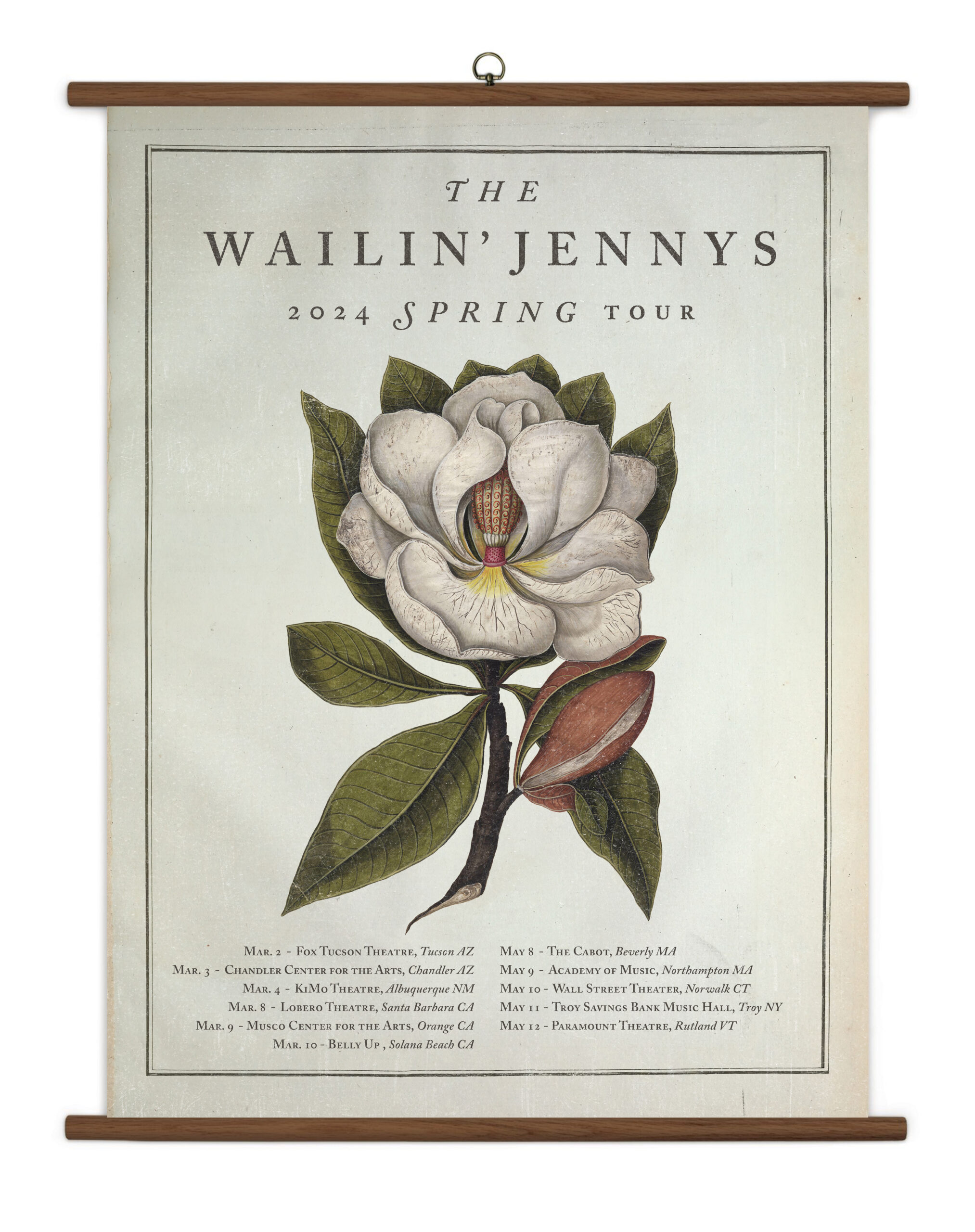
For their 2024 tour, The Jennys asked for something beautiful. Flora and fauna. Something you’d want to hang in your home. The magnolia—resilient, fragrant, fleeting—became the centrepiece.
The design took cues from antique botanical charts: bold in scale, delicate in detail. Displayed like a vintage classroom scroll, it was more print than poster. More keepsake than merchandise. Something to be touched, saved, and remembered.