Finding truth in the myth:a genre expanding vision
After developing the Winnipeg Folk Festival’s new corporate identity, I was asked to lead the 2011 campaign. Until then, the festival’s visuals leaned on familiar tropes—musical notes, dancing figures, the occasional guitar. But Artistic Director Chris Frayer had a broader vision: to evolve the festival’s image and expand its musical scope.
That shared ambition laid the foundation for a new visual direction—one that would introduce custom, thematic imagery each year, with a more illustrative and artful sensibility. The 2011 campaign was the first to explore this idea.

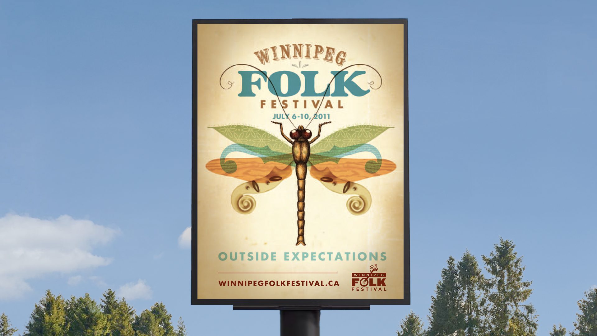
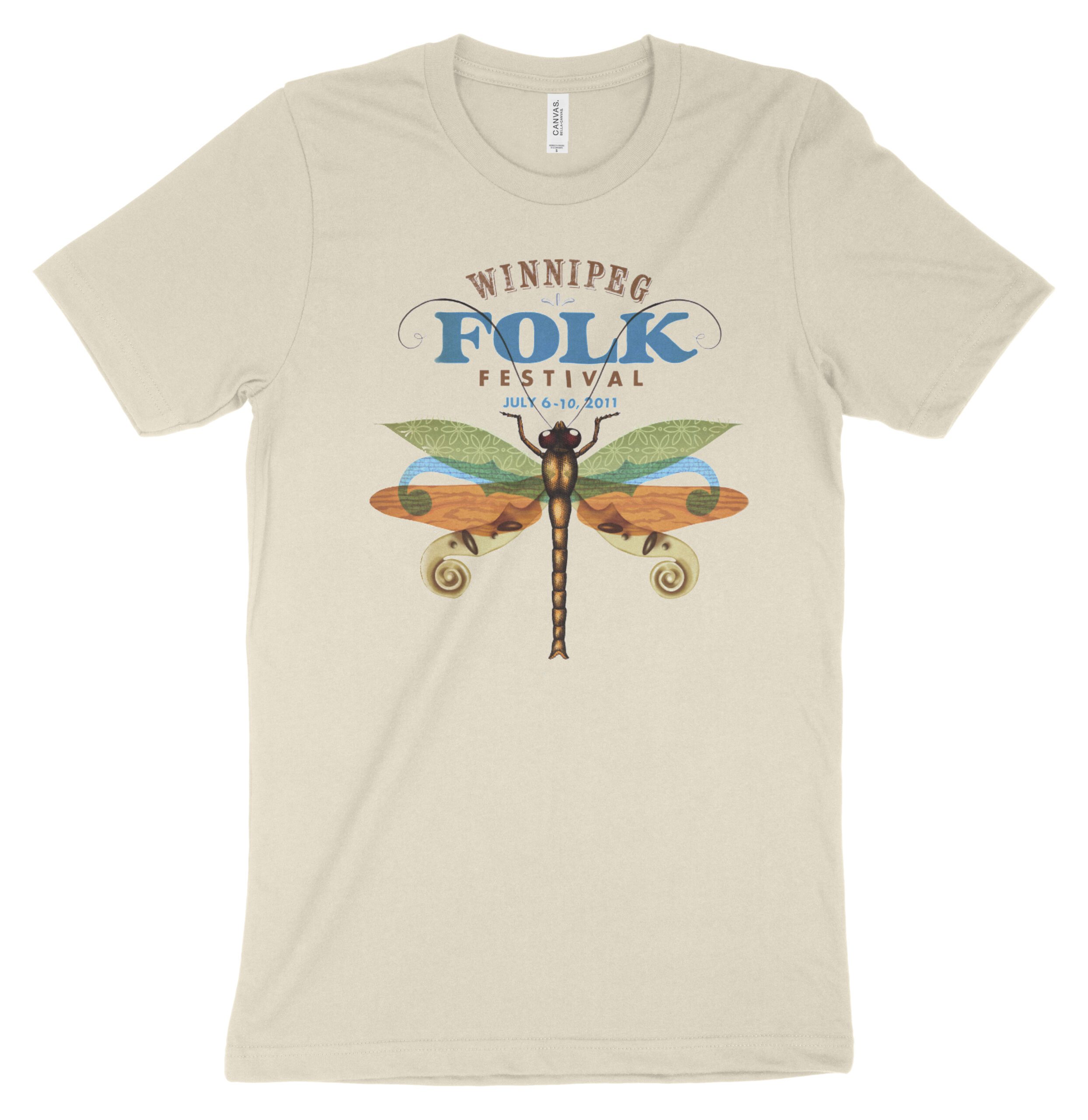
One myth among festival-goers claimed that dragonflies were released before the event to keep mosquitoes at bay. True or not, it struck the right tone—natural, magical, and unmistakably local. That insight became the creative spark: a dragonfly illustrated in pen and ink with watercolour washes, its wings collaged from textures—leaves, woodgrain, cultural patterns, and the scrolling headstock of a stringed instrument, echoing the festival’s new logo.
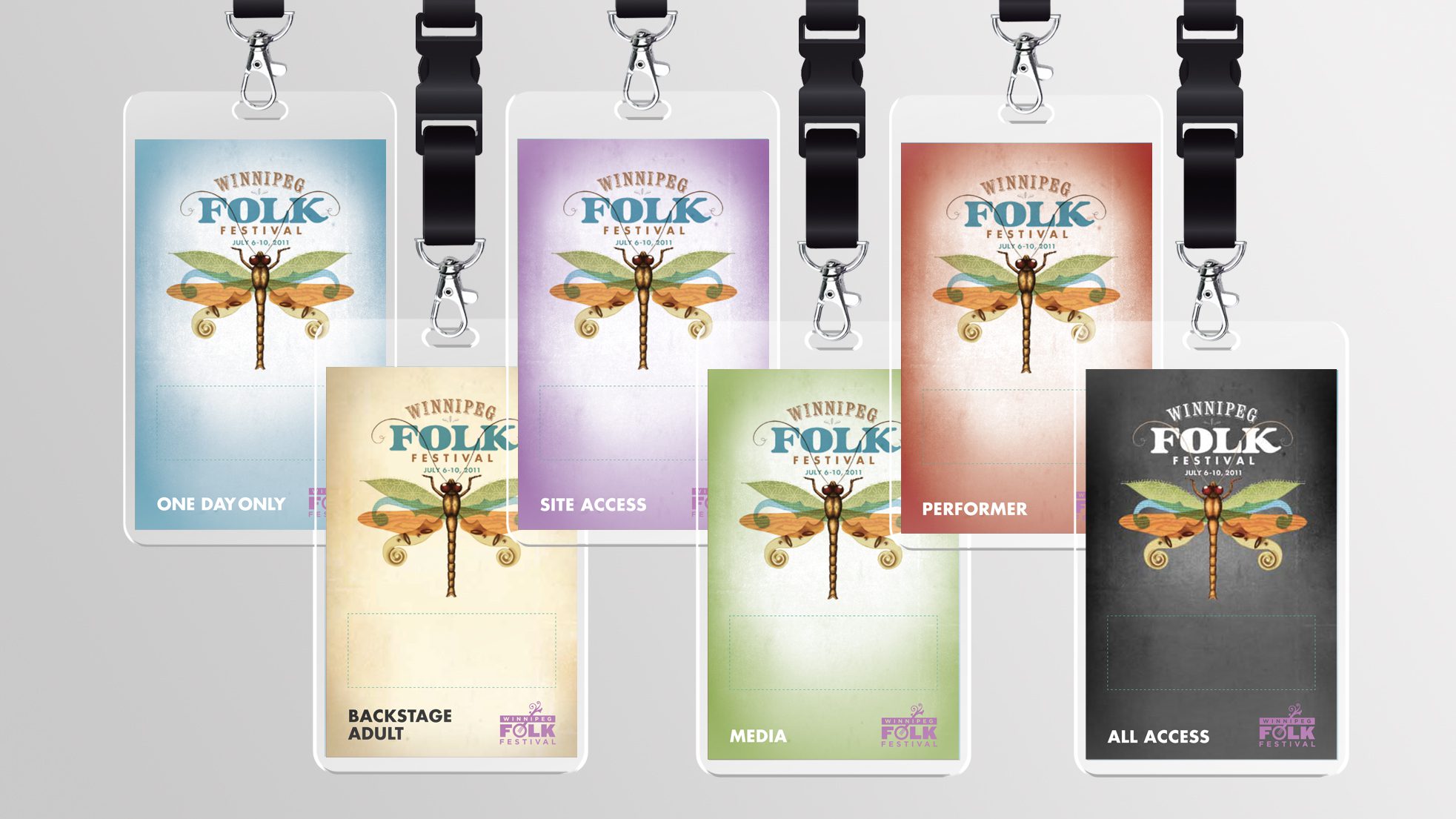
The image appeared across all touchpoints—posters, programs, passes, print ads, the website, and a wide range of merch, from T-shirts to buttons. Though largely a design-led project, the campaign helped boost both ticket and merchandise sales, and remains one of the most fondly remembered in the festival’s history.
Catching the Insight
There are always stories floating around the festival, but the dragonfly stayed with me. It was the kind of myth that felt true—believable because it captured the spirit of the place. That image took hold, and from it, the entire campaign began to unfold.
Outside Expectations
With the festival looking to broaden its musical scope and visual identity, the 2011 campaign needed to surprise and engage. Inspired by local lore and a more artful, illustrative style, the new direction marked a bold step forward—one that truly went outside expectations.
A flexible system,held together by texture
With the dragonfly as the centrepiece, a system of textures—wood grain, organic and fabric patterns—brought richness and variety across campaign applications. In some cases, those textures became backgrounds; in others, subtle overlays. Those textures, along with a unified colour palette, grounded the eclectic materials in a consistent visual language. There was a wide range of applications, and having that aesthetic thread gave the campaign the flexibility it needed across web, print, passes, merch, and more.
“Still one of my all-time favourites.
The 2011 campaign was more than advertising—it refreshed a decades-old,trusted brand, helping it move forward while honouring its roots.Ron captured the acoustic spirit of the festival and conjured our unofficialmascot, the dragonfly, in a way that truly resonated with our audience.”
- Chris Frayer, Artistic Director, Winnipeg Folk Festival


ClientWinnipeg Folk FestivalProjectOutside Expectations CampaignYear2011