Carrying the story forwardinto new ground
Before stepping out as a solo artist, Ruth Moody had already spent over a decade as one-third of The Wailin’ Jennys, the celebrated folk trio whose layered harmonies and thoughtful songwriting earned a devoted international audience. I’d worked closely with Ruth and the band on a series of albums where visual storytelling was as layered as the music itself—full of symbols, textures, and quiet narrative threads.
When she began work on her first solo album, The Garden, it was an opportunity to explore her voice in a more personal frame. Still rooted in the folk tradition, her writing here opened into something more intimate and expansive—songs that felt like they’d grown slowly, patiently, in their own light. My role was to give that sound a visual home, carrying forward the tactile, nuanced approach we’d built together, but letting it take root as something entirely her own.
The Garden
Symbolism, pain, and resilience
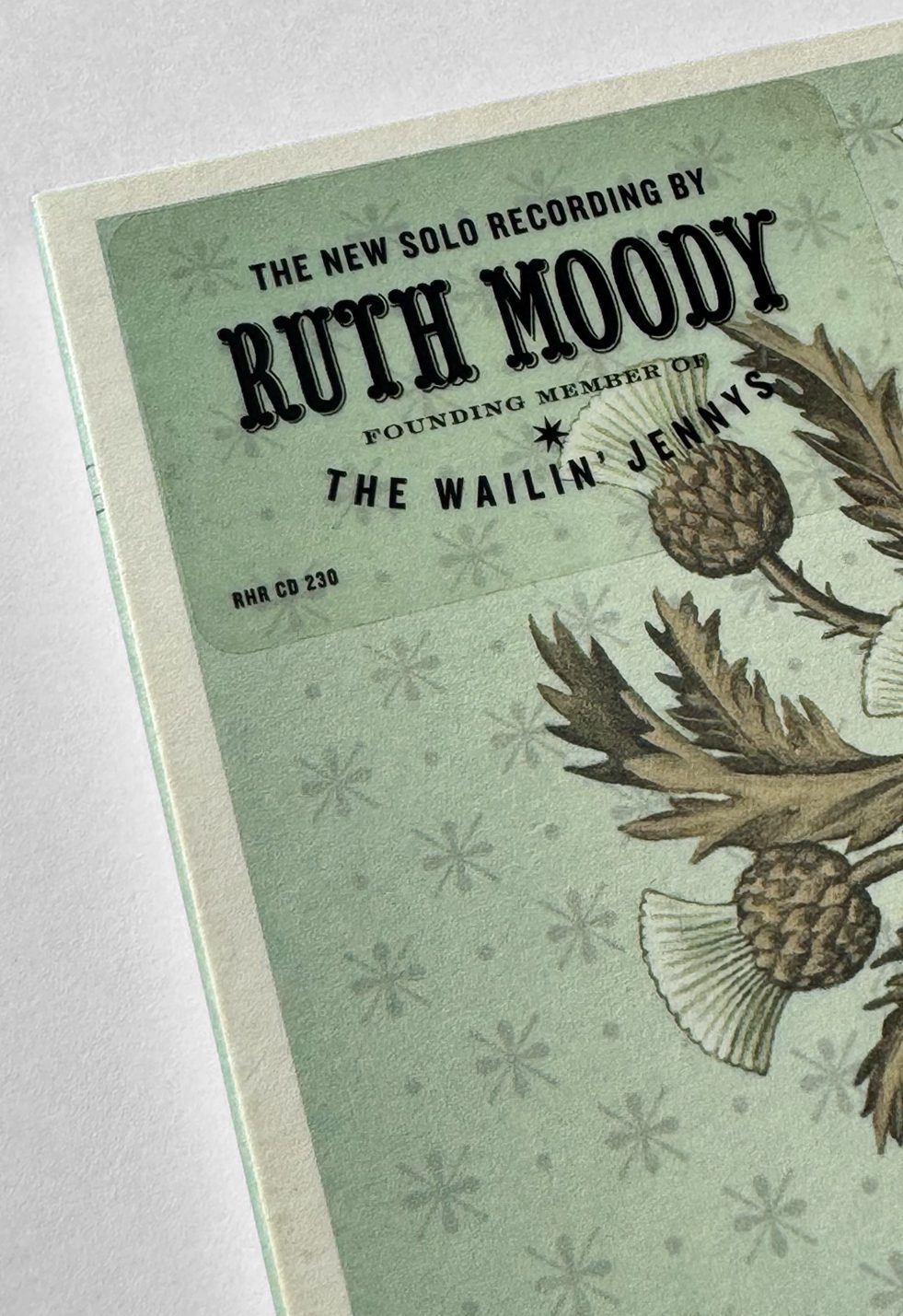
The Garden was Ruth Moody’s first solo album, created at a moment when the Jennys had already reached a wide international audience. Knowing that, I wanted to make something distinct from the Jennys yet unmistakably grown from the same place.
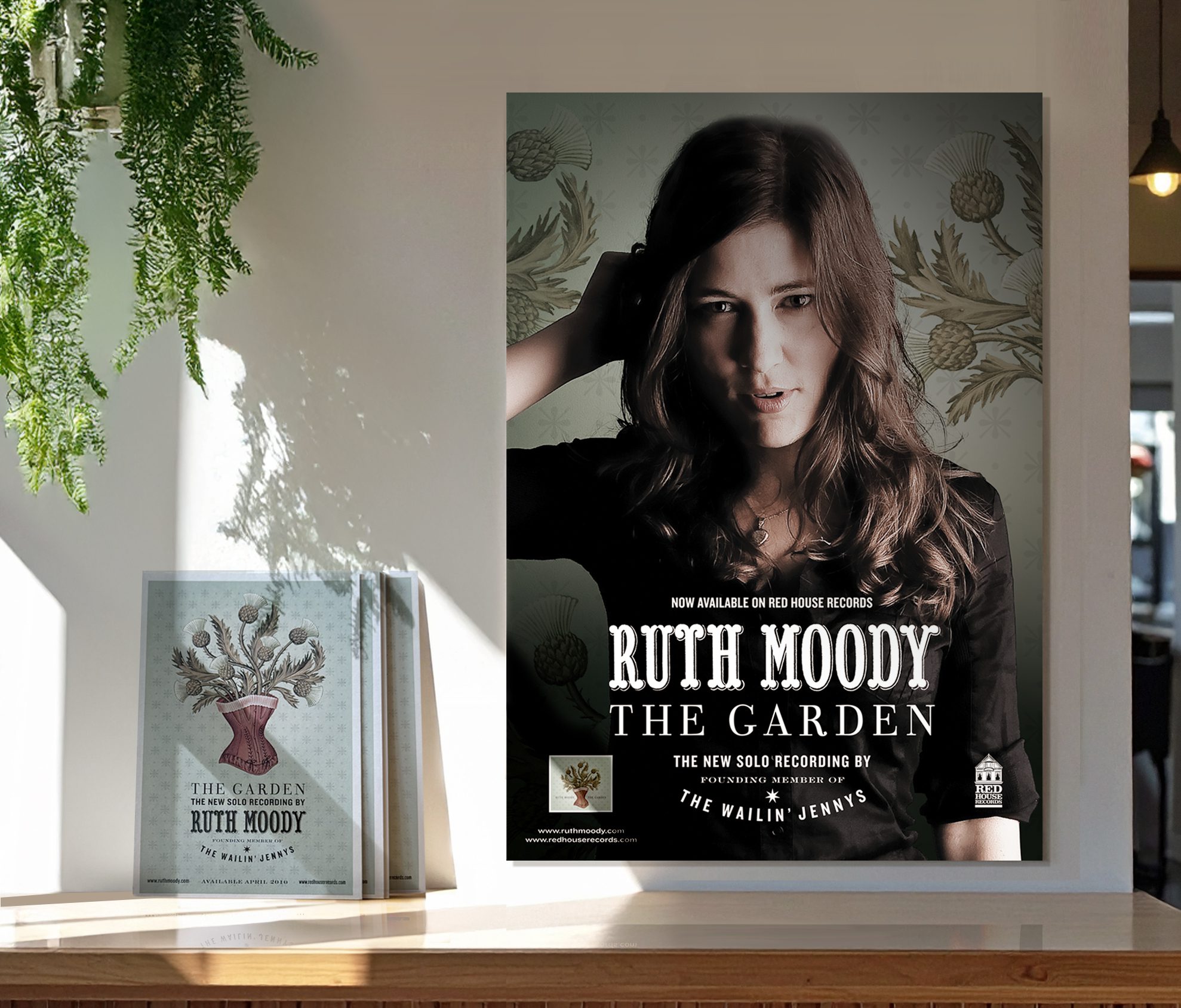
Two images became central. The nettle—painful, invasive, and quick to overtake what’s tended with less care—offered a metaphor for what happens when we ignore what’s important. Yet here, it was gathered into a bouquet, its sting transformed into something strangely beautiful and healing. And the corset—equally capable of evoking elegance and restriction—became its vessel, holding the nettles as though the stories themselves had grown from within.
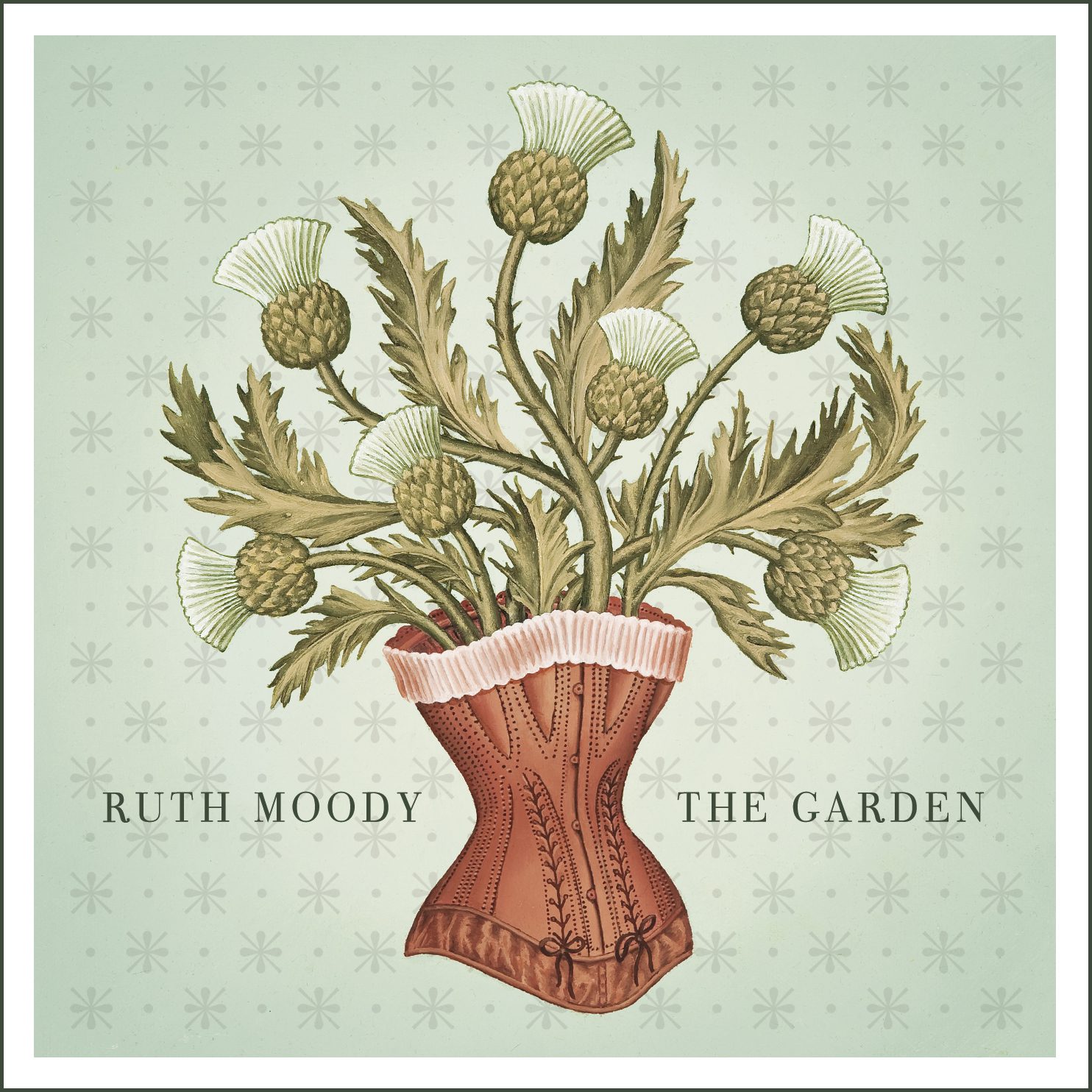
At the heart of thealbum’s imagery: Wherehurt is held, and beautytakes root—mirroring theemotional arc of the songs
The pairing was a study in contrasts: beauty and pain, vulnerability and strength, loss and renewal—echoing the balance often found in the Jennys’ imagery, but now rooted wholly in Ruth’s voice and perspective. Together they extended the symbolic tensions established in the Jennys’ work, yet re-rooted them in something entirely her own—an album-shaped garden of hardy truths and quiet bloom.
Tactility as storytelling
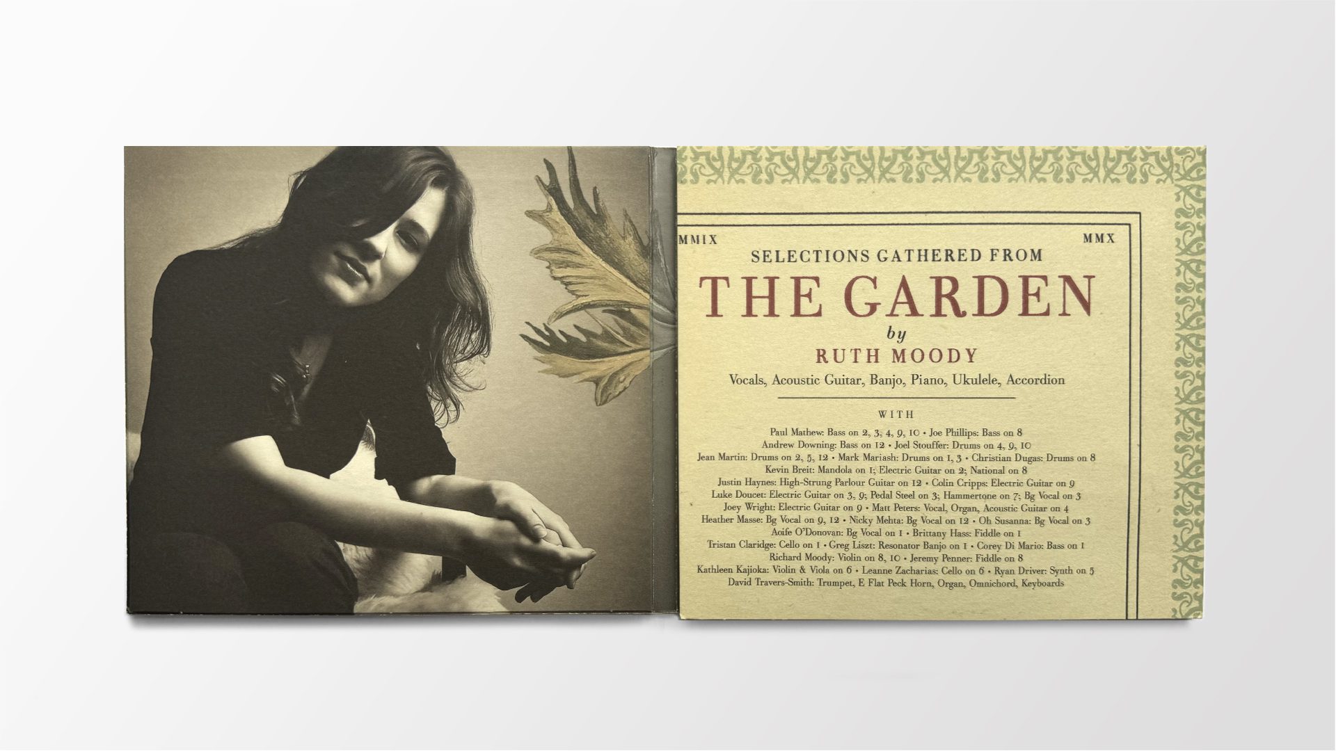
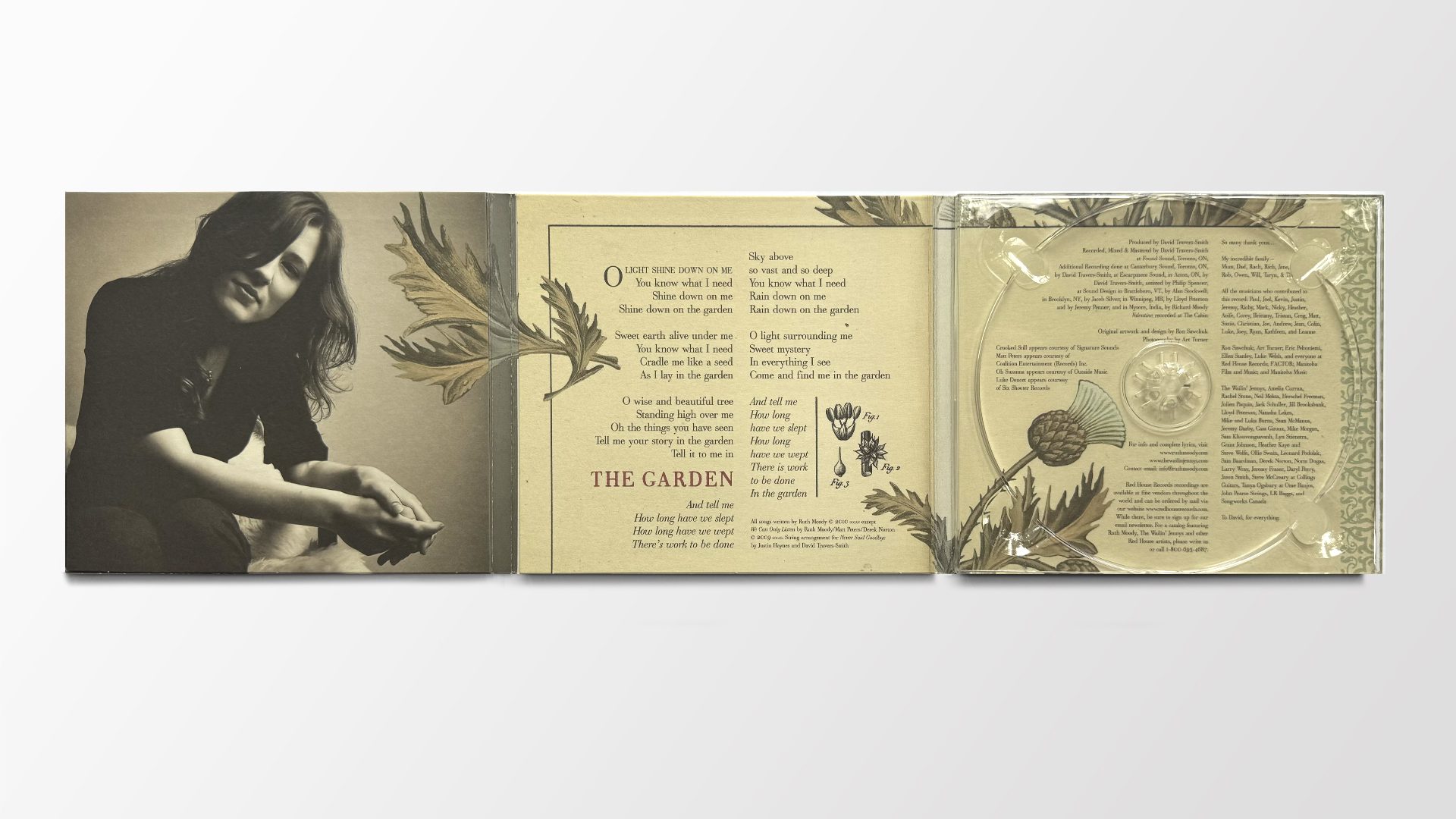
The colour palette leaned muted and restrained, in step with the record’s more reflective tone. I kept the imagery anchored in a timeless, almost surreal frame—neither strictly modern nor antique—so the viewer would linger over the details without being pulled too quickly into any one era.
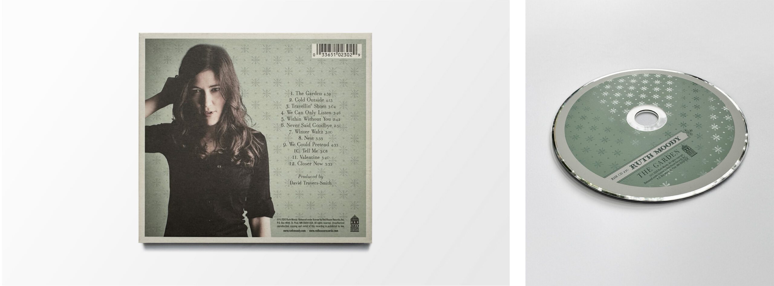
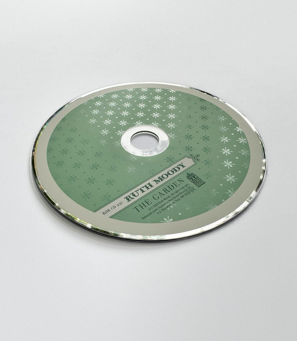
A different kind of texture was sewn across both the cover and the disc artwork: a pattern of florets, or fleurons—typographic ornaments shaped like stylized flowers. This became the graphic representation of the garden itself. On the disc, the pattern shifted into a matte-on-gloss treatment, creating a subtle tone-on-tone effect that mirrored the music’s delicate contrasts.
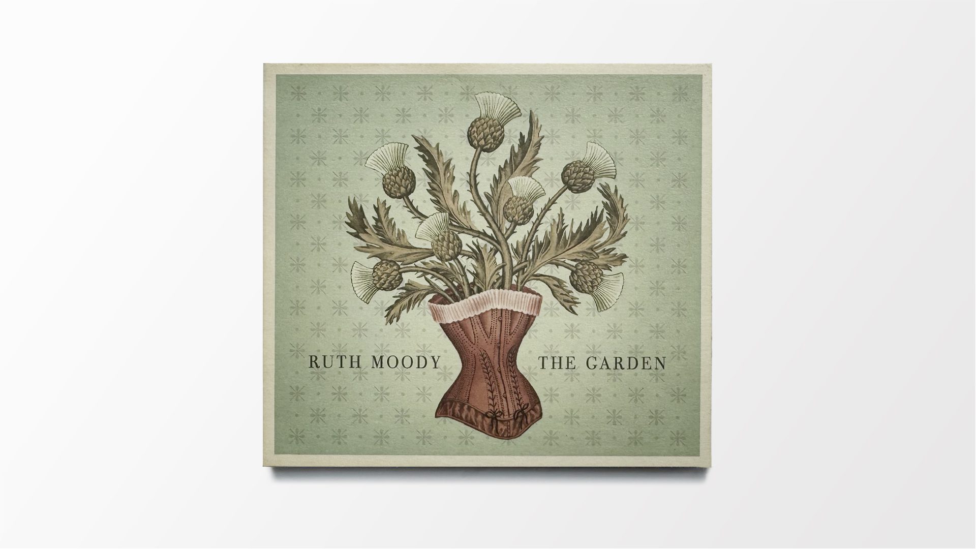
The printing approach followed suit: an uncoated stock to soften the imagery and absorb the ink, giving the cover a velvety matte finish. It was a design meant to be held, its textures reinforcing the music’s intimacy and the sense that, like a garden, it had been grown with care.
Promotional Suite
The album’s visual language didn’t stop at the packaging. Its core imagery and tone carried through to an in-store poster, a postcard for café counters and mail orders, and a dedicated website. Each piece kept the same balance of intimacy and symbolism—ensuring that wherever listeners first encountered the album, they were stepping into the same carefully cultivated world.
Recognition:
- Juno Award – Nominated for Roots & Traditional Album of the Year
- Western Canadian Music Award – Nominated
- Canadian Folk Music Awards – Nominated for three awards
- Signature Awards – Winner of three awards (Ron Sawchuk)
ClientRuth Moody
ProjectThe Garden Year2010