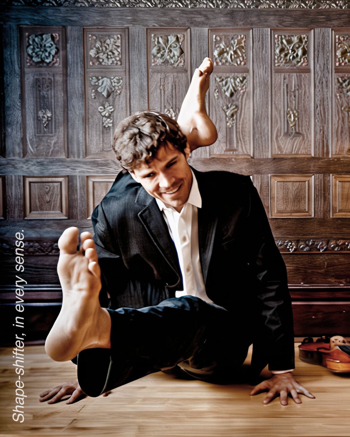
Giving form to ashape-shifter’s voice
Richard Moody is an accomplished songwriter and multi-instrumentalist—but I’ve always seen him as something more elusive: a shape-shifter. Across genres and roles, he adapts fluidly, changing form without ever losing his voice. That quiet versatility is what struck me when we first worked together on Variances, the second Paris To Kyiv album.
His contributions were always essential—responsive, intuitive, and deeply felt. After three albums together, he asked if I’d be interested in designing a new recording of his own. This would be a solo voice, fully his—and I was eager to discover where it would lead.

Woodcuts
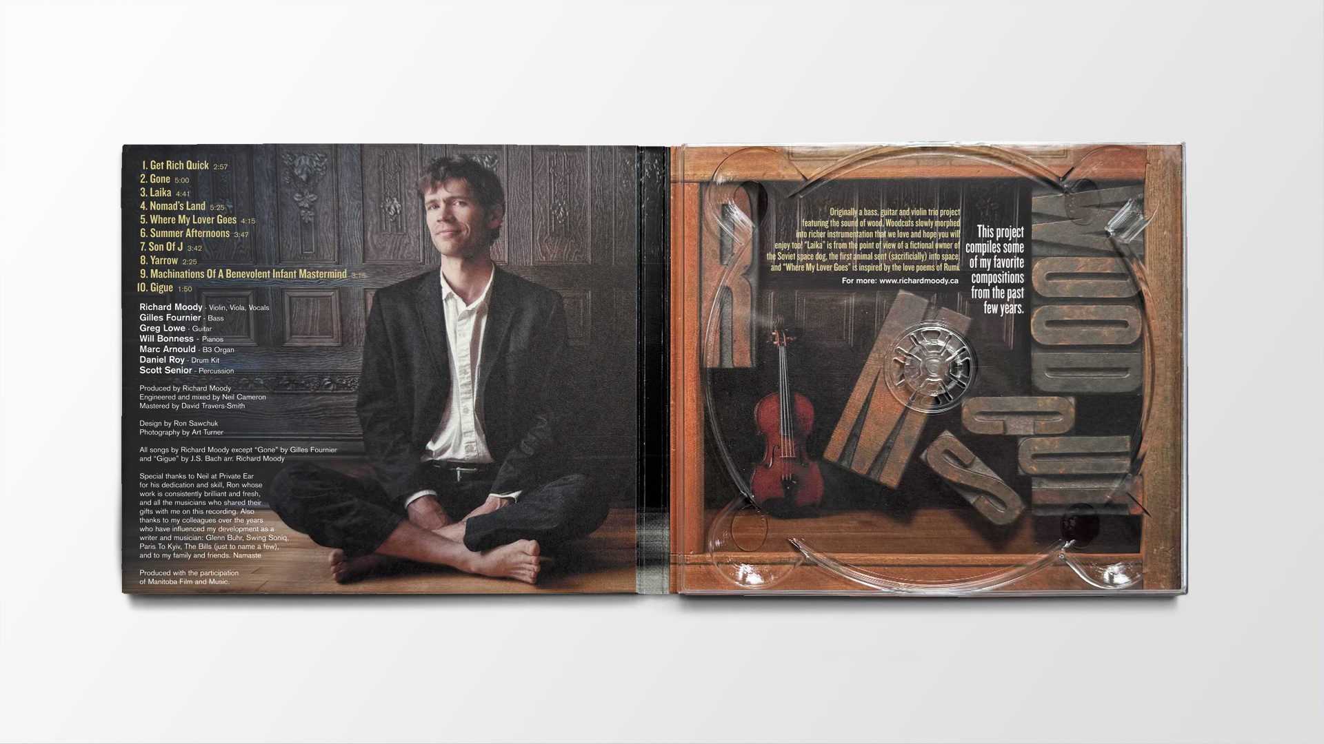
On the inside cover, Richard described the project this way: “Originally a bass, guitar and violin trio project featuring the sound of wood.” I loved the idea of a sound built from such warm, natural material. The music felt handcrafted and eclectic—like discovering a box of old curios in an attic. A mix of intimate, well-worn objects, each inviting closer inspection.
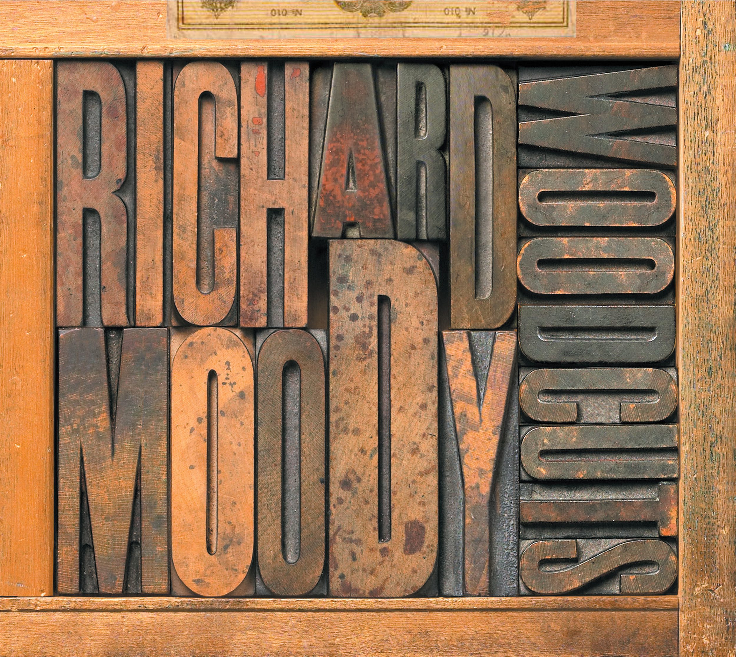
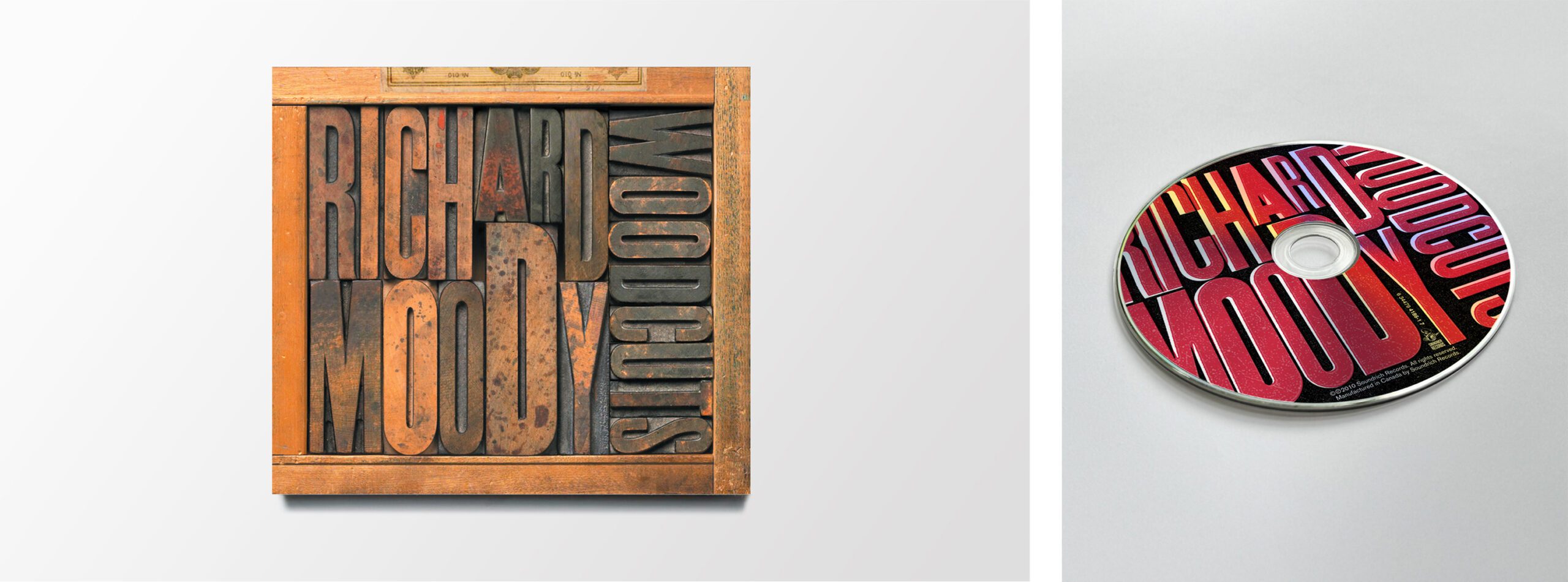
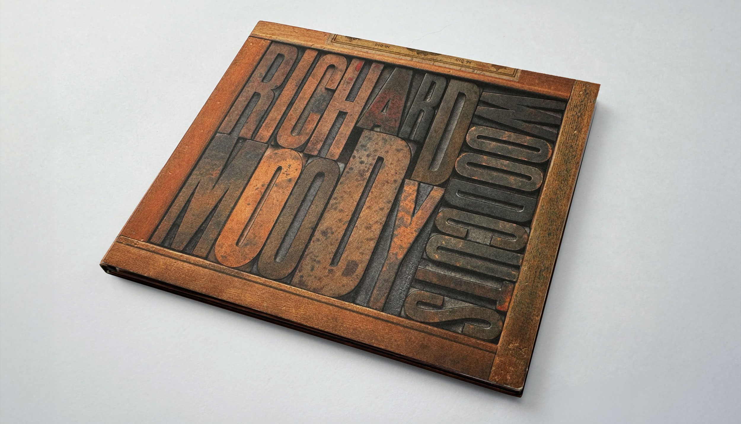
That became the entry point for the design. I imagined a vintage typesetter’s drawer: the kind used to house woodblock fonts from an earlier era of printing. These drawers were full of character—stained by ink, nicked by time, bearing remnants of the many posters they’d helped create. Fonts like these were used to announce everything from boxing matches to vaudeville acts—design that was meant to be seen and heard. It was a perfect visual metaphor for Richard’s music: serviceable, expressive, and able to perform across styles.
There was somethingtimeless in the sound—echoes of old-world jazz,felt through wood andstring. A fitting match forthe texture of type cut fromthe same era.
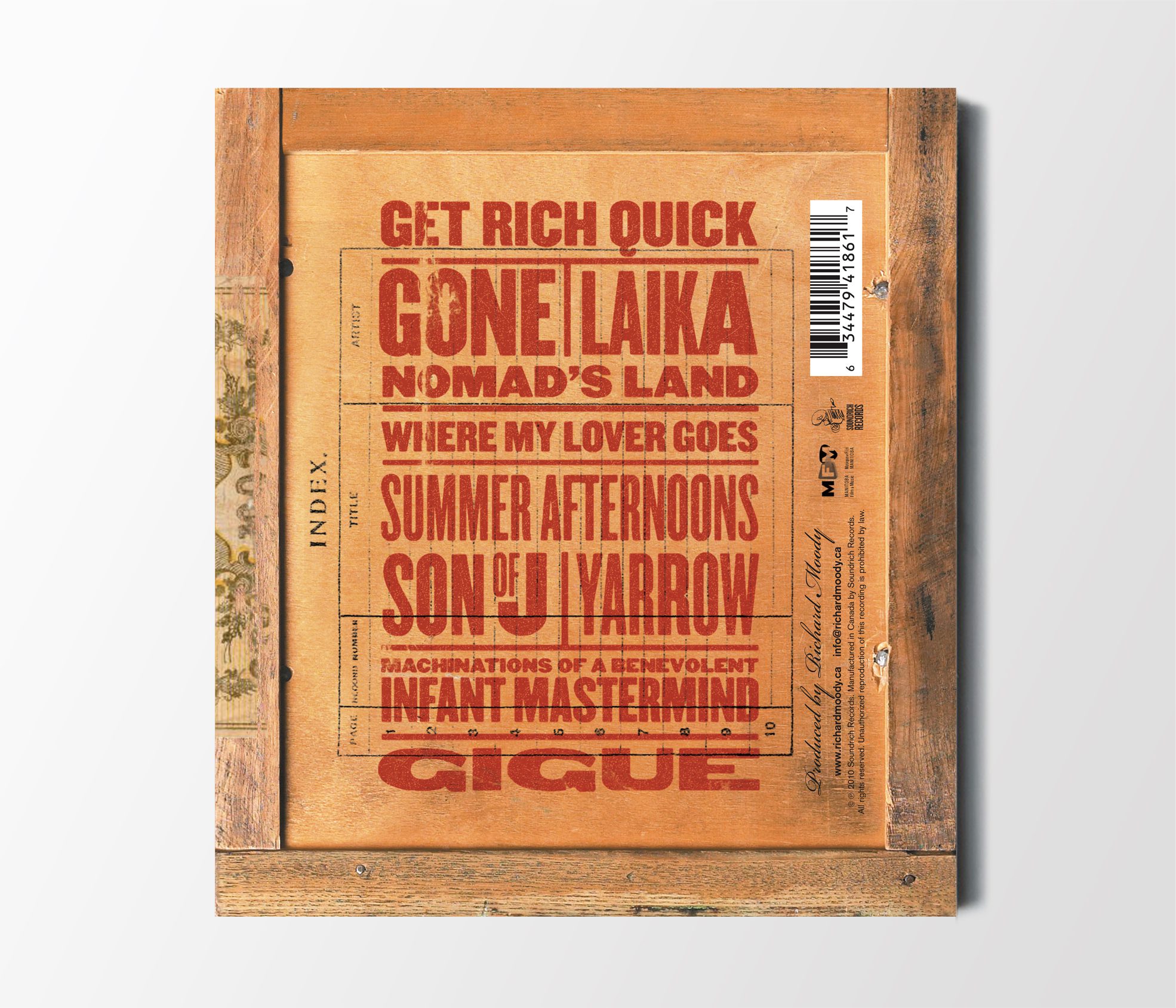
We kept the concept simple. Richard’s name and the album title were photographed inside the type drawer itself—nestled into the compartments like artifacts. On the back, the song titles were set in matching fonts, printed against the bottom of the drawer. Eclectic, bold, and honest. A direct reflection of the music within.
Usually, digipak designs are printed on coated card stock—smooth and shiny on one side, uncoated and matte on the other. Most print on the glossy side for vibrancy, but I chose the uncoated side to match the feel of the wooden tray. It was all about tactility. The design already looked dimensional, thanks to the lighting and the way the forms sat within the drawer. But I pushed it further with a debossed treatment on the gaps between the letters. That production detail created shapes you could feel—inviting people to run their fingers across the cover. To feel the music, not just hear it.
ClientRichard Moody
ProjectWoodcuts Year2010
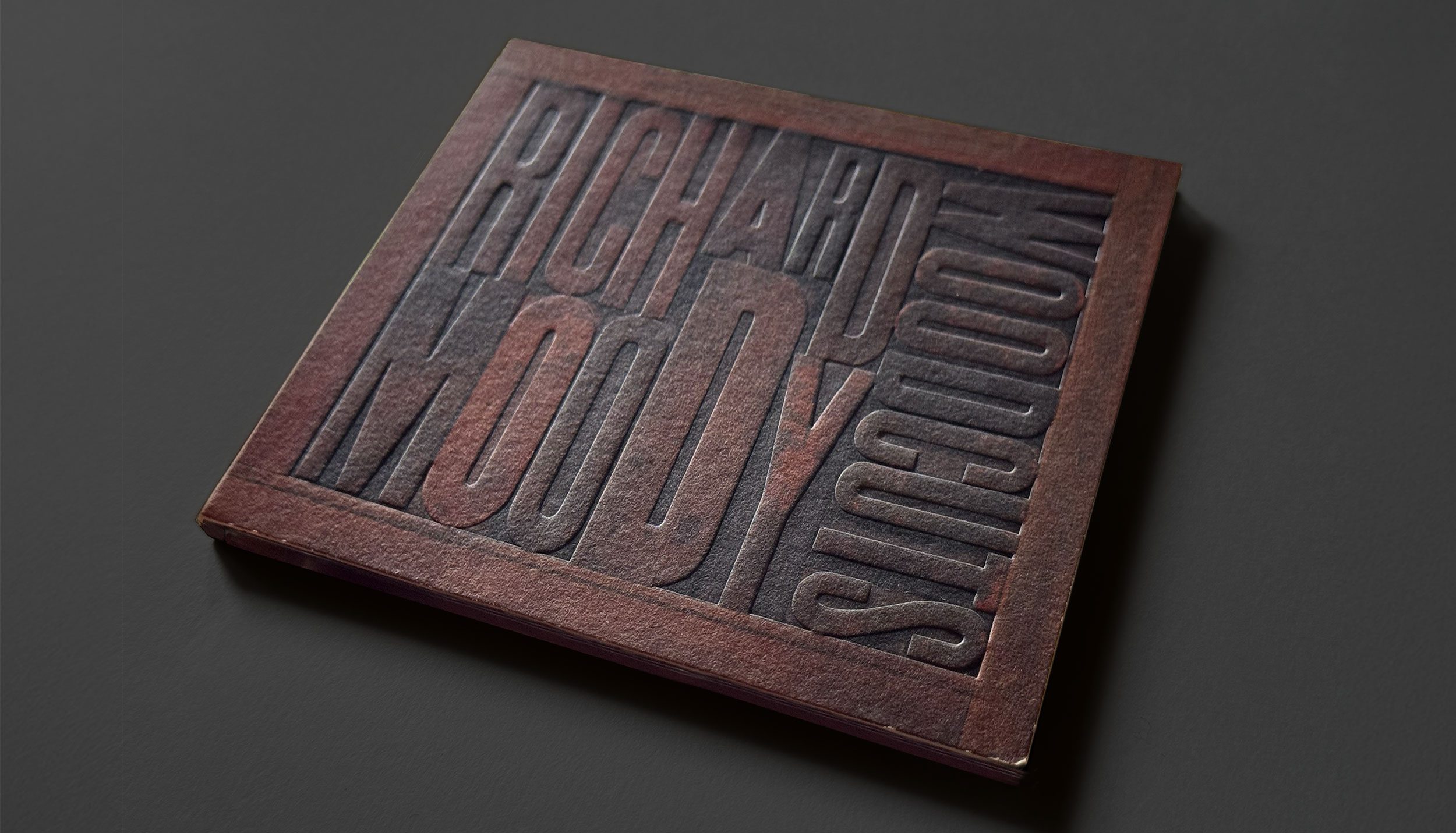
A closer look
It can be hard to convey the tactile quality of a piece like this on screen. The debossed spaces between letters catch light differently depending on the angle, and the uncoated cardstock softens everything with a felt-like warmth. The interactive shift-to-reveal above shows the same cover photographed two ways—one in standard light, the other in raking light to reveal the depth, shapes, and surface texture that bring the design to life.