CBCRA – Recycle Everywhere
With recycling rates flattening and global trust in the system eroding, the Canadian Beverage Container Recycling Association (CBCRA), faced a critical moment. To maintain momentum and restore confidence in Manitoba’s recycling program, the brand needed to shift—becoming more serious, more focused, and more clearly aligned with its core message. Recycle Everywhere had become widely recognized, but the playful logo—a blue bird tweeting the program’s name—no longer reflected the urgency or intent of the initiative.
In 2021, we rebranded both CBCRA and Recycle Everywhere, introducing a new visual identity that re-centered the act of recycling beverage containers. The new logo featured a simplified image of a water bottle in motion—entering the circular opening of a blue bin. The ring not only represented the bin itself—it also evoked the ideas of sustainability, transformation, and closed-loop systems.
Since renaming the program wasn’t on the table, the identity had to do more. It needed to visually direct attention to the action, not just the message. By placing the container and the cycle at the heart of the mark, the identity became more than a symbol—it became a call to action.
ClientCanadian Beverage Container Recycling Association
ProjectCBCRA – Recycle Everywhere Visual IdentitiesYear2021
The new identity needed to perform across both physical and digital environments. Nowhere was this more visible than in the program’s bin infrastructure—featuring a wide range of sizes and formats for indoor and outdoor use. These high-visibility bins became key brand ambassadors, bringing the identity into public spaces and homes across Manitoba.
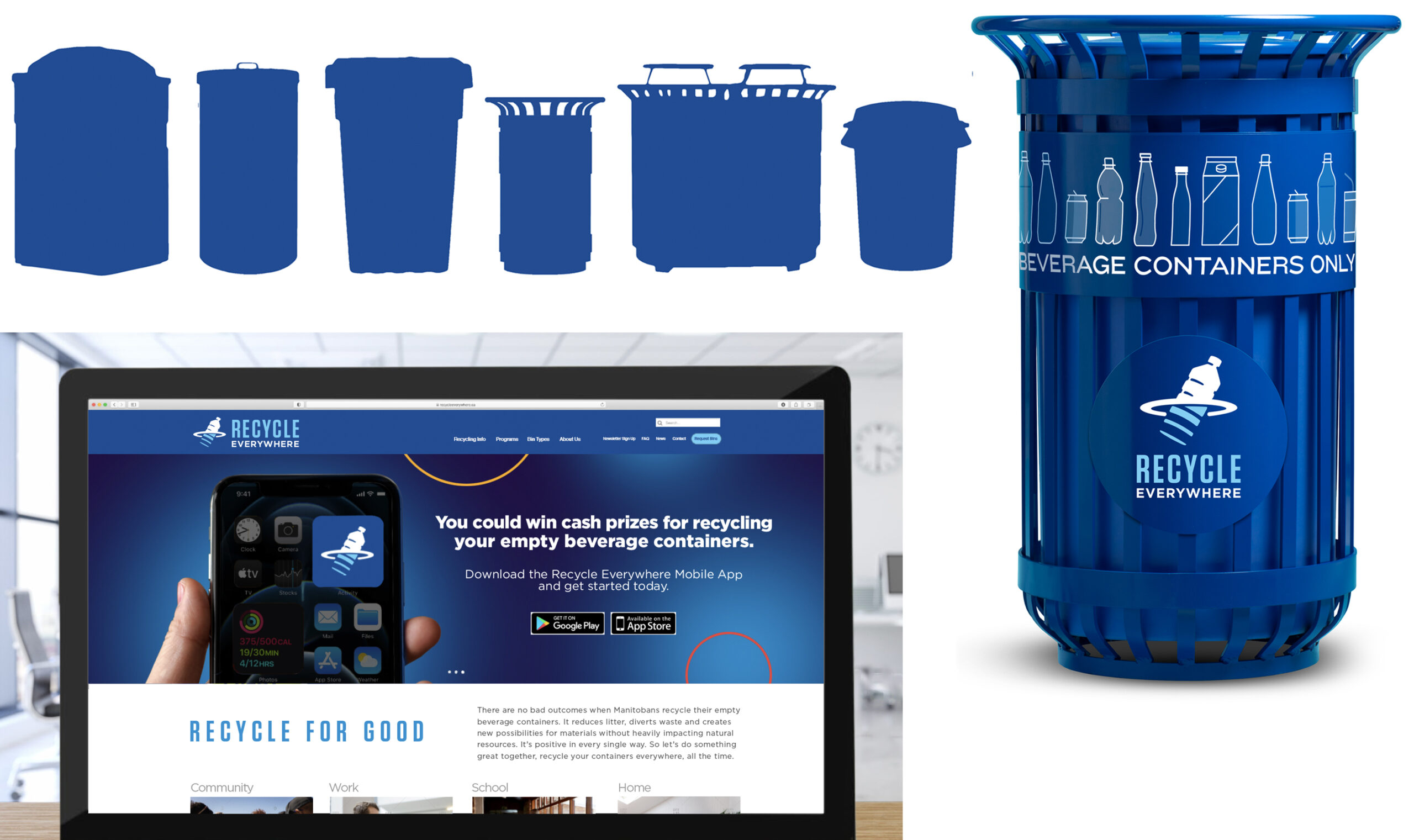
Digitally, the logo was adapted to function as a recognizable app icon and social avatar—ensuring strong visibility across platforms. A screen-optimized palette was developed to support clarity, accessibility, and consistency in social, video, and web applications.
A comprehensive usage guide detailed colour specifications for both print and digital environments, reinforcing consistency across channels. From bin signage to digital campaigns [see the identity in action!], the new system helped CBCRA communicate its mission with greater focus and confidence.