Investors Group Field
Plans for Winnipeg’s new stadium—built to replace Canad Inns Stadium, long-time home of the Winnipeg Blue Bombers—had been in motion for years. Yet despite the scale of the project, the need for a visual identity wasn’t raised until just days before the formal announcement. With the clock ticking, this became another case of identity work arriving late to the play. It was time for a Hail Mary pass.
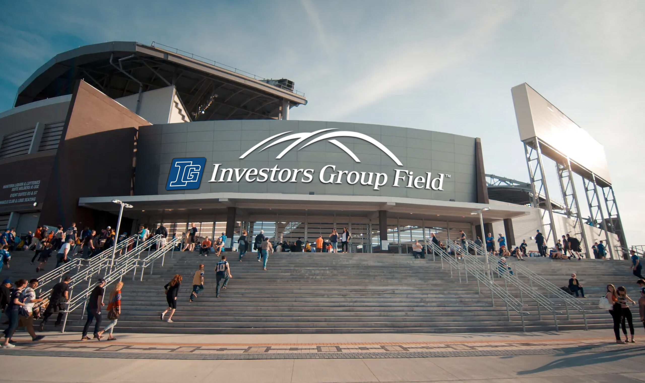
Because the naming rights were fixed for a set number of years, the branding needed to be bold and unmistakable. The design leveraged the existing Investors Group logo and typeface to maintain brand recognition while maximizing impact.
To give the mark a strong sense of place, I looked to the stadium’s signature feature: its sweeping, sculptural roofline, which cuts a dramatic silhouette across the prairie skyline. Two arcs became the defining shape of the symbol, referencing both the architecture and IG’s role in helping clients move from one stage of life to the next. A plan. A path. A goal achieved, brought to life in the final seconds—and built to leave a legacy. See it in action in its first season.
ClientInvestors Group Field
ProjectVisual Identity Year2012