A musical ideaimagined forward
My creative collaboration with singer, composer, and culture maker Alexis Kochan has spanned more than thirty years. While Paris To Kyiv is a musical project by name, it’s always lived more fully—as an idea. One grounded in memory, language, and cultural continuity—drawing from ancient Slavic music, folk poetry, and ritual, and carrying them forward at sonic speed into the modern world.
The idea first took hold in the late 1970s, when Alexis—born and raised in Winnipeg’s storied North End—was offered an internship with the Veryovka Folk Music Ensemble in Kyiv. On the flight there from Paris, a thought surfaced: Paris had become the artistic jewel of Europe by the early 20th century. Kyiv, despite its deep cultural legacy, had not. Centuries of suppression had fractured Ukraine’s cultural continuity—its language, its art, its collective voice—silencing generations of artists and thinkers who might have shaped a different future. But what if that chain hadn’t been broken? What could have emerged?
Paris To Kyiv became a response to that question. Not a re-creation of the past, but a reimagining of what could have been—and what might still be. Each album builds on this idea through a revolving mosaic of musicians—experimentalists and artists from diverse cultural traditions—each one contributing to a purposeful kind of creative tension. Together, they revitalized and reinterpreted Ukrainian source material through modern arrangements, creating something timeless, atmospheric, and entirely new.

Variances
Where contrast becomes continuum
My own contribution began with Variances, the first Paris To Kyiv album where I was able to truly participate as a visual collaborator. From that point forward, our process became a dialogue—her musical call, my visual response. Over time, that creative conversation blurred disciplines, with each of us pushing the other forward. Like all meaningful collaborations, it thrived on trust, shared ownership, and a mutual belief in the idea itself.
Ukraine means “borderland”—and borders, whether physical or cultural, are where things get interesting. Even the title Variances suggests tension and contrast. But at its heart, this project wasn’t about difference for its own sake—it was about the possibility of positive cultural collisions, the kind that deepen understanding and create new meaning. That idea was there from the beginning.
This was also the starting point for two of Alexis Kochan’s most enduring musical partnerships: bandurist and sopilka player Julian Kytasty, and violist and singer-songwriter Richard Moody. These two bards from different cultural worlds would go on to shape the sound of Paris To Kyiv for years to come. Variances fused their distinct influences with the rhythmic counterpoints of African percussionist Evans Coffie and Henry Zacharias, building a musical terrain that felt both ancient and experimental.
The album combined pre-Christian ritual songs, fragments of medieval chant, and traditional village dance music—reimagined with modern expression. The juxtaposition might have seemed contradictory, but spiritually it felt correct. It was timeless. And it gave me a conceptual foothold as I began to develop the visual direction.
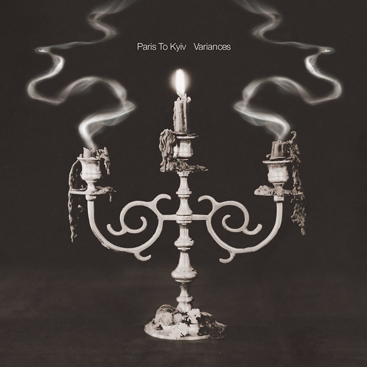
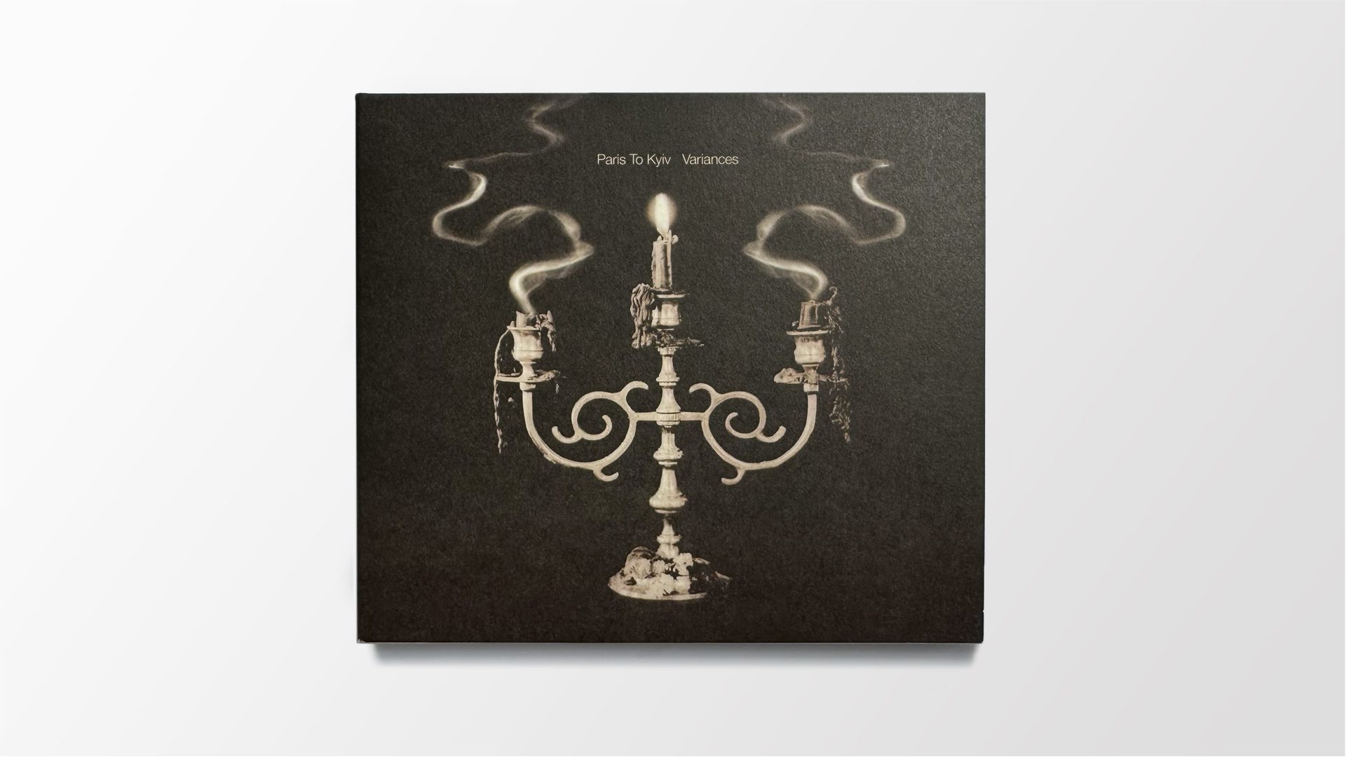
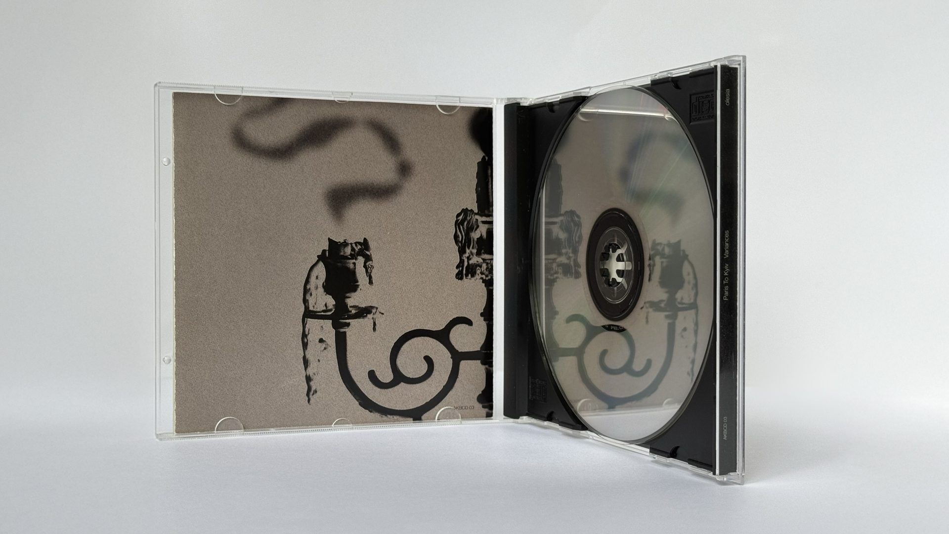
The cover was my first opportunity to introduce symbolic storytelling to the project. The colour palette was drawn from “Stone Age Carol,” one of the album’s oldest songs, where ancient symbolism flips modern associations: black represents the fertile earth—life—while white, the colour of sun-bleached bone, signifies death. That inversion became the foundation for the packaging. And it wouldn’t be the last time we’d return to this rhythm—black and white, exterior and interior, old meanings recast in new form.
On the outside, the visuals are dark and symbolic. Inside, they give way to quiet white panels with understated typography. The contrast between interior and exterior reflects the broader tension between old and new, ritual and reason.
Each element reflected aduality: ritual and modernity,life and death—heldtogether in fine balance.
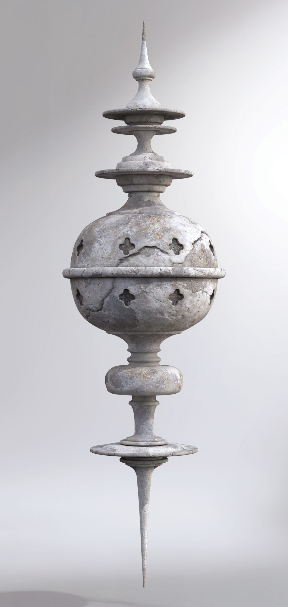
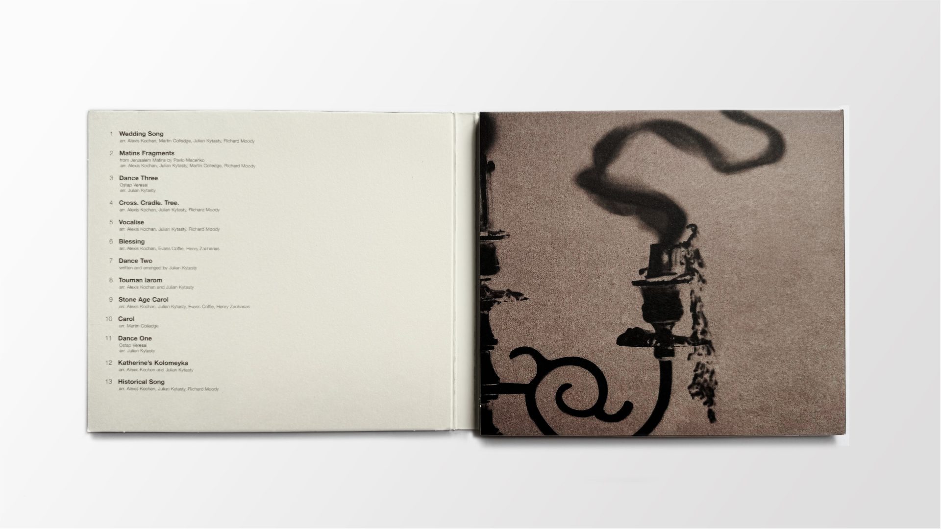
The cover features a black-and-white photograph of a three-branched свечник (candleholder). The two outer candles have been recently extinguished—their smoke curling upward in perfectly mirrored trails—while the center candle remains lit, its flame undisturbed. The symmetry of the smoke suggests continuity and duality: past and future, old world and new world, pagan and Christian, body and spirit. It’s a moment frozen between extinguishing and illumination. That visual tension became a guiding principle for the rest of the design.
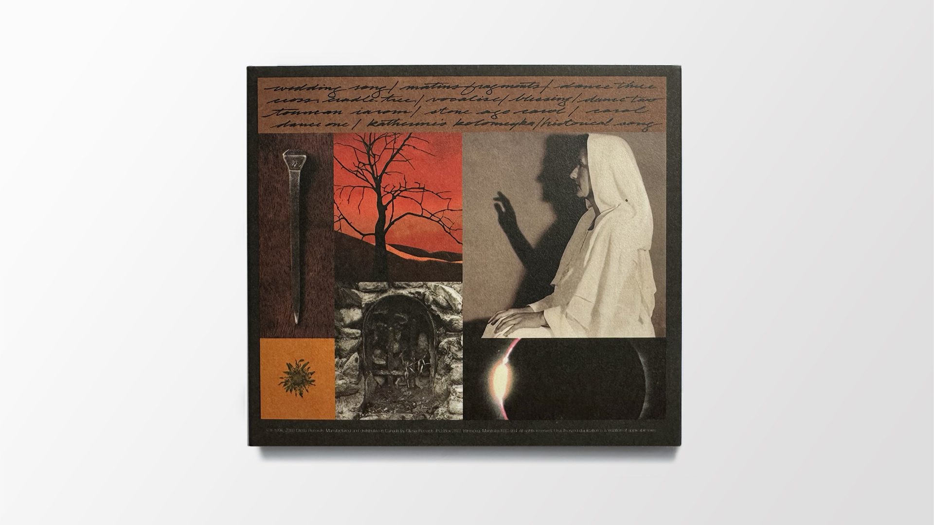
On the back, a grid of photographic vignettes extends the visual language without relying on cliché. A nail. A dead tree. A grotto missing its icon. A surreal image of Alexis with her shadow’s hand raised in a gesture of blessing, while her real hands rest silently in her lap. A moment of total eclipse. In isolation, each image may seem incongruent. But in context, they align.
Designed to be decoded—mirrored symmetry in bothform and meaning.
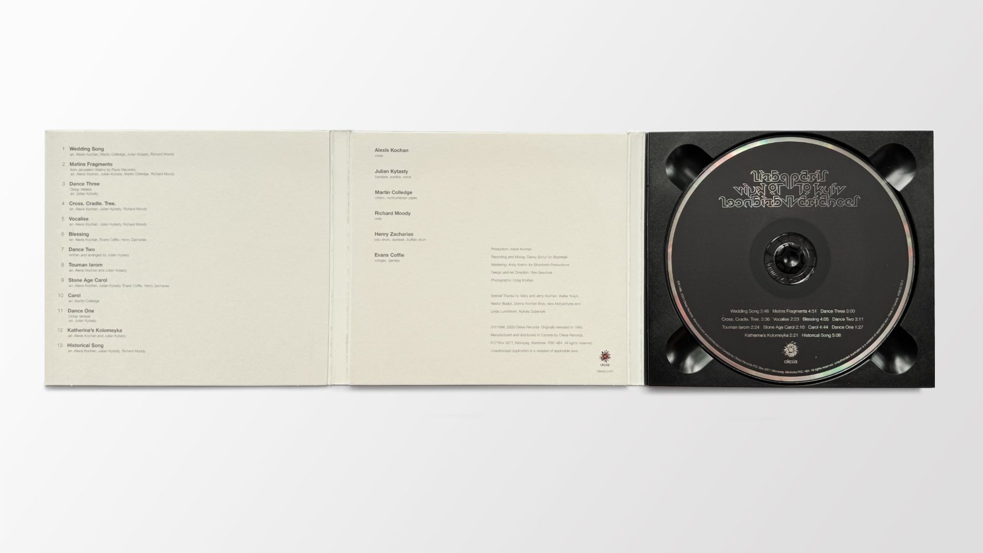
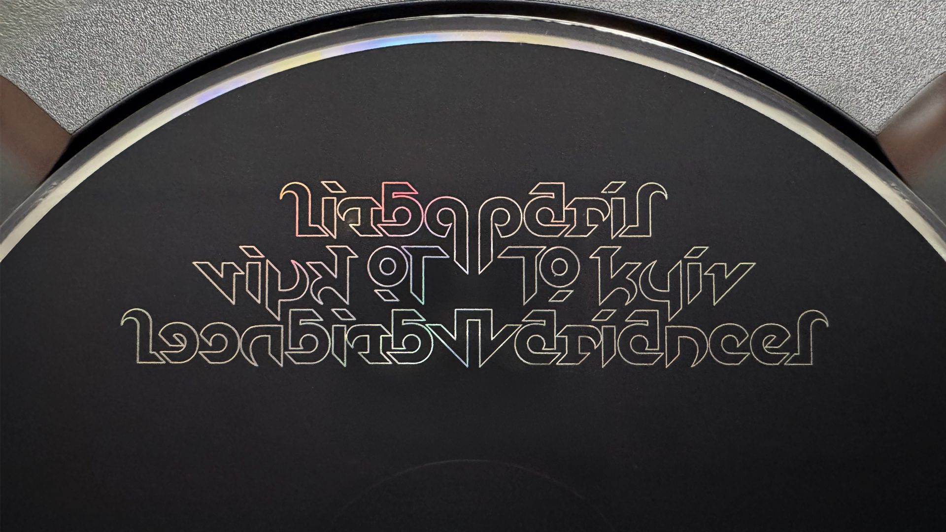
Typography throughout the package is restrained and minimal, offset by the custom-designed disc artwork. The mirrored symbolism continues in the typography itself. The title—Paris To Kyiv Variances—is rendered in a fully custom, stylized, geometric typeform that mirrors itself vertically: the right side reads clearly, while the left side reflects it in reverse. The design is abstract and architectural, with a structure that feels almost ritualistic. It’s less a logo than a symbolic artifact—another visual expression of balance, transformation, and dual identity.
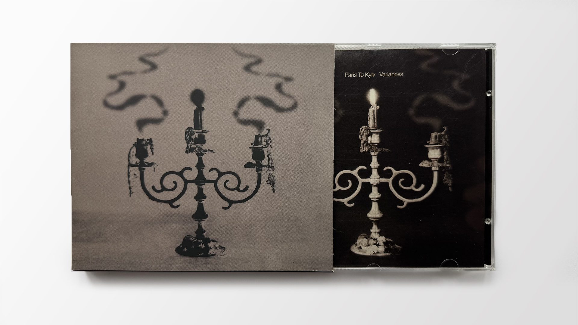
Original First Edition – 1996
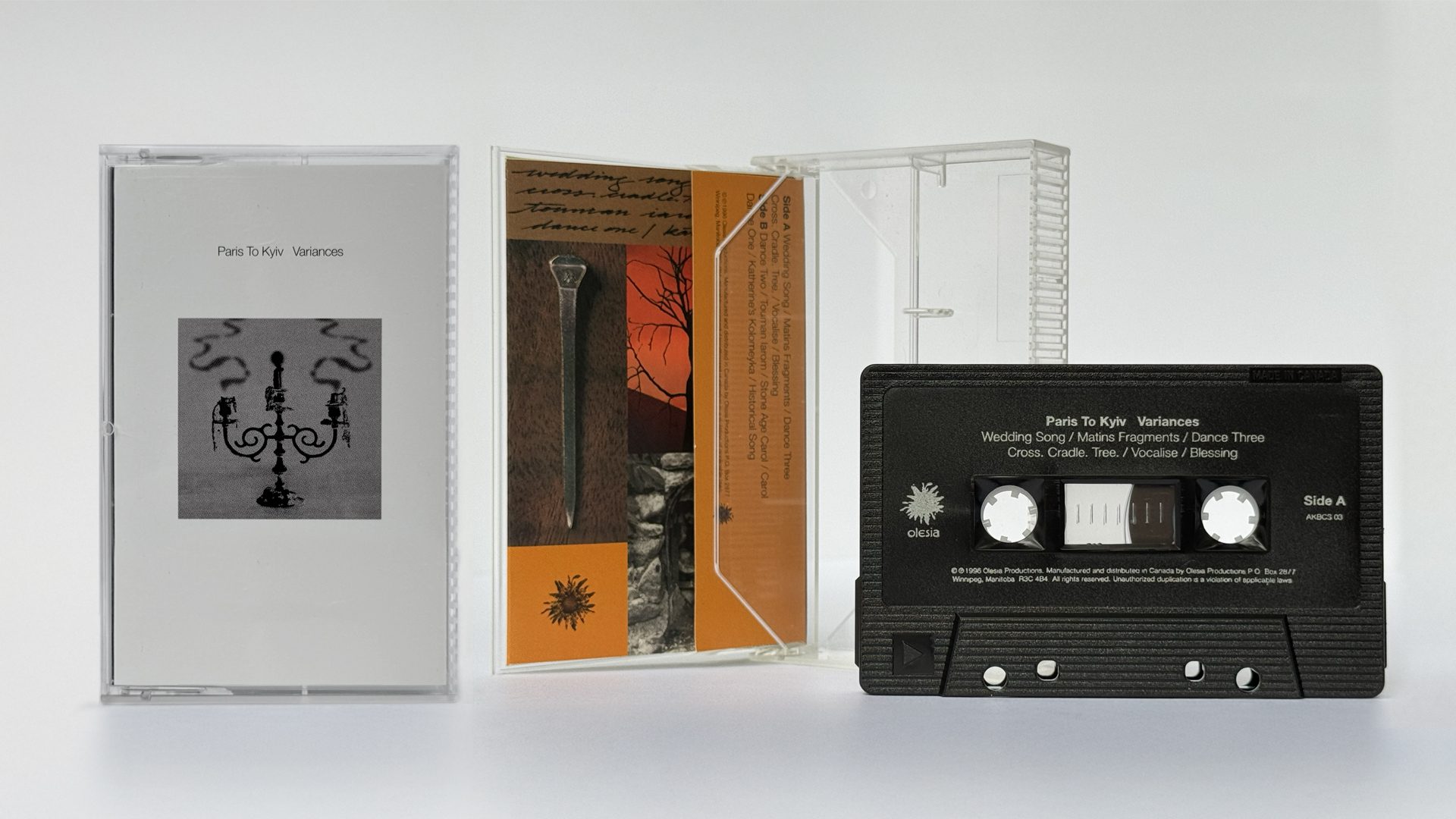
The 1996 first edition of Variances pushed expectations by packaging the jewel case inside a printed slipcase—unusual for its time and carefully considered. The slipcase presented one view of the candelabra: light, tonal, and inverted. The jewel case underneath revealed its darker, photographic twin—high-contrast and positive. The two images—one a visual negative of the other—functioned as deliberate inverses. Together, they mirrored the music’s own dualities and set the tone before a single note was heard.
One detail was meant to be discovered, not announced. On the back panel of the booklet, only a cropped section of a single snuffed candle was visible. But when the CD was flipped over and placed face-down in the tray, the reflection completed the candelabra—revealing the full image through mirrored symmetry. A moment of alignment built into the design. Another gesture toward inversion, duality, and the unseen connections that run beneath the surface.
Even the cassette format offered variation. For that edition, the visual language was inverted—its minimalist interior becoming the exterior, while the darker, denser imagery moved inside. A reversal in presentation, echoing the album’s core themes.
A 2003 reissue of the album introduced reverse board printing, deepening the earthy, tactile quality of the materials. In many ways, it made the unspoken elements of the original more physically felt.
In its totality, Variances presented Ukrainian music with conceptual depth and stylistic restraint. A foundation had been laid—for the sound and the visuals—that every future Paris To Kyiv project would build upon.
ClientParis To Kyiv
ProjectVariances Year1996 – Repressed 2003
“Ron and I have been collaborators for over 30 years, creating the Paris To Kyiv project together. Through a visual aesthetic that is truly his own, he’s built a body of work that doesn’t just reflect a culture—it helps define it. In many ways, it captures the essence of a people.”
- Alexis Kochan, musical artist, producer, culture maker
HIDDEN “Ron and I have been collaborators for over 30 years, creating the Paris To Kyiv project together. Through a visual aesthetic that is truly his own, he’s built a body of work that doesn’t just reflect a culture—it helps define it. In many ways, it captures the essence of a people.”
Alexis Kochan, musical artist, producer, culture maker
Prairie Nights and Peacock Feathers
Visual landscape shaped by soundscape
Released in 2000, Prairie Nights and Peacock Feathers took shape during a two-week residency at a monastery on the Manitoba prairies in the summer of 1999. The atmosphere was open and collaborative. I remember the time and the music being created as evoking a kind of musical caravan—artists coming together, sharing meals, building songs in real time.
Following the residency, the ensemble performed an open-air concert on the same site, among the monastery ruins. The space and atmosphere perfectly complemented the music and the title of the concert—Music In The Ruins—a haunting echo of a culture in renewal. It felt less like a conclusion than a prelude to something not yet known.
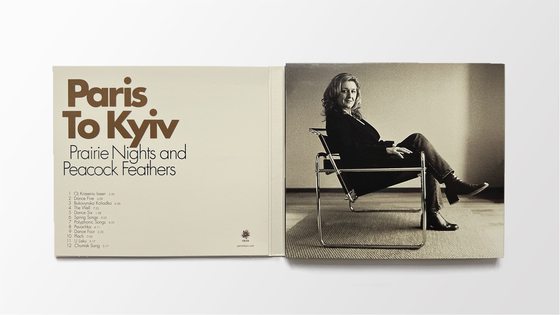
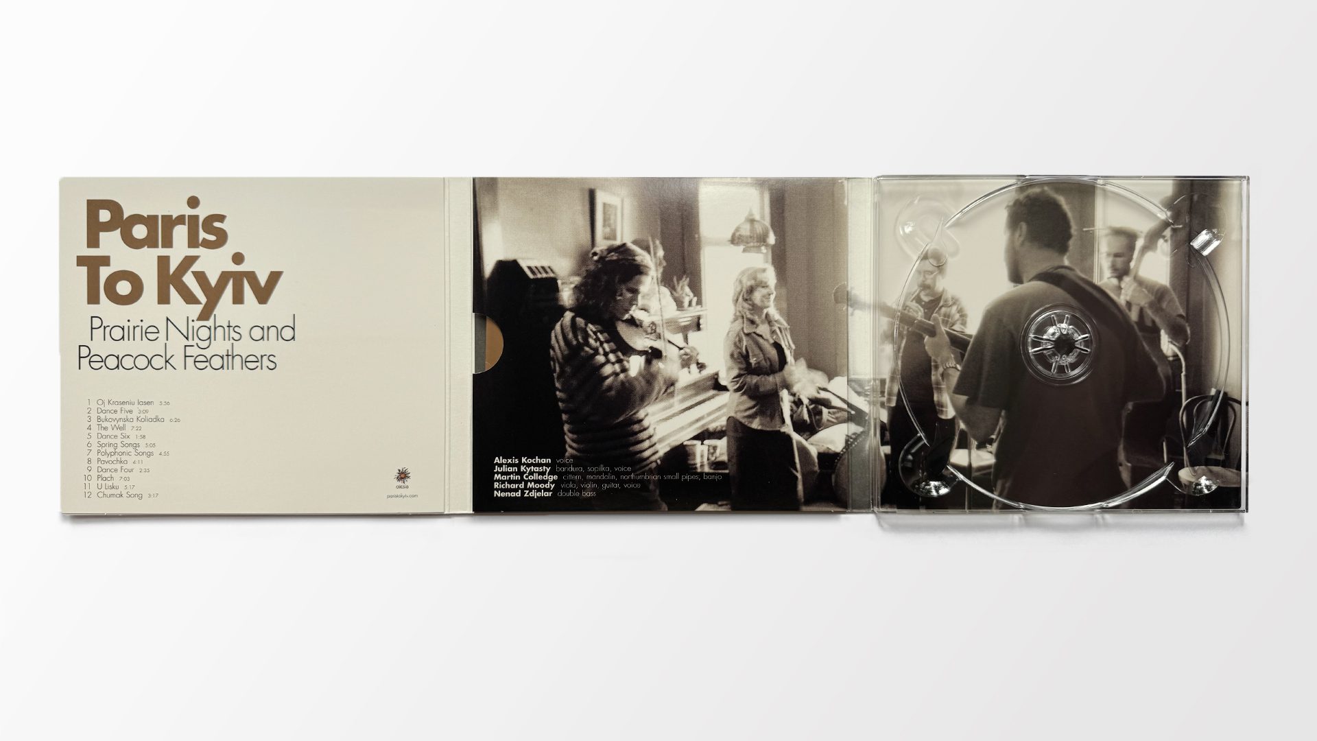
That caravan included returning collaborators Julian Kytasty and Richard Moody, alongside British multi-instrumentalist Martin Colledge, whose Celtic influences helped define the album’s tone. Newcomer Nenad Zdjelar, a Serbian contrabassist, joined the ensemble as the percussionists from the previous recording stepped away. The resulting sound was expansive and dynamic—ranging from spare two-part vocal harmonies to lush ensemble arrangements of ritual songs that moved through the rhythms of the earth and sky, life and afterlife, season by season. English translations by the team of Virlana Tkacz and Wanda Phipps extended the project’s reach without diluting its cultural grounding.
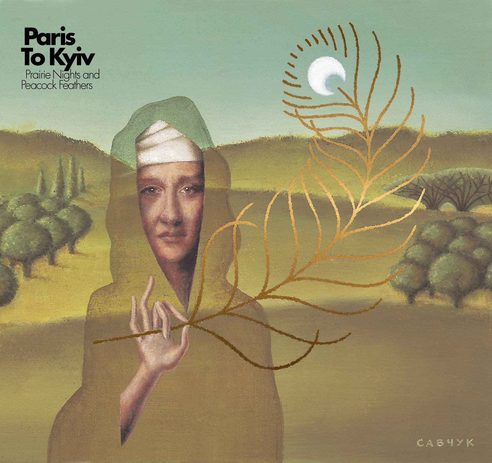
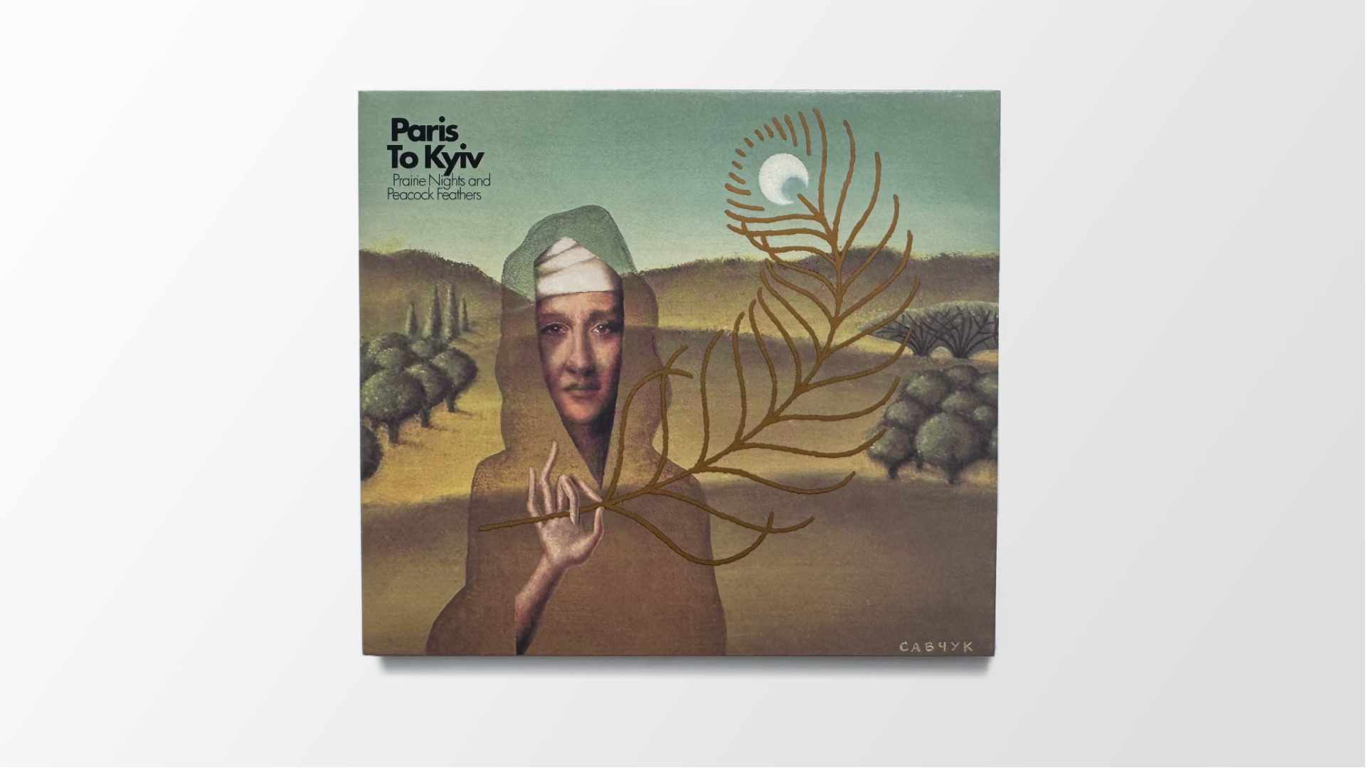
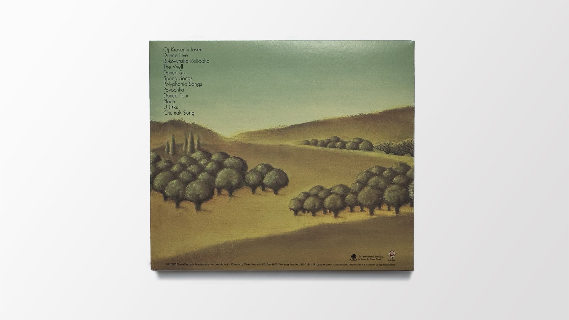
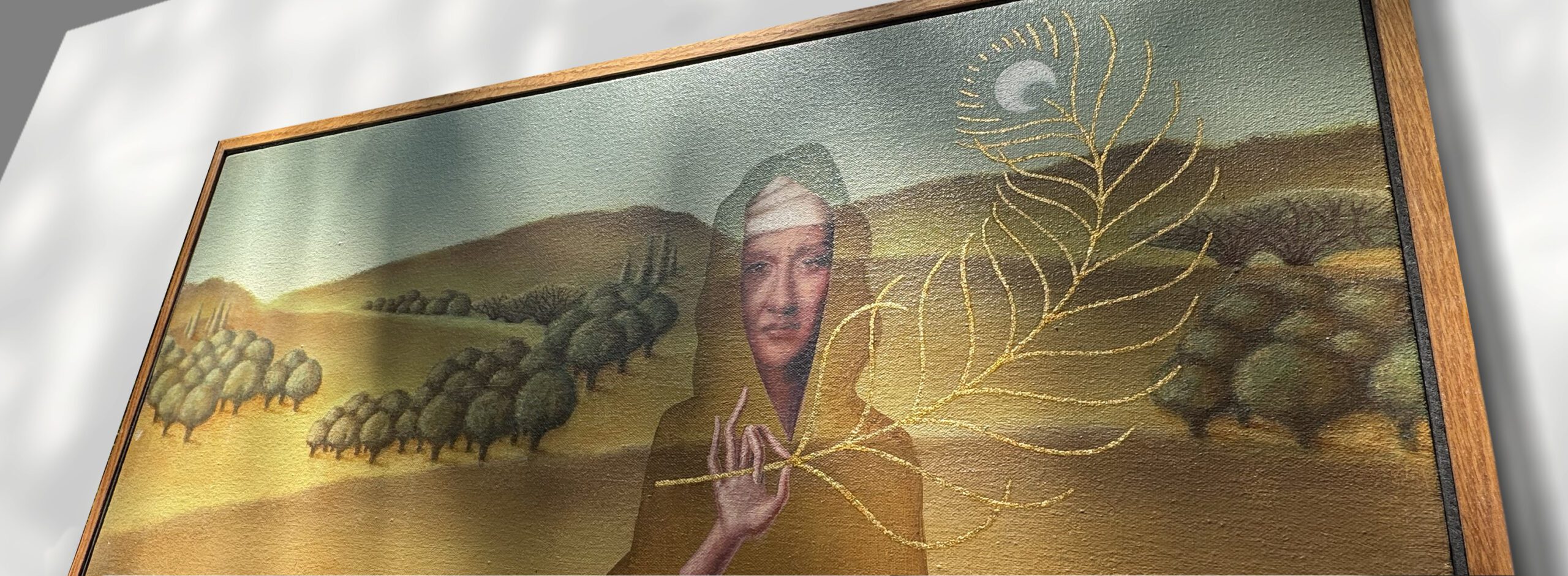
Visually, the work began with feeling. The music evoked landscape. The caravan suggested distant paths—connecting the Ukrainian steppes to the Canadian prairie. That image became a canvas: a surreal oil painting of Alexis as a transparent figure holding a peacock feather that curls toward the sky. Alexis once described the project as “travelling through distant times and places.” That image—part apparition, part oracle—was my response to that idea. The “eye” of the feather becomes the moon—a gesture linking the human life cycle to the celestial phases above. A visual symbol of continuity, movement, and transformation.
Celestial rhythm.Earthbound ritual.A feather that movesthrough both.
Byzantine iconography found its way in through the selective use of gold. On the packaging, gold ink became a bridge between sacred tradition and modern print design—glowing on the feather, flooding the lyrics booklet, and reflecting across the disc. The painting itself followed older methods: gold leaf applied by hand, rooted in centuries of devotional art. It feels less like a cover image and more like an object of reverence—something found, kept, and returned to. At the album launch, it was quietly displayed near the merch table—bringing the visual story into the space where the music met its audience.
ClientParis To Kyiv
Project Prairie Nights and Peacock Feathers Year2000

Promotional Suite
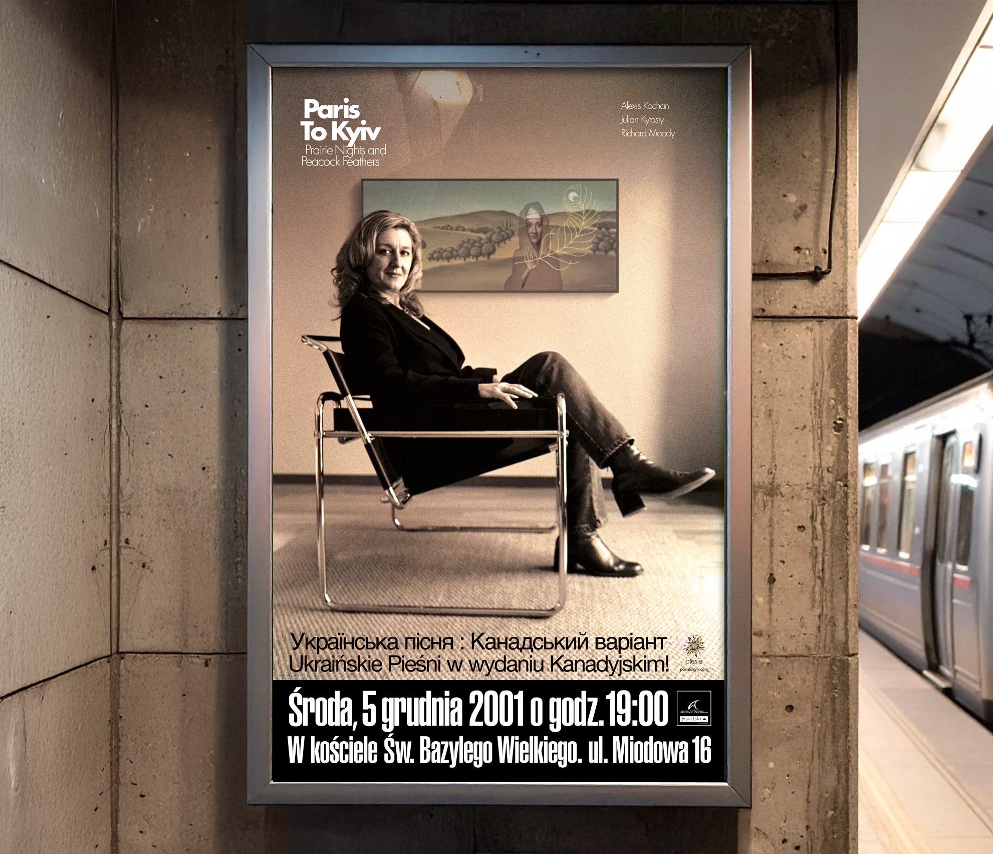
One promotional image brought all these elements into a single frame: a modern photograph of Alexis seated in a Wassily chair by Marcel Breuer, in front of the very painting that would become the album’s cover and back. A moment where history and modernity met—quietly, confidently, through art.
That image would be featured prominently across a series of tour posters, postcards, and print ads—becoming a visual thread that tied together the album’s symbolic language, its design treatment, and the ensemble’s public presence.
It was a carefully curated expression of the project’s evolving identity—pointing both inward, to its cultural and symbolic roots, and outward, to new audiences and places the music was about to travel.
This poster foreshadowed the ensemble’s 2003 return to Europe—sparked by a series of intimate performances in Poland.
East European Tour - May 2003
The music that moved between old and new worlds
Following the release of Prairie Nights and Peacock Feathers, Paris To Kyiv toured extensively across Canada and the United States. In late 2001, a smaller version of the ensemble—Alexis, Julian, and Richard—was invited to perform a series of concerts in Poland, including the Ukraina-Polska-Europa Festival at the Centre for Theatre Practices in Gardzienice. Those performances sparked curiosity. There was a real hunger to hear Ukrainian ritual song reinterpreted by North American musicians. Two years later, they opened the door for the full ensemble to return to Europe for a spring tour in 2003.
That tour would carry the music through Belgrade, Warsaw, Kraków, and Wrocław before continuing on to Ukraine for several performances in Kyiv and Chernihiv. It was a kind of homecoming—bringing this Ukrainian-Canadian expression of culture back to its roots, with all the transformation that had occurred along the way.
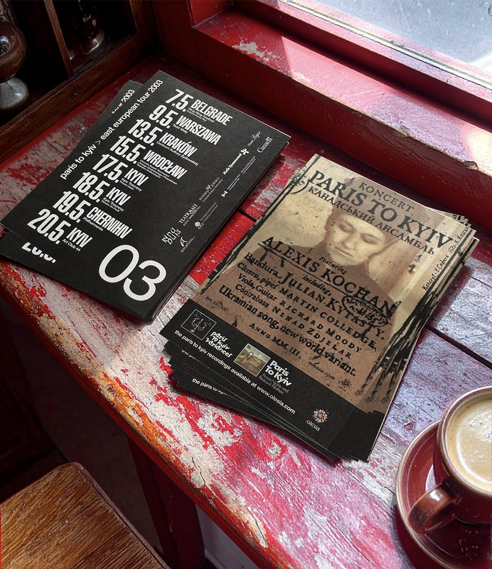

I created a small campaign to support the shows and point audiences to the website. The line Ukrainian song, new world variant became a touchstone. The poster and postcard designs emulated the look and feel of a 17th-century artifact—complete with archaic glyphs, acquisition stamps, and aged textures—like something newly unearthed. A mix of English, Polish, and Ukrainian Cyrillic expressed the ensemble’s multilingual identity in an effortless way—without needing to translate every word. The balance of languages reflected the tone of the music itself.
The costume I envisioned for Alexis was created specifically for the tour poster: a tall wool hat and long coat, photographed in a distressed industrial space. A modern relic. It’s interesting to note that several members of a fledgling Ukrainian act were in the audience at the Dakh Theatre in Kyiv during the ensemble’s performance. They would go on to form the band DakhaBrakha—adopting a similar aesthetic and achieving international success. A perfect loop: old world influencing new world, influencing old world.
What travels, translates
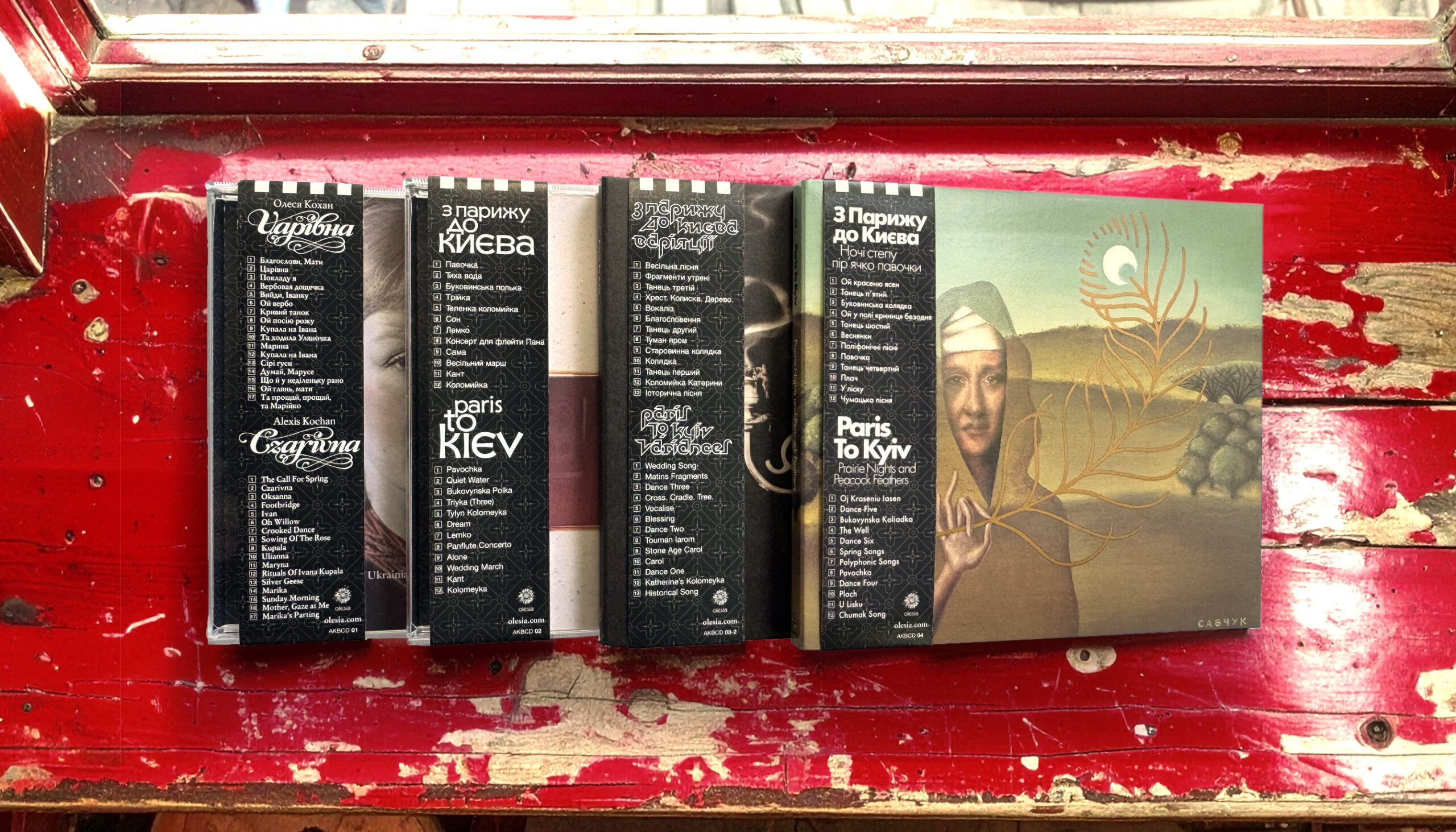
To bring the full back catalogue to new audiences, we reissued all four albums with Ukrainian-language obi wraps. These paper bands—common in Japanese vinyl releases—translated titles, track listings, and label information into the mother tongue, giving the collection a sense of cultural and visual unity. Each required a reimagined logotype in Cyrillic, adapted from the original designs. An act of design stewardship that carried the visual story across languages, formats, and borders.
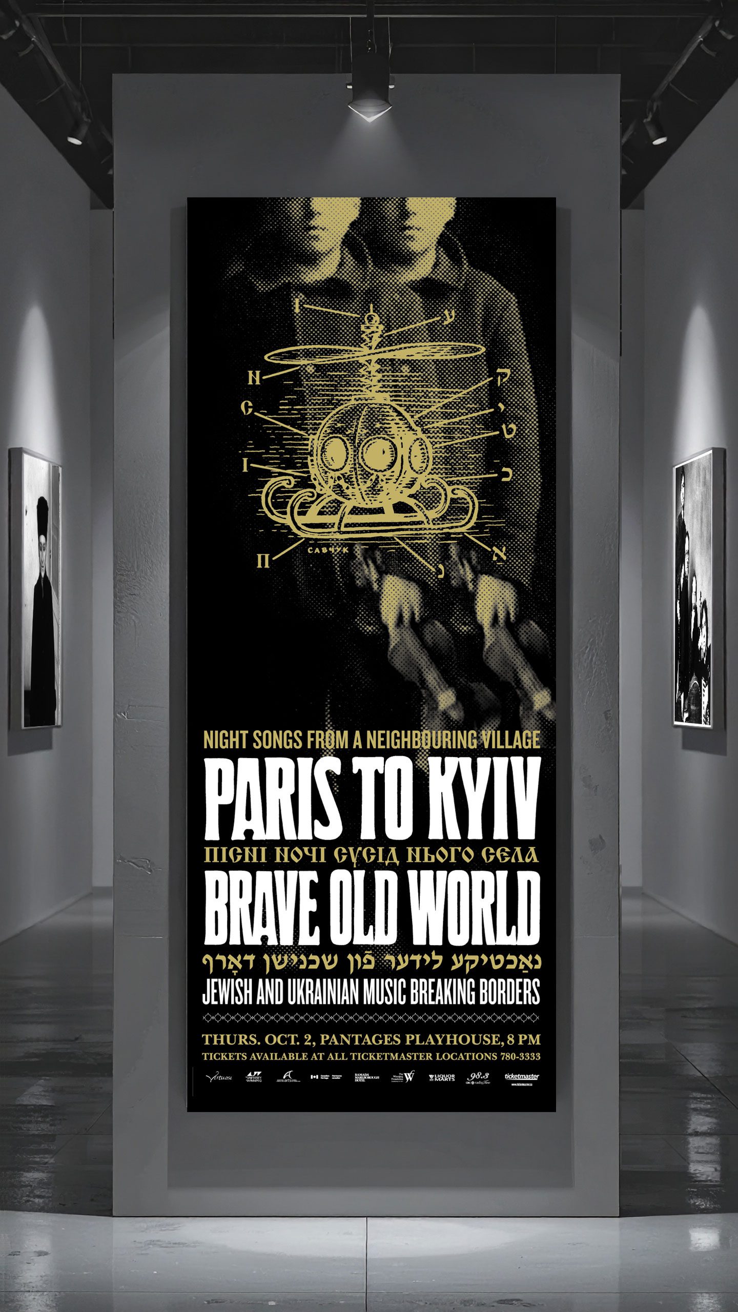
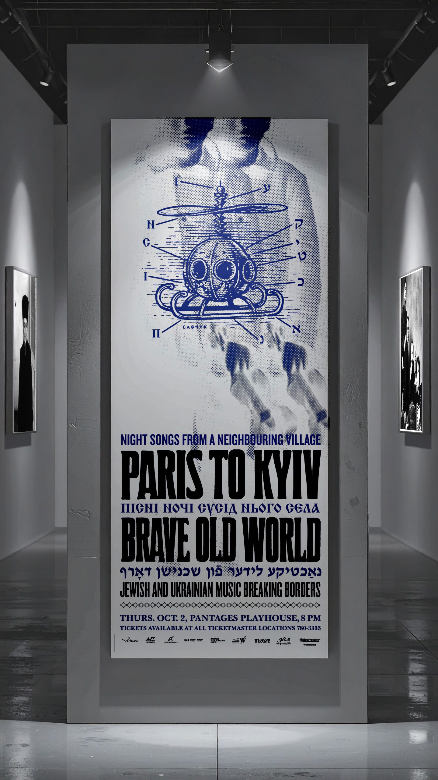
Night Songs FromA Neighbouring Village
Jewish and Ukrainian music breaking borders
This one-off concert featured Paris To Kyiv and Brave Old World in a rare collaboration at Winnipeg’s Pantages Playhouse Theatre in October 2003. It followed earlier performances in New York, Berlin, Toronto, and Los Angeles—each part of a growing tradition of cultural exchange.
Both ensembles were known for defying clichés—refusing to traffic in tropes. Their collaboration was inspired by a 1930s poem by Ukrainian-Yiddish writer Herts Rivkin, who described hearing Ukrainian songs “like flowing honey” from a neighbouring village. That simple image—of one culture overhearing the other across distance and sorrow—became the spiritual centre of the show.
The poster took a similarly imaginative approach. It layered an archival photo of a village fiddler—duplicated and doubled—into two nearly identical figures, bound more by likeness than difference. Superimposed over them: a fantastical flying machine drawn like an old-world blueprint. Its labeled parts—rendered in Cyrillic and Hebrew—spelled out Night Songs, echoing the music’s ability to transcend borders.
Used across posters, postcards, programs and ads, the piece was an art poster by intent—inviting viewers to imagine their own crossing between worlds.
Slide the border on the image to reveal the original sketch—where the inverted artwork becomes blueprint, and the machinery of metaphor is laid bare.

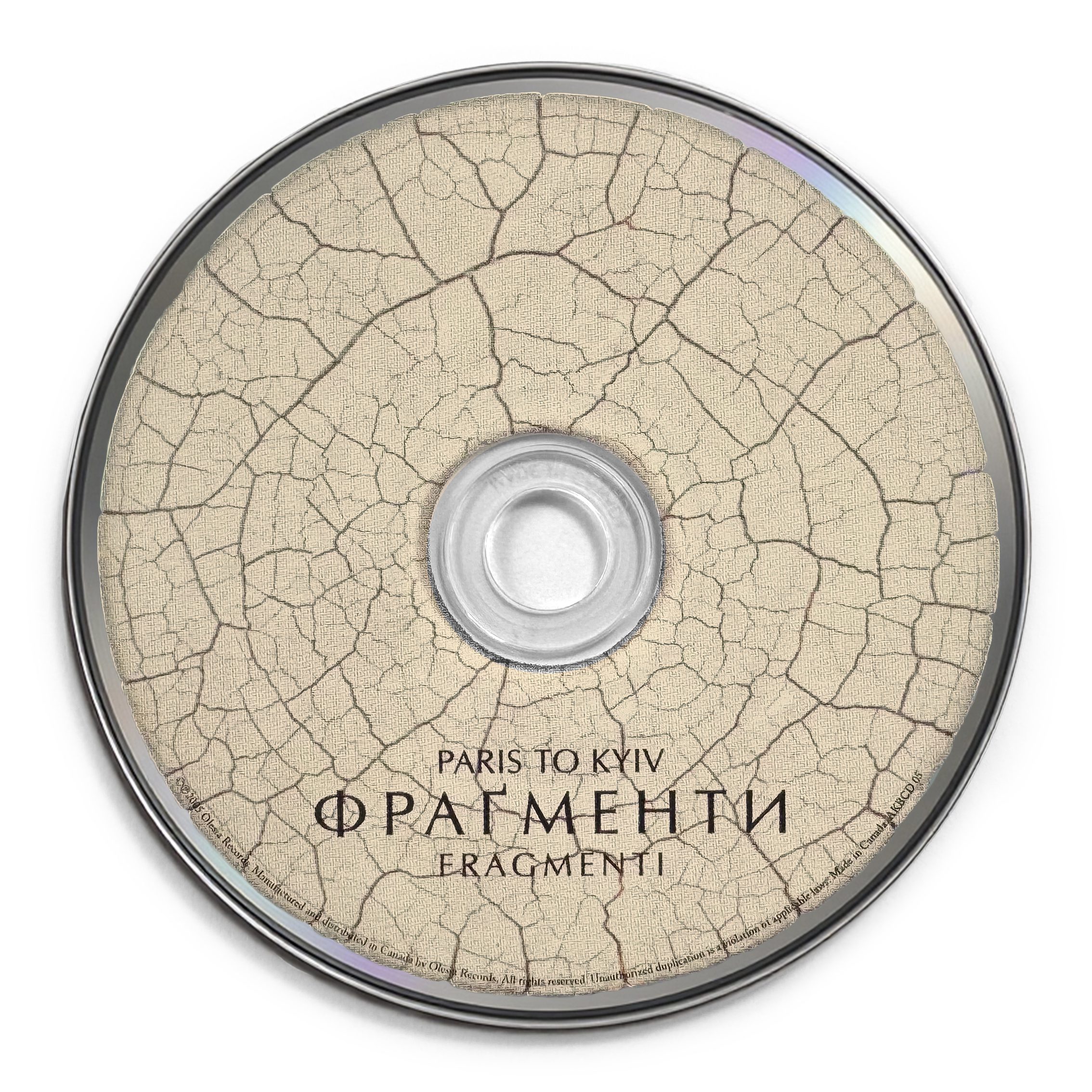
Fragmenti
A shift in spirit, a deepening of sound
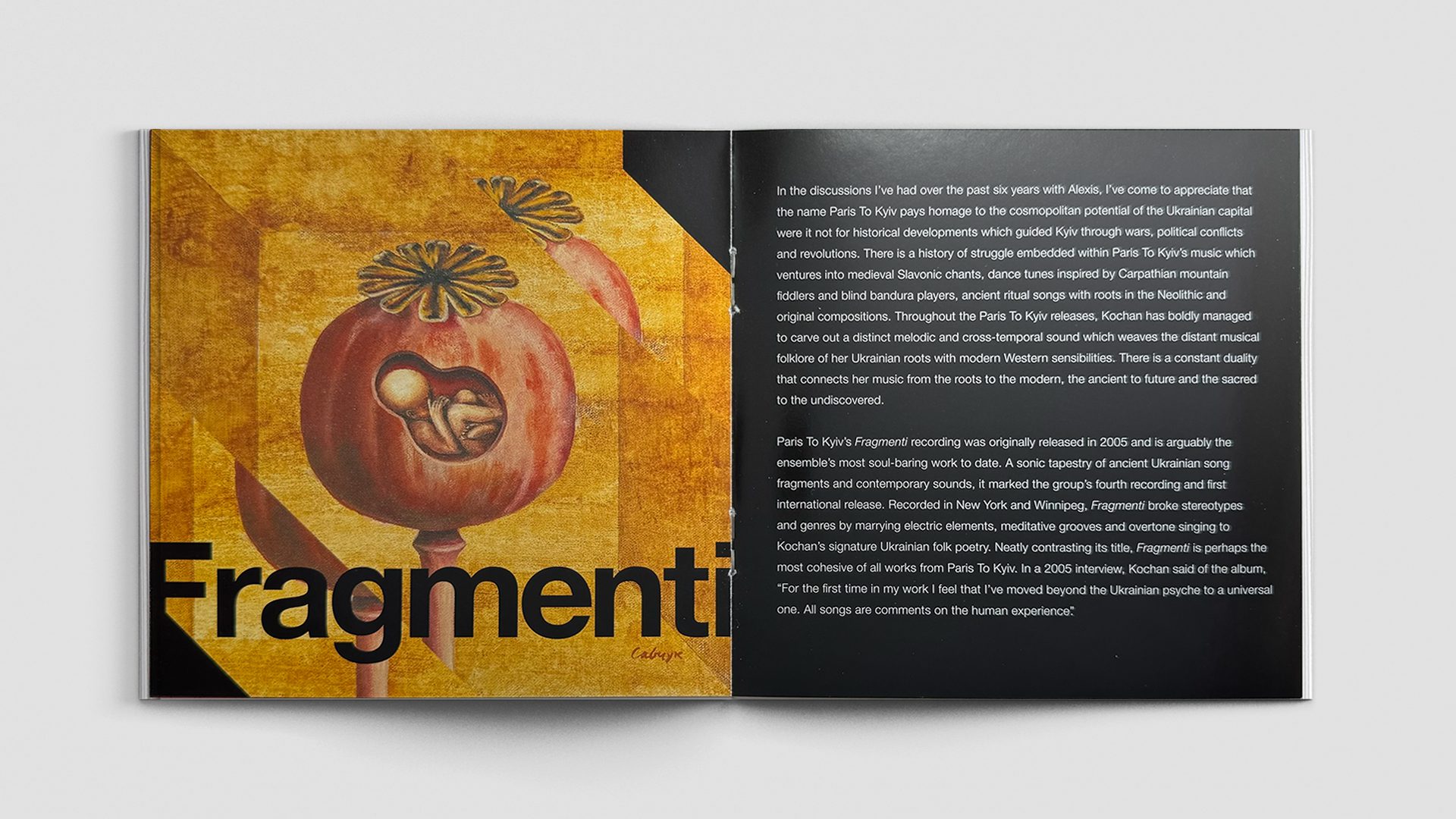
By 2005, the Paris To Kyiv project had entered a new phase. Years of touring had solidified the group’s reputation, but also brought a sense that something needed to change. Singer Alexis Kochan wanted to push the work further—sonically, emotionally, and culturally. Rather than refine what had come before, she aimed to chart new territory. Fragmenti would become the result. It was Paris To Kyiv’s most stripped-back and soul-baring recording to date—and arguably its most conceptually ambitious.
Kochan pared down the ensemble to a tight core of trusted collaborators: Julian Kytasty on bandura and sopilka, Richard Moody on viola and guitar. Moody also stepped into the role of producer, shaping much of the mood and recording approach. The resulting work was darker, more meditative, more elemental. Guest musicians contributed overtone singing, percussion, and drone—extending the group’s sonic vocabulary into new emotional registers. The music drew from fragments of ancient Ukrainian ritual songs, but also carried unmistakable echoes of ambient composition, and contemporary acoustic minimalism.
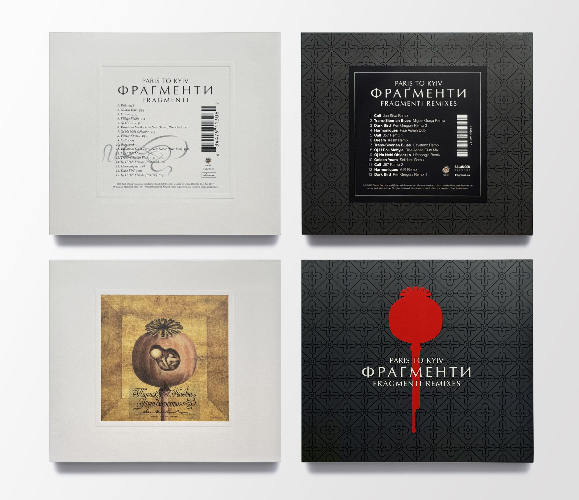
The album’s title—Fragmenti—was based on a concept I had shared with Alexis: the idea of lost sheet music, rediscovered in a ruined archive. Evoking the kinds of ancient scrolls or artifacts rediscovered in pieces, with their gaps and silences as meaningful as their content. It was fictional, but it resonated on many levels: memory, loss, reconstruction, and reinvention. The work was deeply rooted in Ukrainian cultural memory—but, for the first time, Kochan felt the project had moved beyond the Ukrainian psyche into something more universal. As she would later say, “All the songs are comments on the human experience.”

Concept
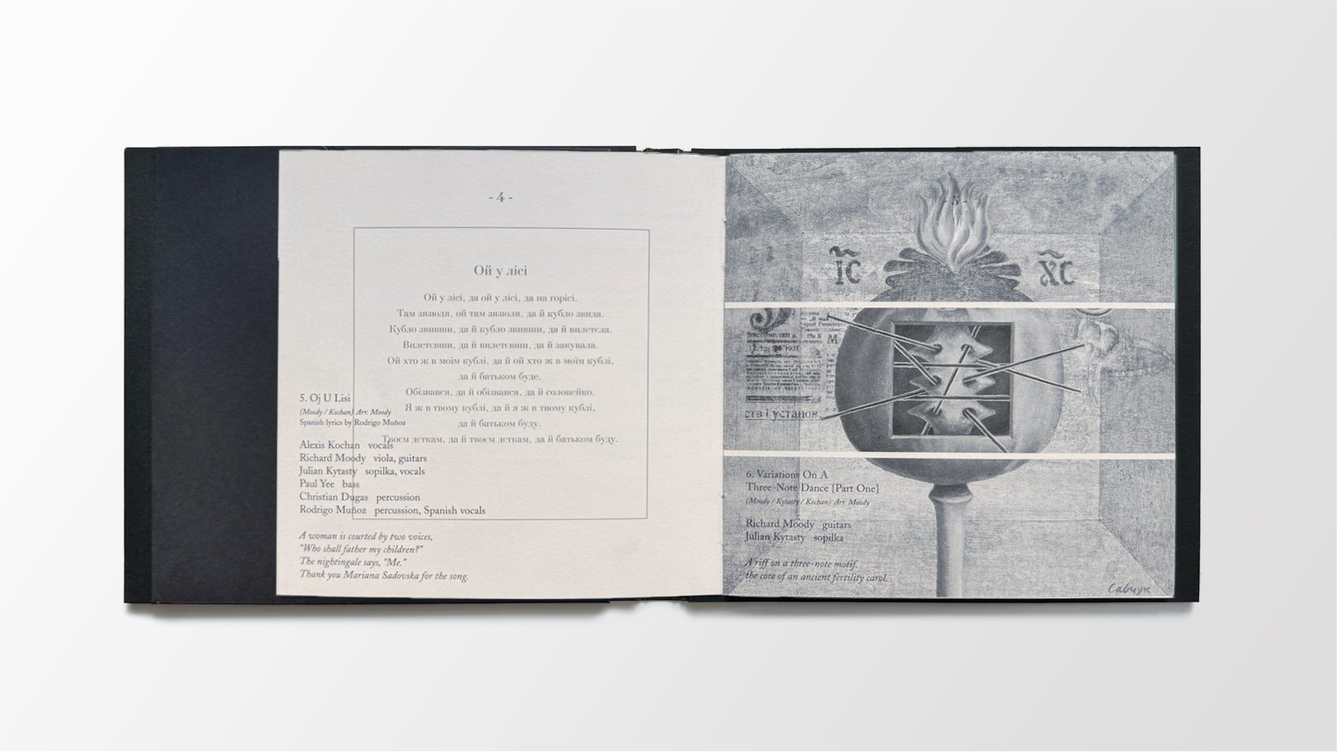
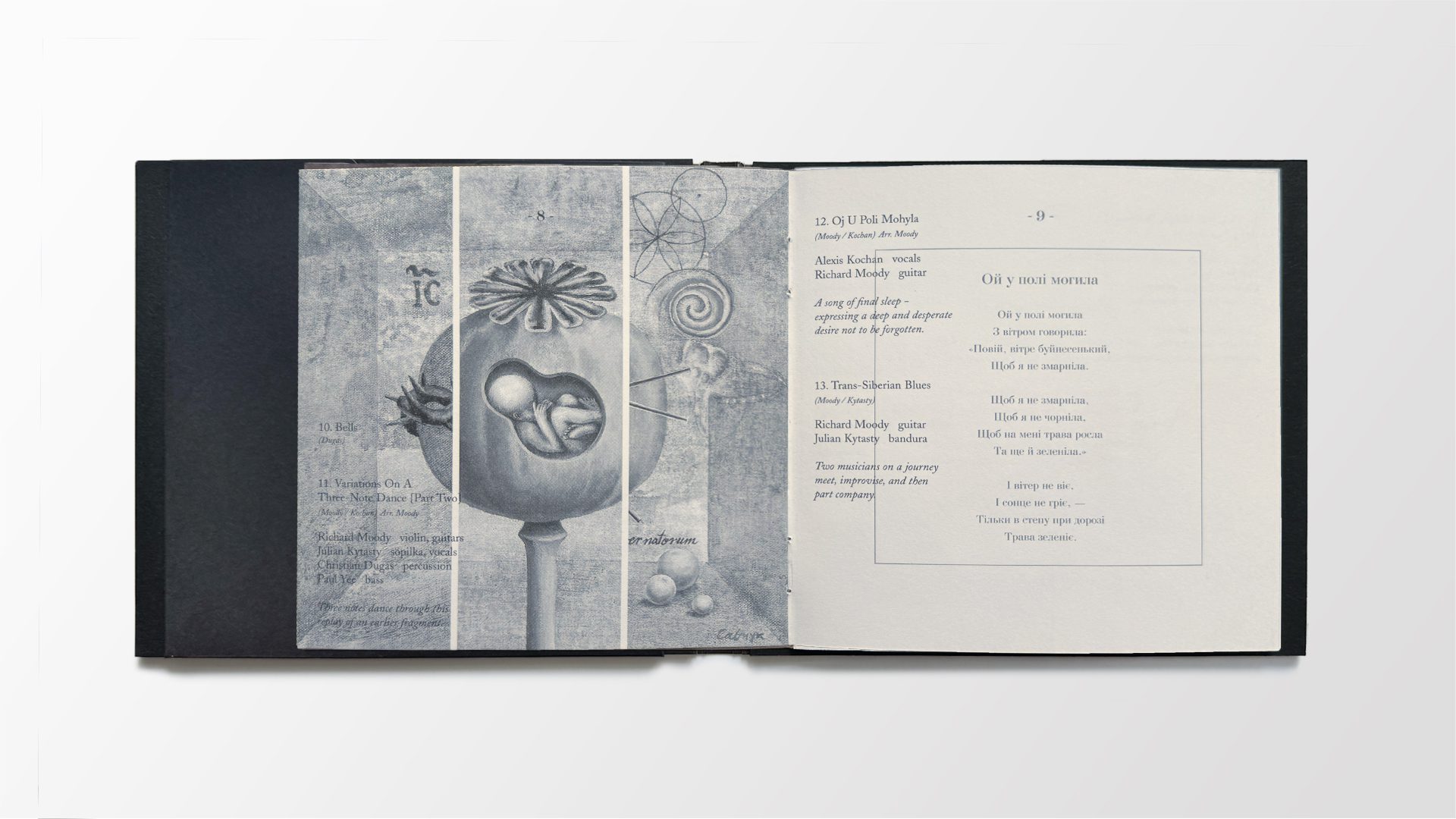
The artwork for Fragmenti began with a single form: the poppy pod. Traditionally symbolic of both fertility and remembrance, the poppy in Ukrainian culture also carries associations with grief, conflict, and transformation. But rather than depict the lush flower, the paintings in this package strip the poppy down to its barest, most evocative state—a seed pod waiting to bloom. A form of potential, held in stasis. The design unfolded as a triptych of original paintings, each revealing a different facet of the human condition—rooted in potential, layered with memory, and resolved through resilience and renewal.
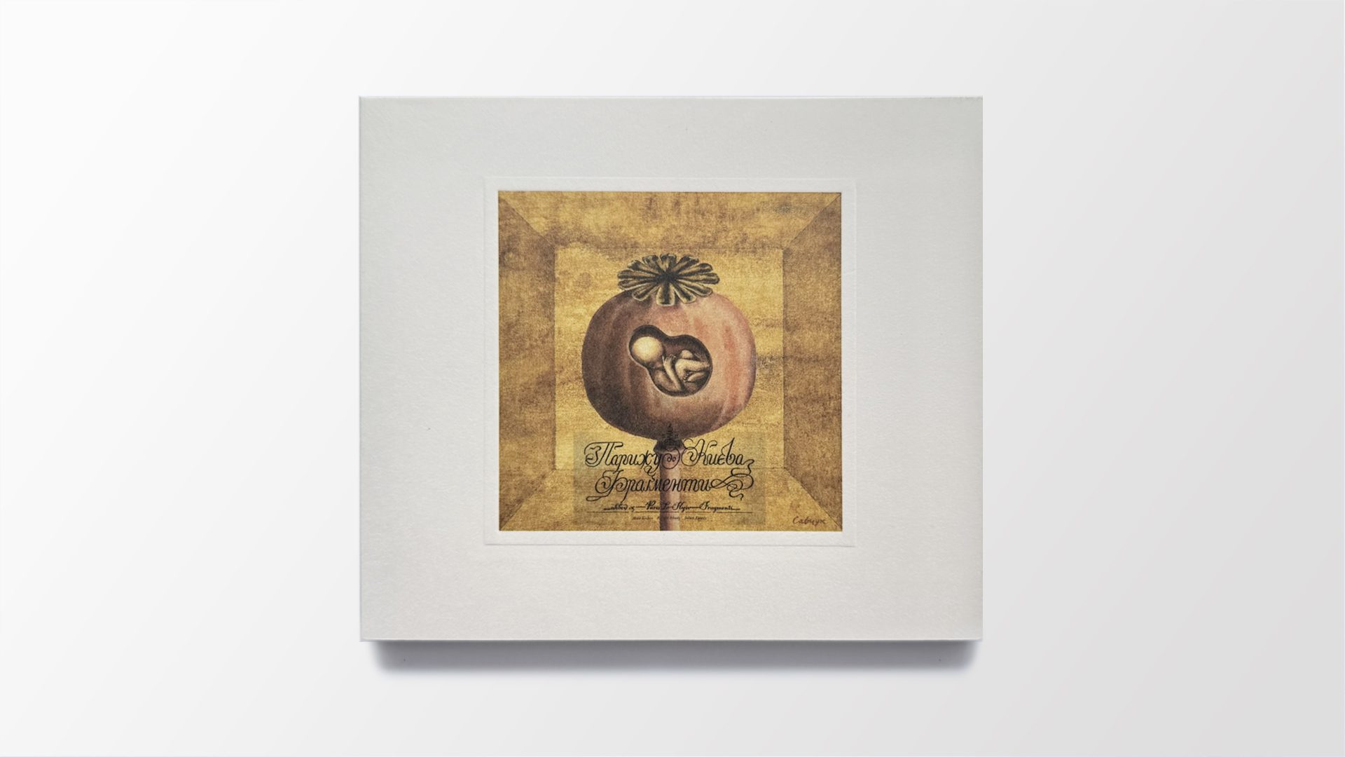
Painting 1 – The first painting appears on the cover, illustrated in a folk-naive style but layered with surreal symbolism. A single poppy pod floats in space—opened just enough to reveal what’s held within. We see an unborn child: a symbol of the next generation. A generation shaped not only by what was lost, but by what still survives. And here, the poppy becomes a symbol for the culture itself, held in stasis but with the potential to bloom. Suspended between rupture and renewal. The image is inset within an embossed square—its own kind of window—framed on the stark white sleeve like a reliquary. An invitation to look closer, and to consider what lies inside.
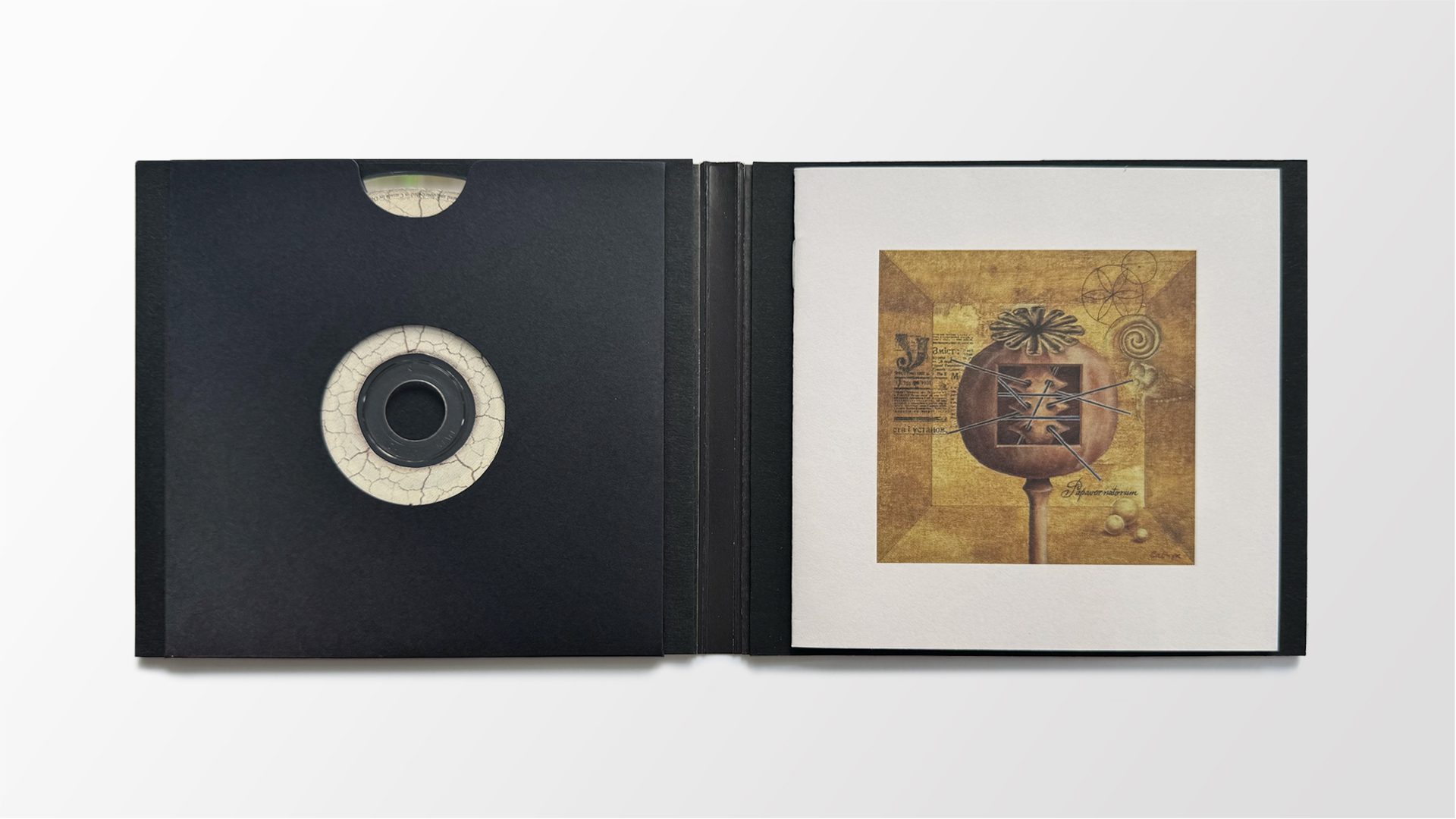
Painting 2 – The second painting cuts deeper—both visually and symbolically. Its square aperture reveals not anatomy, but a kind of cultural cross-section. Are we seeing a spine, or a sopilka? A diagram of the body, or of the music itself? Lines radiate outward and inward, pointing to half-lost words, untranslated texts, fragments of knowledge. It’s a visual map of how meaning travels: between generations, between languages, between memory and reinvention.
Papaver natorum (n. sp.)
Family: Papaveraceae
Common name: Child’s Poppy (alt. “Poppy of Children”) Found along thresholds—of ritual, renewal and cultural rebirth.
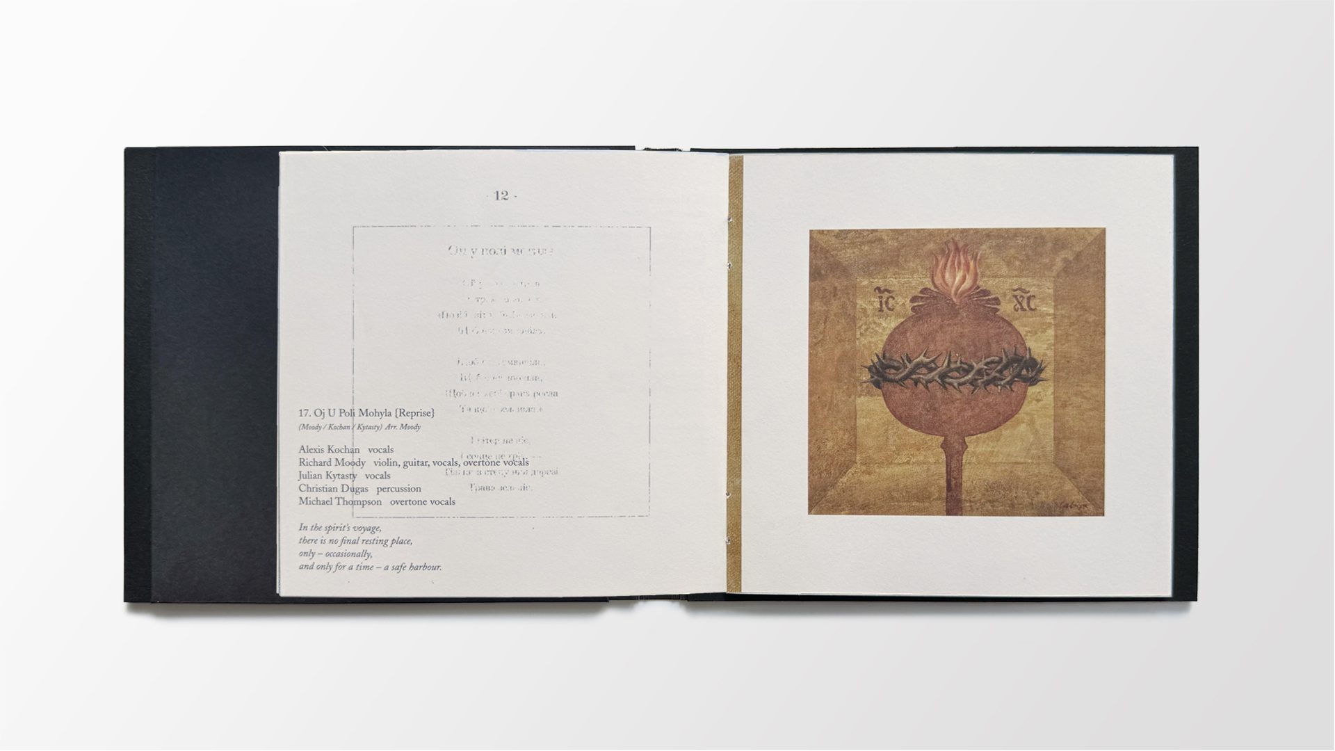
Painting 3 – The third and final painting shifts to silhouette—an abstracted poppy pod, reduced to form and flame. Here, we don’t look inside. Instead, we feel what surrounds it: a crown of thorns, a field of fire. The image evokes suffering, yes—but also transformation. A nod to the burning heart of Christian iconography, reimagined here as a symbol of cultural endurance. What survives hardship is often what’s most essential. And what burns can sometimes illuminate.
Together, the three paintings form a journey: from potential, to memory, to resilience. Each one marking a threshold—personal, cultural, and timeless.
Design
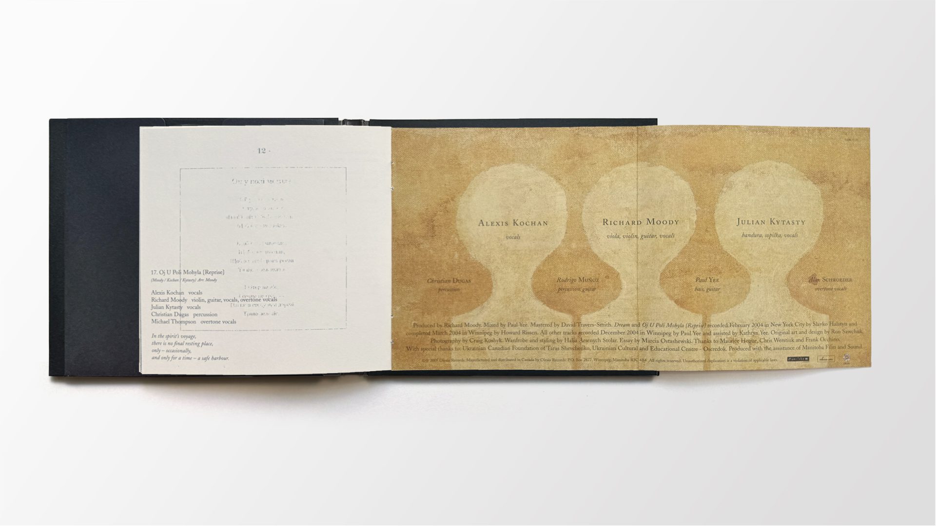
The physical design reinforces the album’s themes. A rigid casebook format wraps around matte-black interior boards—an inversion of the colour story used in Variances, where black cloaked the outside and white lined the inside. This reversal signals a shift in emotional terrain: one where light surrounds the dark—and in this world, what’s most vital is held inside.
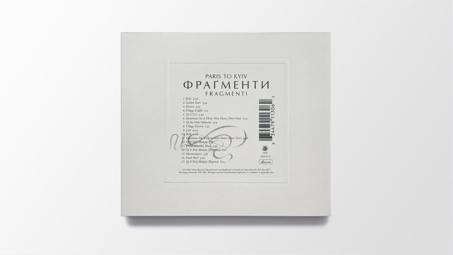
No plastic was used. The CD rests in a custom paper sleeve, held friction-tight. The 12-page booklet pairs Ukrainian lyrics with spare English “essences” rather than direct translations. These fragments mirror the musical approach: poetic, partial, open to interpretation.
The original paintings appear in full, but also re-emerge as collages—cut, recombined, and layered into new forms. A gesture toward memory’s tendency to reassemble what’s been lost.
International release
Fragmenti marked a turning point not just artistically, but geographically. It was the first Paris To Kyiv album to receive international distribution—with a particularly meaningful release through Poland’s influential Koka Records.
Founded in 1989 by Volodymyr Nakonieczny, Koka became a vital outlet for underground Ukrainian music—both avant-garde and traditional—especially from the Polish-Ukrainian borderlands. Their catalogue was singular in scope, championing artists like Cukor Bila Smert’, Svitlana Nianio, and Mykhailo Hai. Fragmenti didn’t fit that mold exactly. But perhaps that was the point.
Though created in Canada, the album struck a chord with Koka’s aesthetic: spare, searching, rooted in cultural specificity but unafraid to experiment. When Alexis Kochan connected with Nakonieczny during her tour of Poland, the kinship was felt. For me, having long admired Koka’s role in the Ukrainian underground, seeing our work recognized by them was a rare and resonant moment.
Fragmenti also arrived during the Orange Revolution—a time of reckoning and possibility. Though recorded in Winnipeg and New York, the album spoke to a broader Ukrainian experience, shaped not by geography, but by memory, reinvention, and cultural continuity.
Recognition:
- Western Canadian Music Award – Best Album Design (Ron Sawchuk)
ClientParis To Kyiv
ProjectFragmenti Year2005
“Possibly the most stylish Ukrainiancompact disc ever produced.”
- Dr. Robert Klymasz, folklorist and cultural historian
Promotional Suite
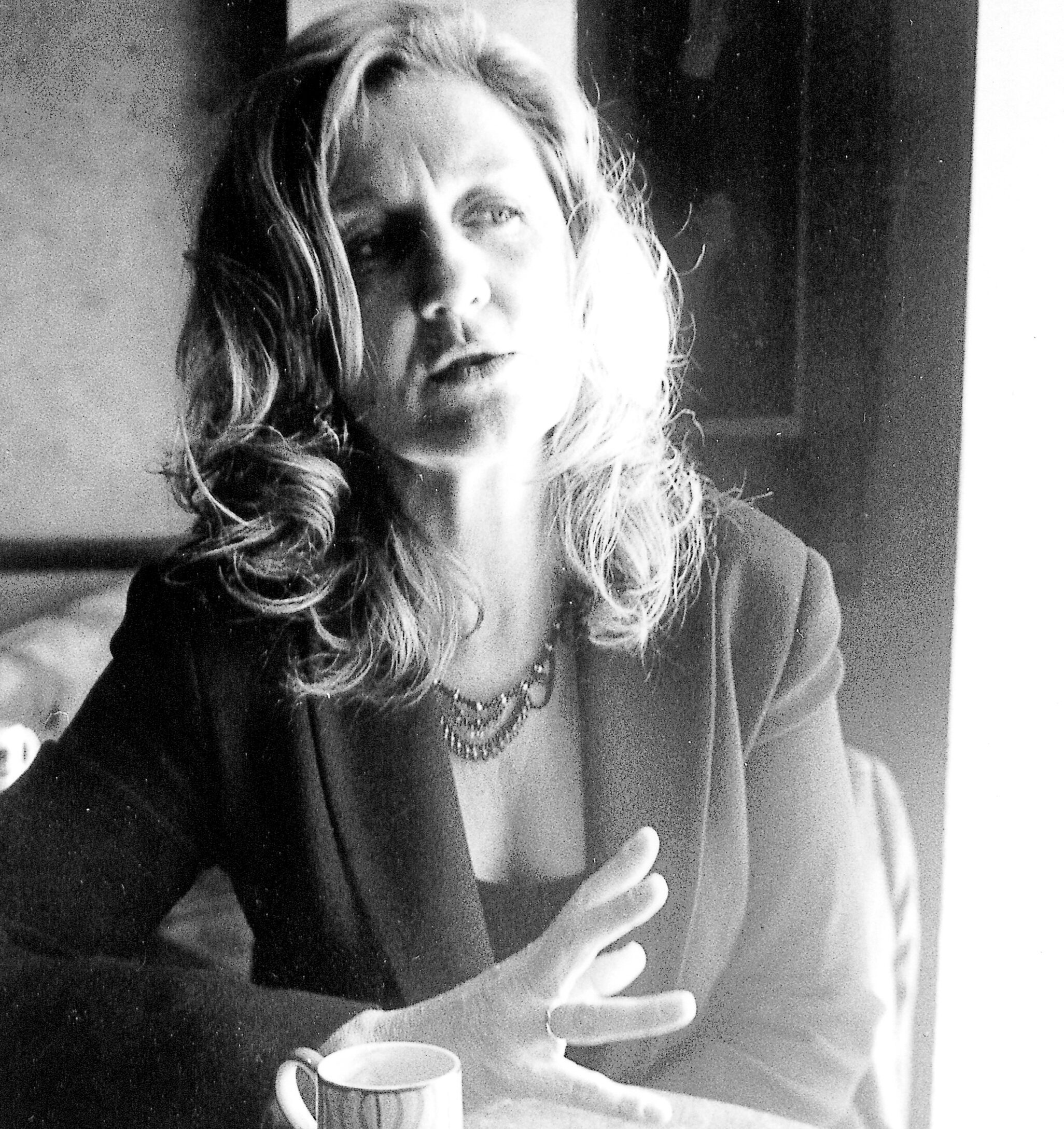
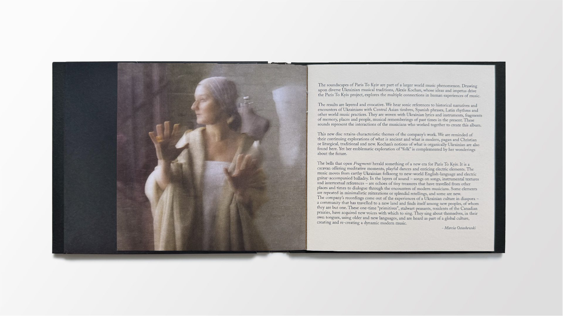
The promotional materials for Fragmenti were few—but intentional. Posters, postcards, and programs that carried the album’s visual language outward, not only to record stores, but into cafés, cultural spaces, and creative enclaves where their presence felt more like quiet suggestion than call to action.
One key image—a portrait of Alexis lit in profile—evoked something beyond promotion: stillness, memory, and the lasting resonance of the music itself. Shot with a dreamlike stillness that invites contemplation, the photo holds movement and quiet in equal measure. The wardrobe—styled in close collaboration—could belong to a 17th-century portrait, or a contemporary fashion editorial. Time slips. Meaning lingers.
Bridging Two Worlds
Fragmenti featured in Travel Manitoba’sCanada’s Heart Beats campaign
This is where cultural memory met commercial storytelling. I selected and remixed songs from the album for use as soundtracks across the campaign’s seven television spots. It was a rare moment when two streams of my work—personal and commercial—converged, and each was elevated by the other.
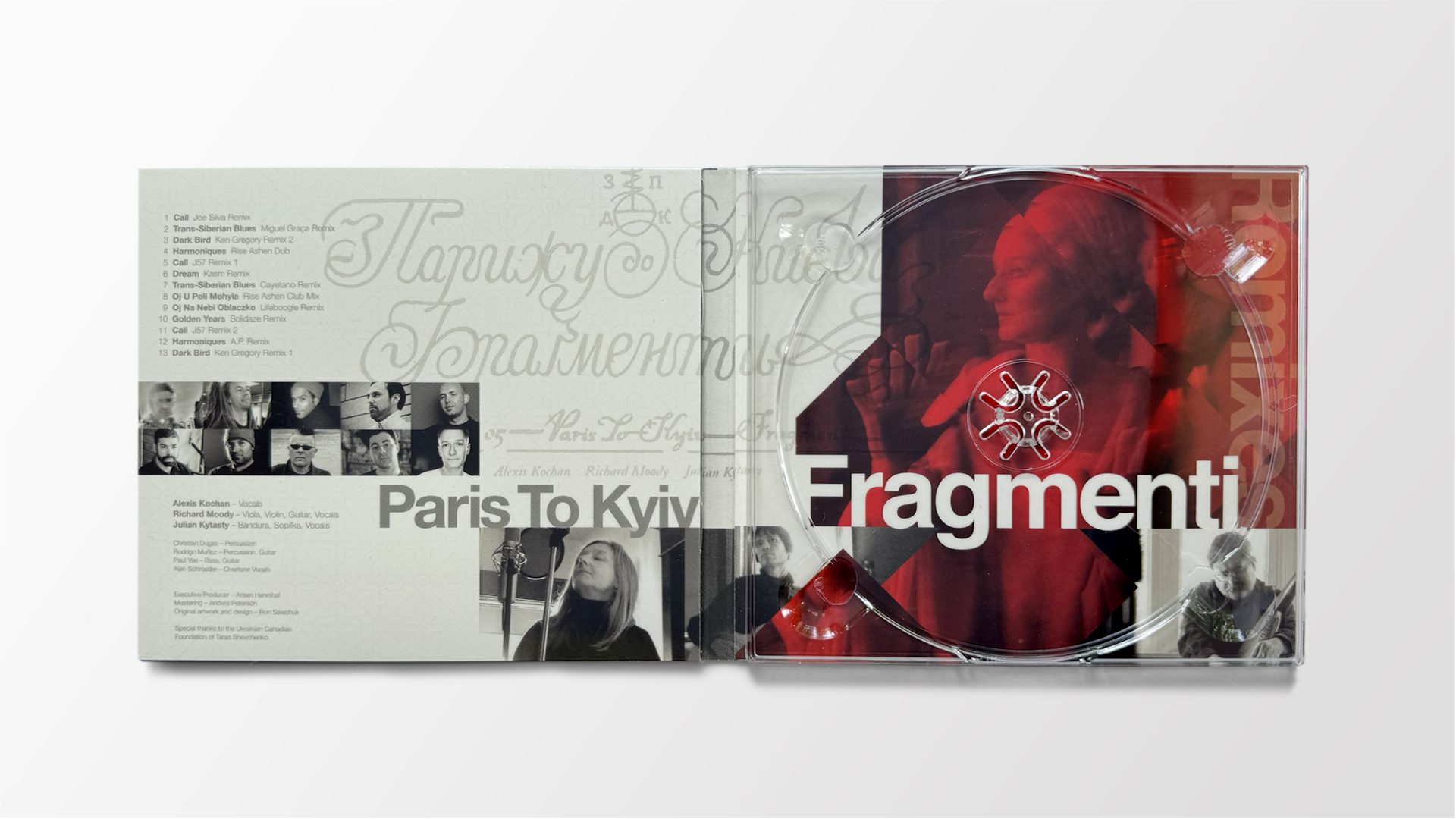
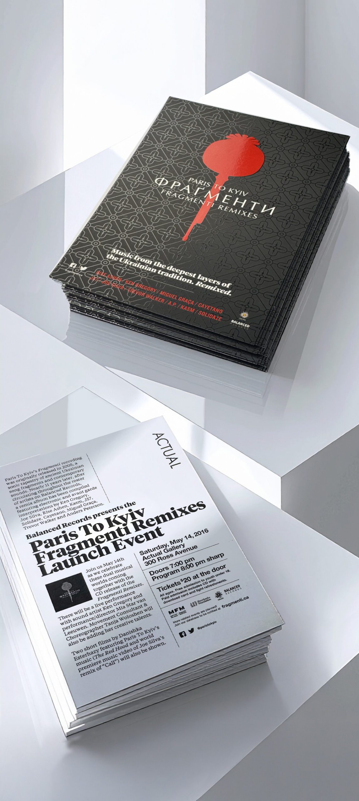
Fragmenti Remixes
A new voice, still in dialogue
From its inception, Paris To Kyiv was never a fixed entity. It was an evolving idea—an invitation for others to enter a conversation through sound. With Fragmenti Remixes, that invitation reached a new community of artists: electronic producers from across Canada and beyond, each offering their own reinterpretation of the original Fragmenti album.
Some saw this as a bold departure. But to Alexis Kochan and her collaborators, it was entirely consistent with the project’s spirit. Remixing wasn’t a break from the past—it was a continuation of the same instinct: to take fragments of traditional song and ask new voices to respond. The result was something contemporary, dynamic, and entirely unexpected.—Music from the deepest layers of the Ukrainian tradition. Remixed.

Concept
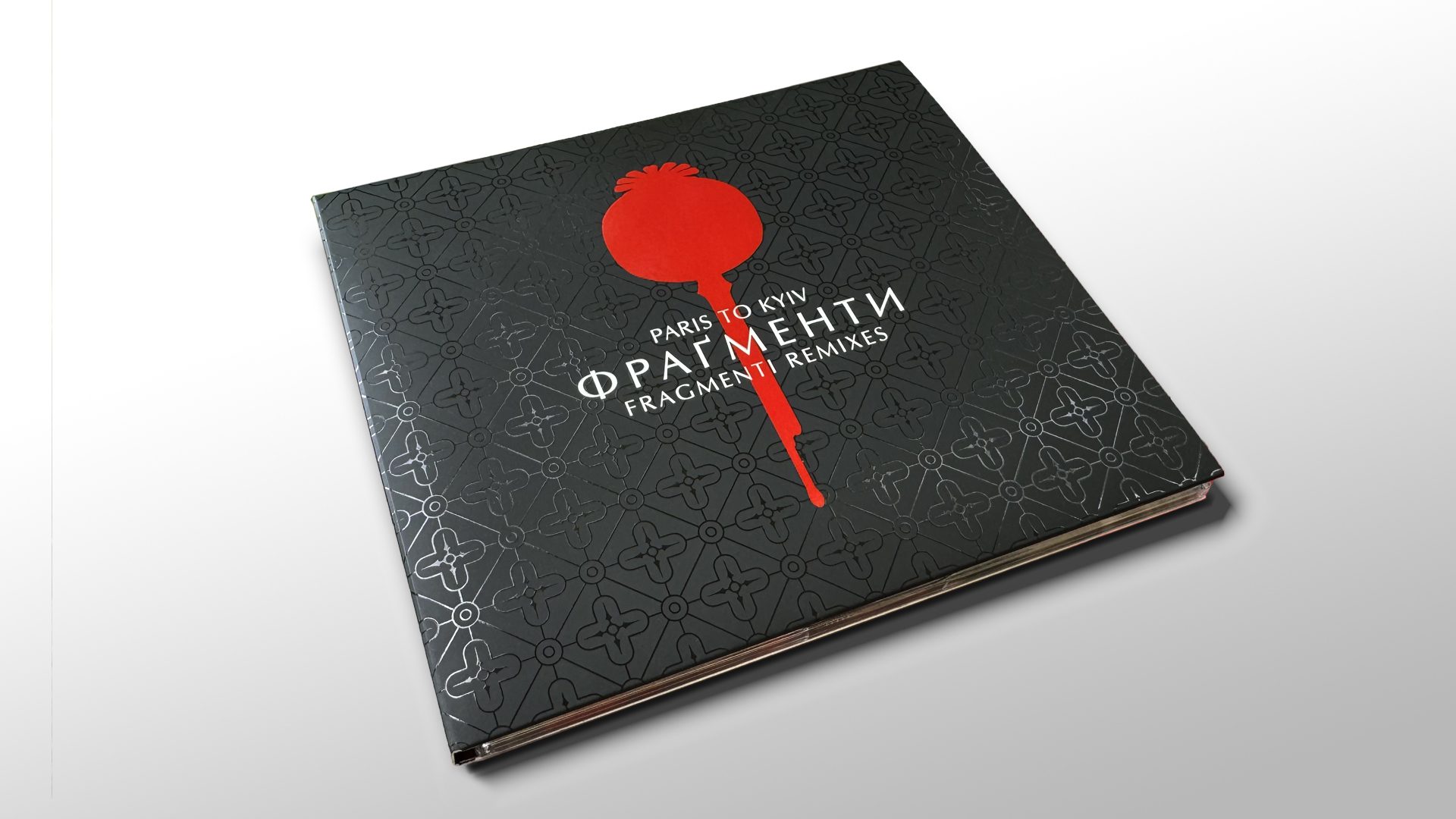
The original Fragmenti artwork unfolded to reveal a triptych of poppy pod paintings, each representing a phase of the human condition—potential, memory, and resilience. But there had been a fourth idea at the time: a graphic silhouette of a single red poppy, its stem dripping downward like blood or ink. Visually distinct from the painted series, it was set aside—unfinished. The original unfolded in white; the remix reappeared in black. A reversal of surface that carried symbolic weight—and set the stage for what followed.
A decade later, as new interest in Fragmenti emerged, that shelved concept found renewed urgency. Ukrainian unrest deepened as the Russo-Ukrainian conflict escalated. The poppy’s clean silhouette and downward drip became a potent image—both a time capsule and a response. A symbol of protest and of continuity. A bleeding poppy. A mark that won’t fade. A silent witness.
Design
Where past Paris To Kyiv releases gave visual space to illustrated content, this one turned to graphic minimalism. The front cover featured only three elements: a red poppy silhouette, a cross-lattice pattern, and the elegantly spaced title lockup. The poppy was gloss varnished onto a matte black background—its sheen catching light like liquid. The cross-lattice, rendered in varnish only, evoked both confessional grille and windowpane. A geometric echo of the square frames used in Fragmenti.
Embossing and varnish offer two distinct tactile signals—each directing attention in its own way. On Fragmenti, an embossed square had framed the text—elevating the surface as though it had been carved. On the remix album, the same area was marked with a broad field of gloss varnish, amplifying the tonal contrast and directing attention through light and sheen.
The textures of the packagemirror the music—revealing,reframing, and returning towhat’s beneath.
The black exterior opened to reveal a white gatefold interior—a subtle inversion of Fragmenti’s format. Photographs taken during the original Fragmenti recording sessions now appeared for the first time: composed, documentary-style portraits placed within a collage of Cyrillic script and sharp geometries. The visual language carried forward the formal elements of Fragmenti, but reinterpreted them through a modernist lens—stripped down, reframed, yet still rooted in memory. Fragments remixed.
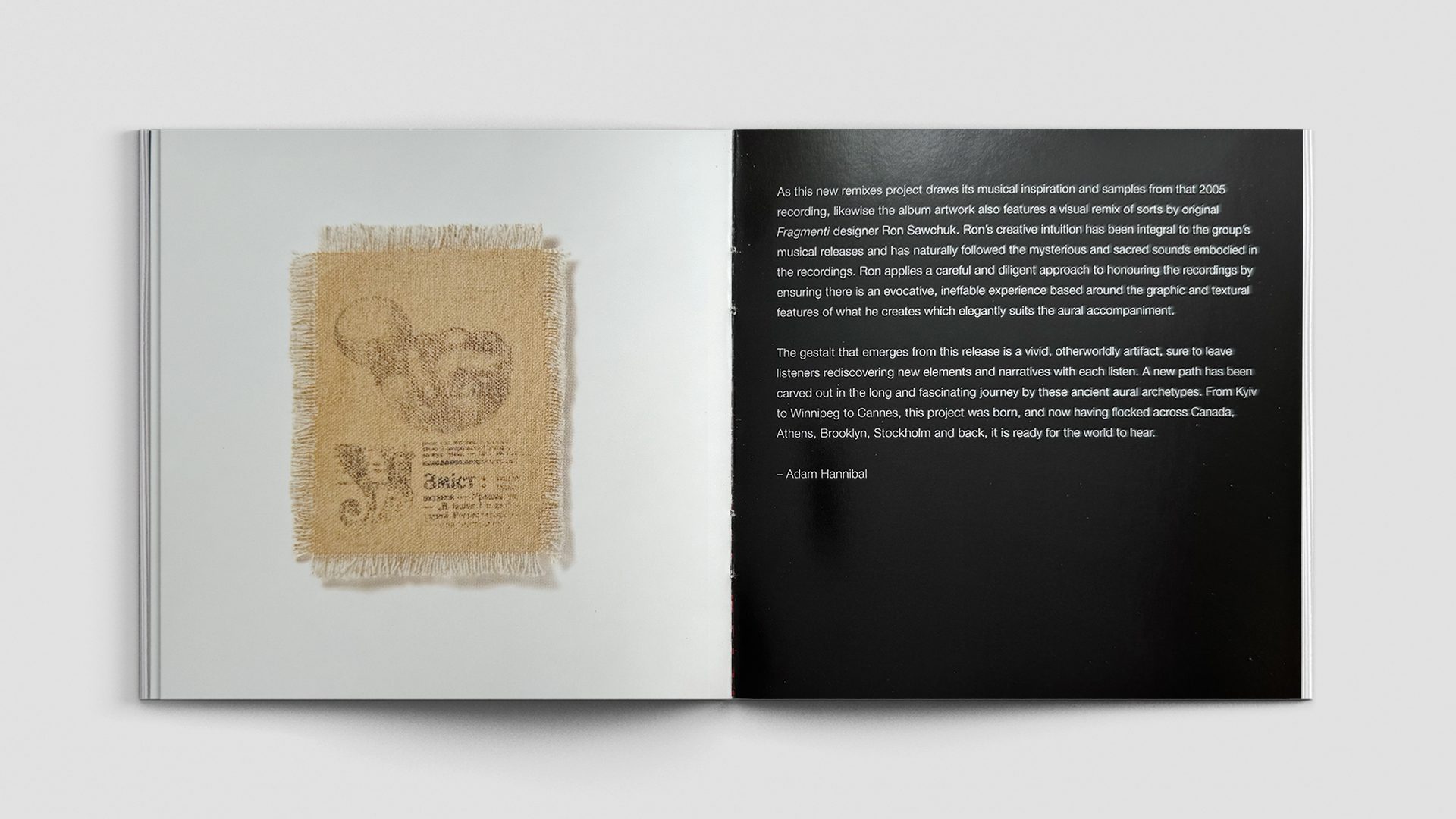
A booklet continued this rhythm, pairing an essay by Adam Hannibal, curator of the remix project and founder of Balanced Records, with a final hidden detail: a study sketch of the unborn child from the original painting, drawn faintly on linen canvas. Still incomplete. Still waiting to emerge.
“The gestalt that emergesfrom this release is a vivid,otherworldly artifact—sure toleave listeners rediscoveringnew elements and narrativeswith each listen.”
- Adam Hannibal, Balanced Records
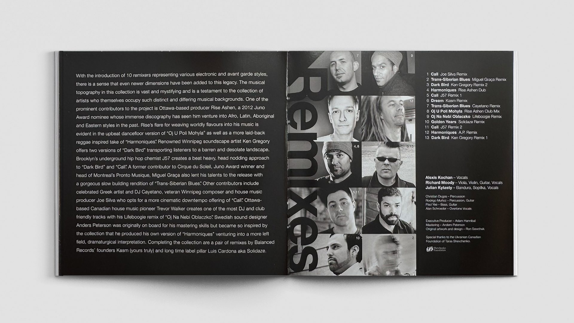
International response
The project brought together a diverse slate of international remixers—each invited by curator Adam Hannibal to reinterpret the source material through their own lens. Some approached it with reverence, others with radical invention. But all shared a common intent: to reanimate the fragments.
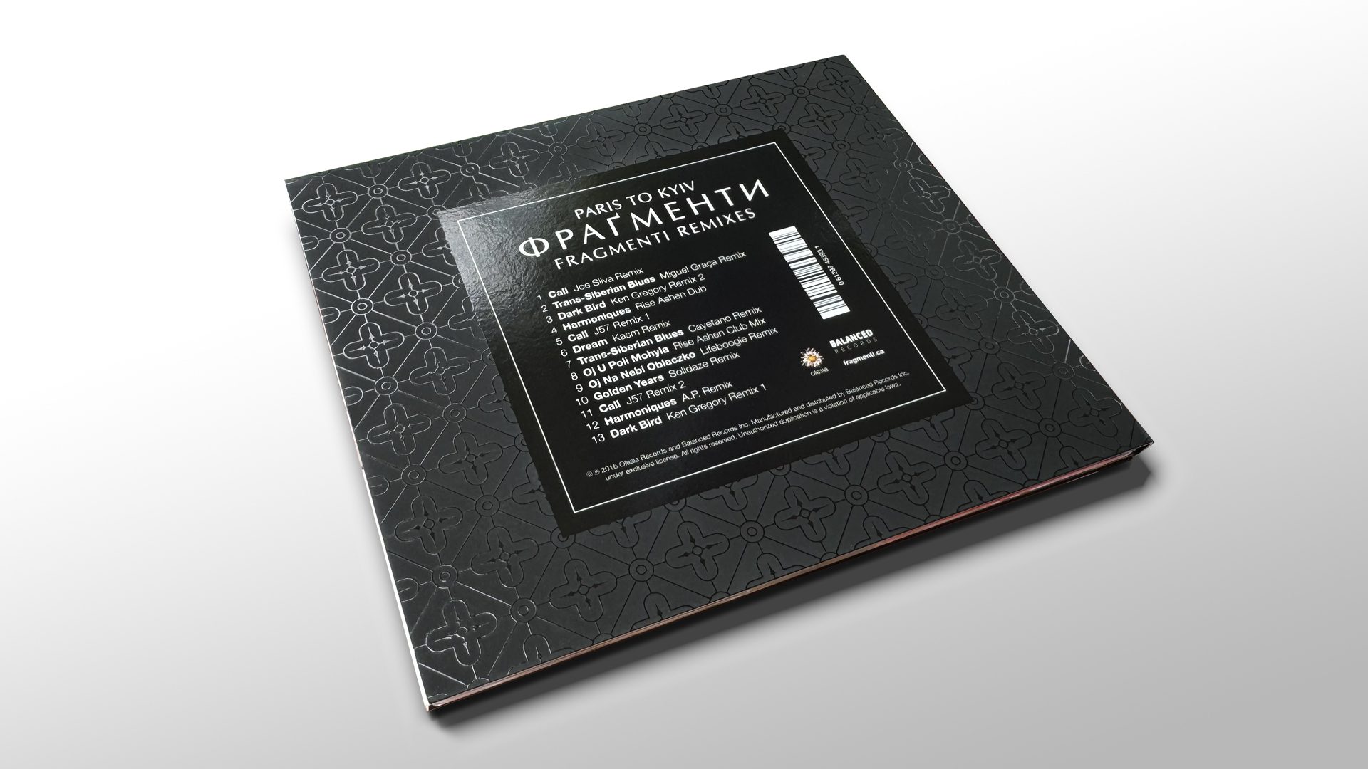
Remixers included Juno winner Rise Ashen (Canada), Greek downtempo artist Cayetano, Swedish sound designer Anders Peterson, New York hip hop producer J57, Winnipeg’s Ken Gregory and Joe Silva, and Montreal’s Miguel Graça, among others. Each track layered the sacred and the synthetic, the folkloric and the futuristic.
The result was a sonic terrain that felt expansive and trans-temporal. New meanings emerged—not by replacing the original material, but by refracting it. This wasn’t a step forward so much as a glance sideways—an alternate path revealed, if only for a moment.
ClientParis To Kyiv
ProjectFragmenti Remixes Year2016
Promotional Suite
A minimal suite of postcards, ads, and a purpose-built website helped launch the album across physical and digital platforms. Each format extended the same quiet, layered approach—less sales pitch, more invitation.
The materials weren’t about reach so much as resonance. Placed in record shops, galleries, and curated online spaces, they were designed to find the project’s audience where they already were: searching for culture, meaning, and new sound.
The gallery launch event reflected that same spirit—bringing together a dancer, a filmmaker, and a composer to respond to Fragmenti in their own disciplines. Not a remix, but a reinterpretation. Another layer of response. Another act of translation.
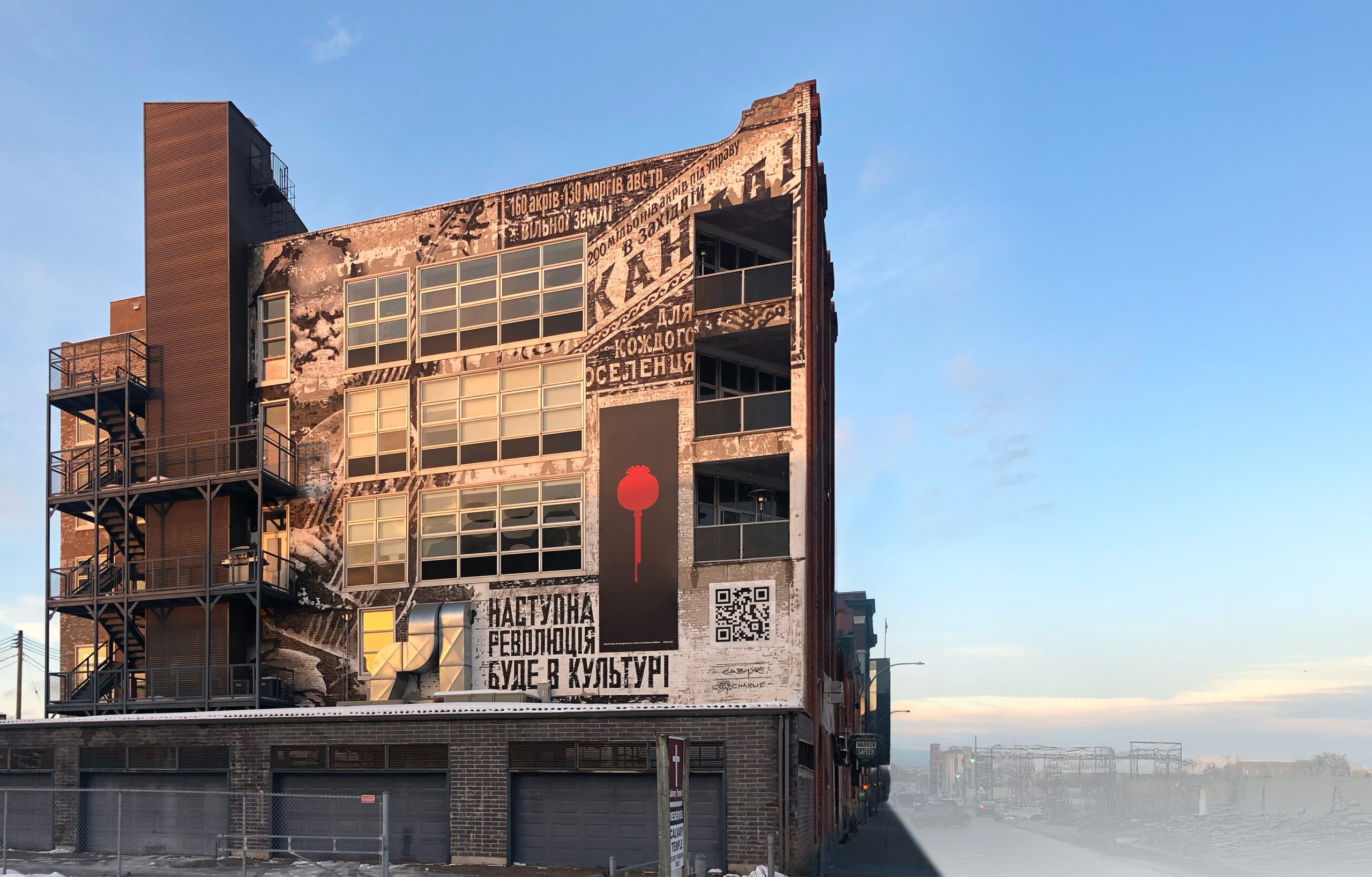
Mural as Message
Memory on the surface and revolution beneath it
A mural project for the side of the Olesia Records building pushed the Fragmenti visual world beyond the realm of album art—painted not on paper or canvas, but directly onto the city itself. Not as promotion. Not as branding. But as a larger cultural statement, layered like everything that came before it.
The building at 448 Hargrave Street in Winnipeg—home to Olesia Records—became the site of a visual epilogue. Its outer brick walls already bore the passage of time: chipped paint, weathered textures, accidental markings. Rather than conceal the distress, the concept embraced it—treating the building as both canvas and artifact, layering new meaning over old surface.
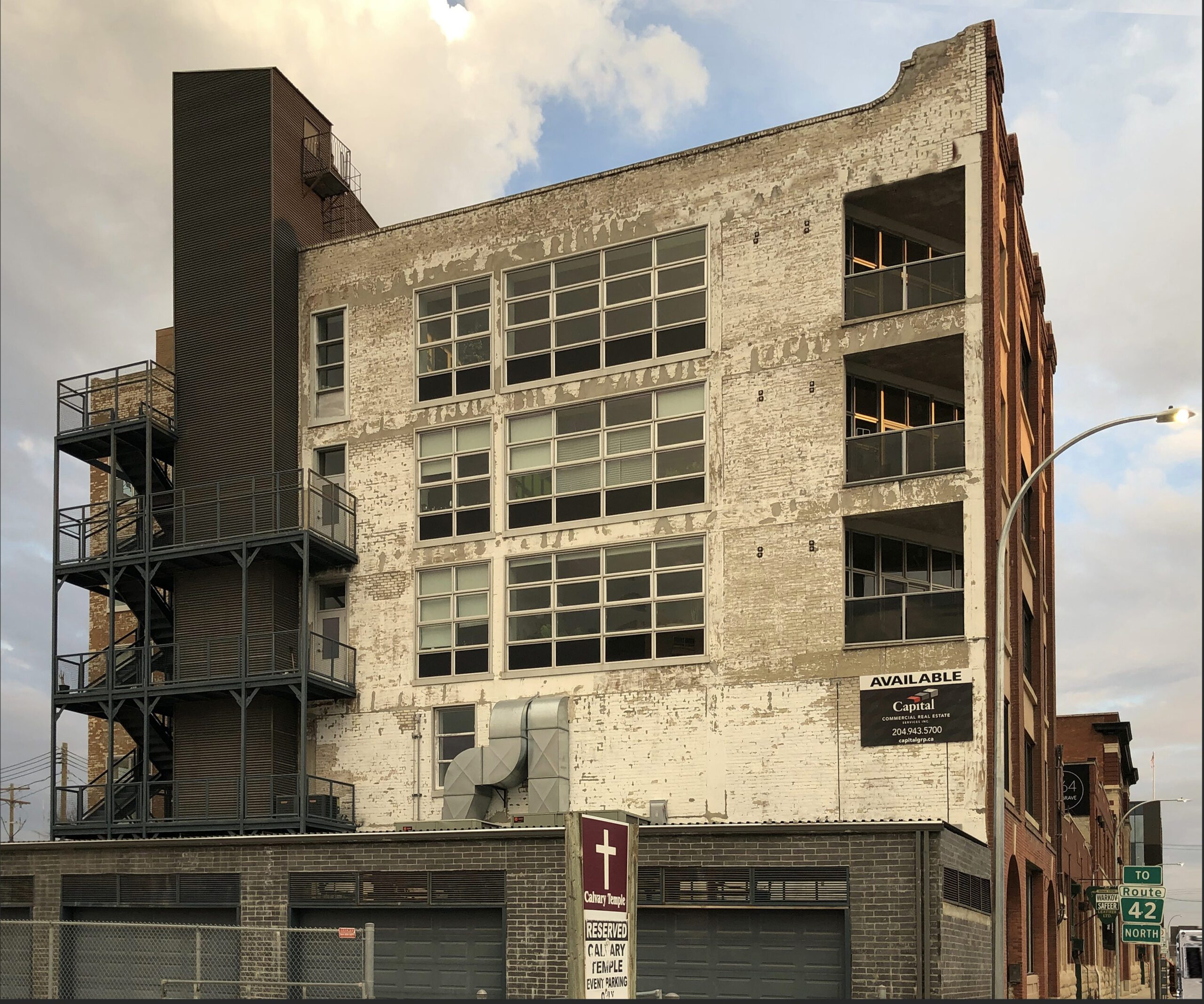
At the top left, a portrait of 19th-century blind bandurist Ostap Veresai, rendered graphically in stark black and white, fused traditional reverence with street-art urgency. Not simply a folk icon—here, he becomes a symbol of musical resistance. As we shift to the right, a faded ghost sign appears: a relic from the late 1800s, a promise made to the first wave of Ukrainian immigrants of a rich and fertile future.
And then, floating in from another register entirely, a panel from the Fragmenti Remixes album. Not painted on the wall, but installed and affixed to it, like a slick, modern advertisement. A poppy bleeding for a people, still hungry for self-determination.
Below all of this, painted in bold Soviet-era type: НАСТУПНА РЕВОЛЮЦІЯ БУДЕ В КУЛЬТУРI An expression underscoring a message of hope for tomorrow, that revolutions need not result in bloodshed but rather can be an outpouring of ideas and creativity.
This wasn’t a mural in the traditional sense.
It was a visual intervention—a layering of time periods,
ideologies, and aesthetic languages.
A ghost sign. A bard. A bleeding poppy.
A whisper of protest. A call to what’s next.