Manitoba Liquor & Lotteries
In 2013, the Manitoba Lotteries Corporation and the Manitoba Liquor Control Commission were merged into a single entity—Manitoba Liquor & Lotteries (MBLL). The new identity had to serve as a corporate umbrella, connecting two very different brand ecosystems: Liquor Marts and Vendors on one side; Club Regent Casino, McPhillips Station Casino, Video Lotto, Lottery Ticket Centres, and PlayNow.com on the other. The challenge was to balance familiarity and continuity with a sense of renewed purpose.
The solution centred on a bold red symbol inspired by a wax seal—a mark of quality, refinement, and trust often associated with the liquor industry. Embossed into the seal was a scrolling double “L,” representing Liquor & Lotteries in a single, fluid gesture. The shape suggested continuity and connection, while nodding subtly to bubbles, gaming chips, and other elements from each legacy brand. Purple and gold arcs referenced the colour systems of the former organizations while suggesting energy and sociability. With the seal as its focal point, the identity projected a confident, unified presence—anchored in quality and designed to bridge the two sides of a newly formed corporation.
ClientManitoba Liquor & Lotteries
ProjectVisual IdentityYear2013
The identity extended across multiple sectors of the organization, touching internal departments, corporate communications, community sponsorships, and public-facing retail. Examples ranged from fleet vehicles to uniform programs and community support templates—all designed to ensure consistency and usability across a sprawling brand landscape.

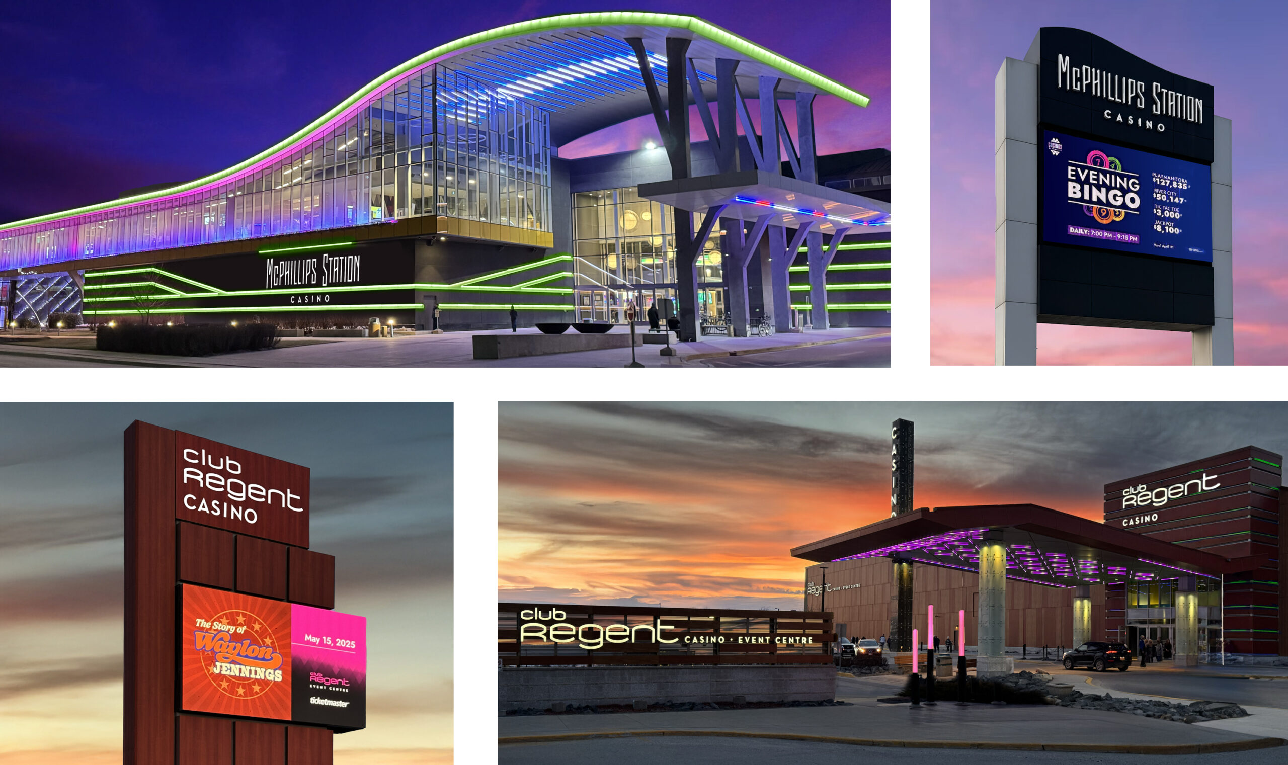
The system later expanded to include the rebranding of several sub-brand properties. Club Regent Casino and McPhillips Station Casino were each given a custom designed typeface and a distinct colour palette—magenta for Club Regent, green for McPhillips. A third logo, “Casinos of Winnipeg,” was created as a unifying sign-off, combining both colours to simplify communications across properties. The Video Lotto logo was also redesigned with a strong family connection to the new MBLL mark. The work set the tone for a cohesive system that was realized in a suite of integrated brand standards.