Winnipeg Folk Festival
As one of Canada’s most iconic music festivals, the Winnipeg Folk Festival had a strong visual personality—but no consistent identity system. The brand had become synonymous with its annual event visuals—playful, eclectic, and creatively distinct each year. But as the organization expanded its offerings beyond the summer festival, it needed a clearer, more consistent identity to represent the parent brand across all seasons and platforms.
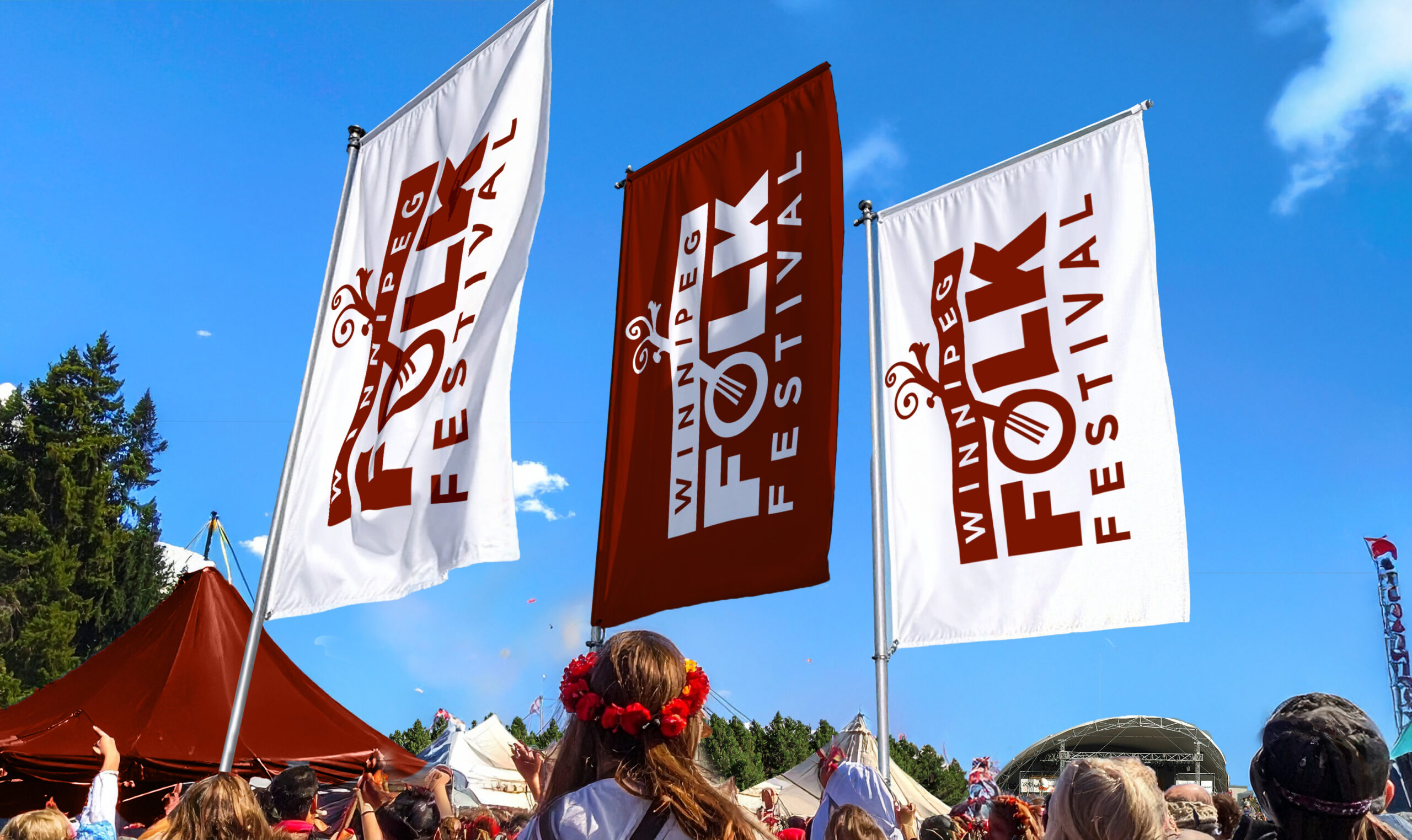
The solution centred around a refined wordmark that paid homage to a recurring symbol from the festival’s past: the banjo. Redesigned with custom lettering, the new mark integrated the circular banjo body into the letter “O,” while the organic shapes extending from the headstock suggested growth and transformation. These subtle details helped signal the festival’s evolution—from a singular annual event into a year-round cultural organization with an increasingly diverse lineup and broadening appeal.
ClientWinnipeg Folk Festival
Project Winnipeg Folk Festival – Identity Year2011

The identity was designed to coexist with the ever-changing look of each year’s festival campaign while standing confidently on its own in corporate, fundraising, and off-season contexts. It balanced the warmth and authenticity of the festival’s legacy with a more contemporary structure—growing the brand without leaving its roots behind.